The #jeffersonavekitchen is complete! Without changing the footprint in this kitchen remodel, the clients were able to gain a much more functional layout and bring the character the rest of their hundred year old home has into the kitchen. Rascher & Co did an amazing job with the construction and it was a great project to complete together!
Let’s start with what this kitchen looked like before!
Before
While the rest of this home has a lot of function and character, the kitchen was starting to fall apart. The cabinets needed a major upgrade and the clients were also looking for a layout that better suited their family – without changing the current footprint.

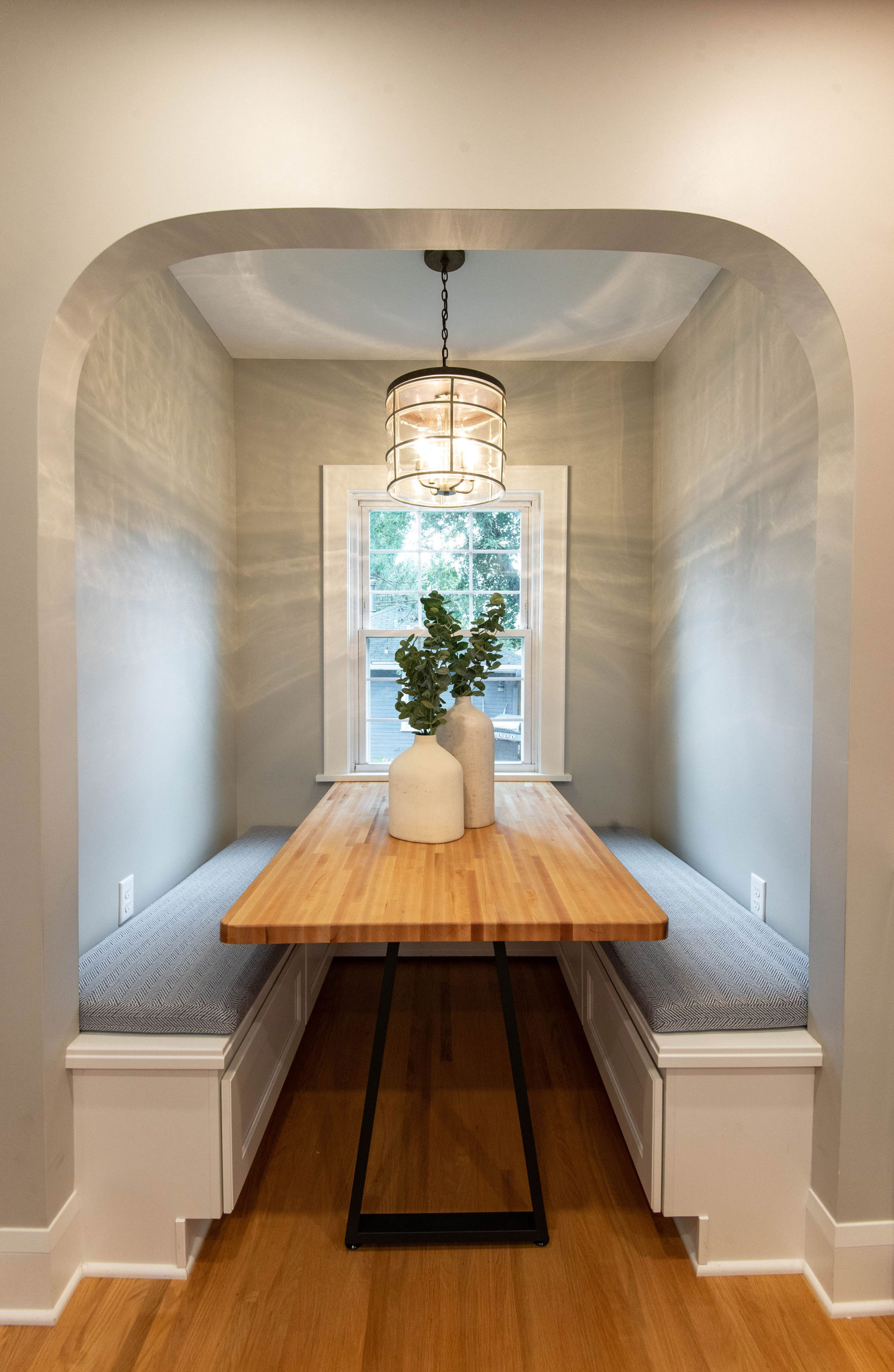
They love this breakfast nook, since most of their meals are eaten in this space, but wanted to give it a new and fresh look.
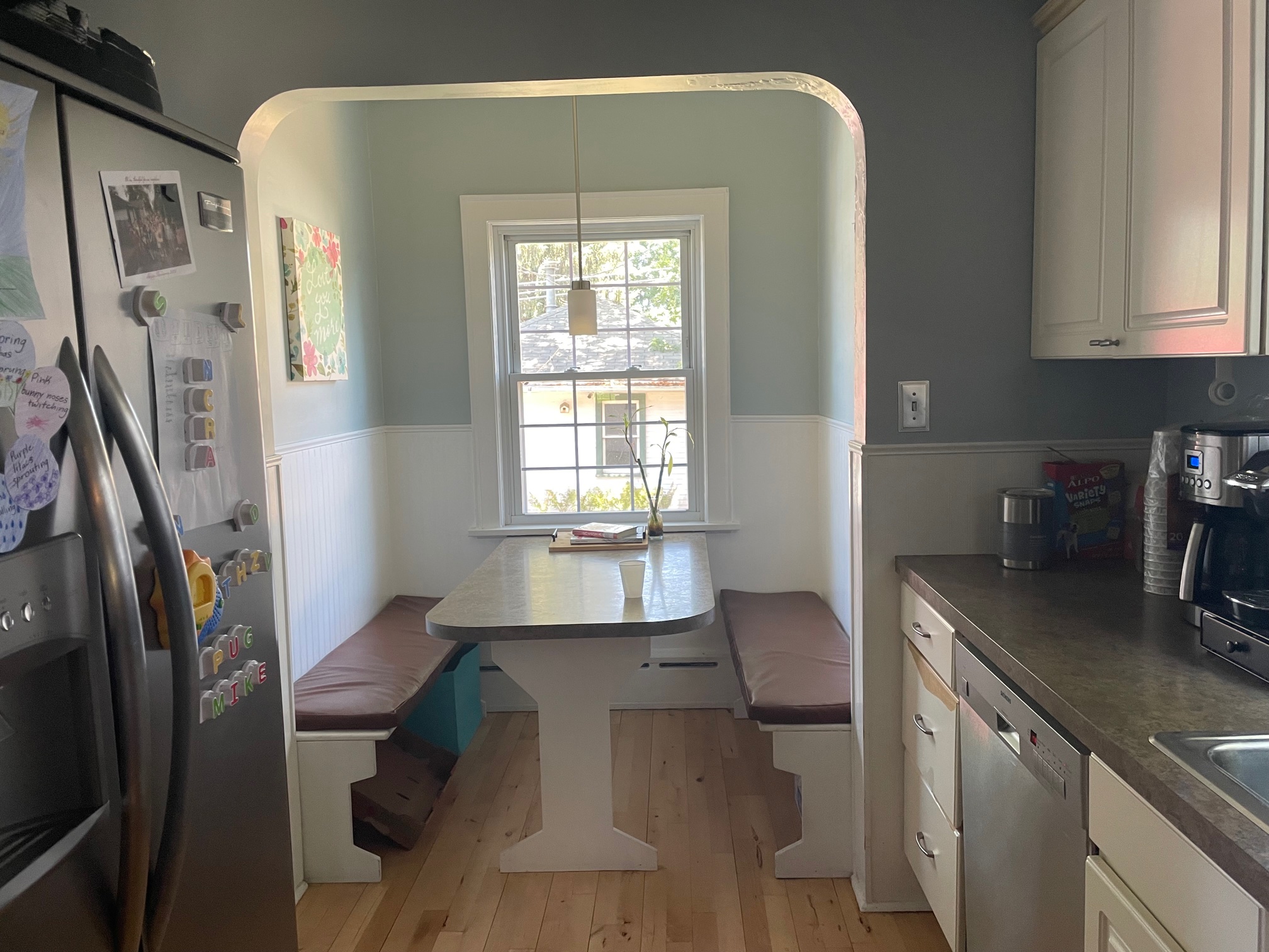
After walking through the space and playing around with ideas, the goal was to swap the fridge and range to create a better flow and more workspace.
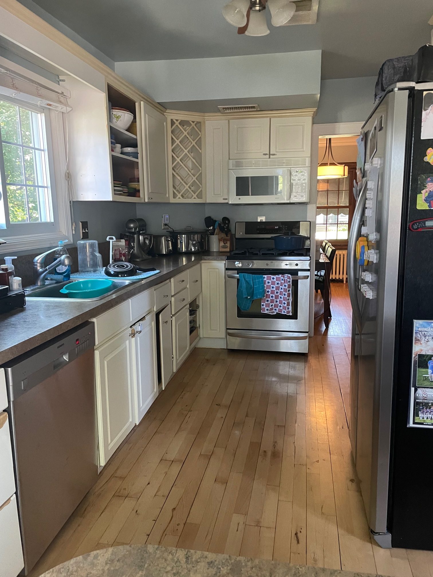
Another goal in this kitchen remodel was to make the most of counter space and get the appliances out of sight.
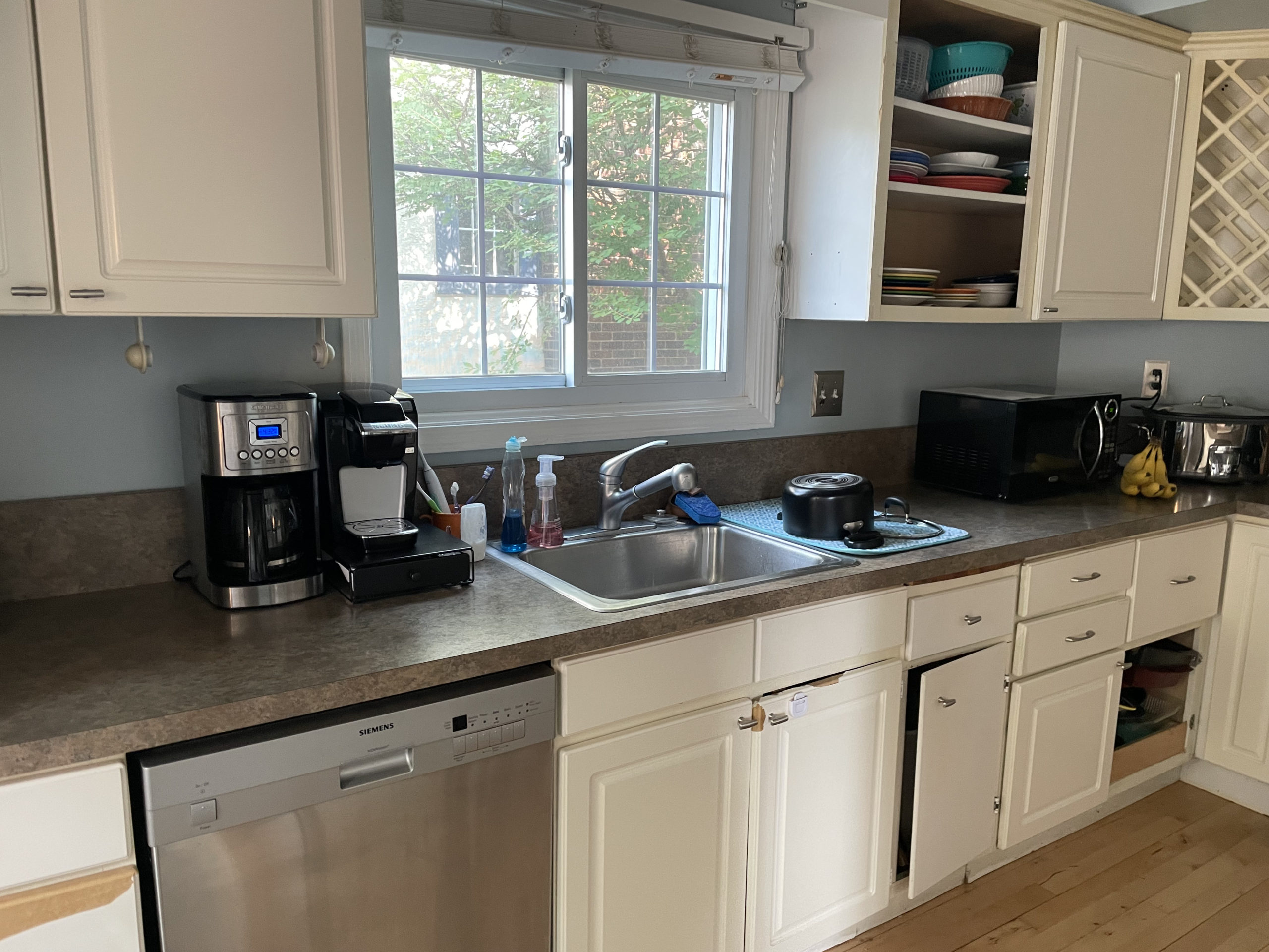
The Design
Mood Board
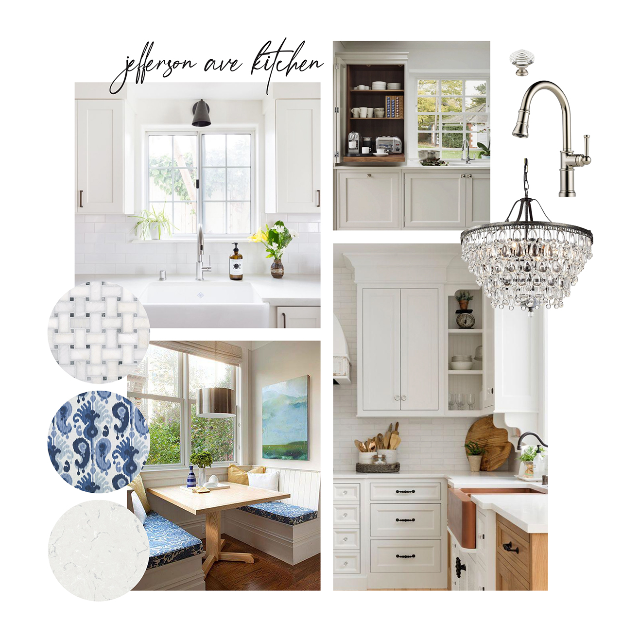
In the mood board below, you’ll see that the inspiration included white cabinets that would brighten up the space. We also wanted to incorporate timeless finishes and pops of blue. An appliance garage like the top left photo was top of the wishlist for this home.
The Plan
As you can see in the plans below, the footprint didn’t change at all, but the functionally and flow is so much better. In the previous plan, the fridge stuck out into the walkway space, especially because the back door leads to a pool and there is lots of traffic going through this area. There wasn’t any space on the right side of the range, which became a problem during prep and cooking.
Although we originally wanted to square off the corner for more workable space and storage, but were unable to because of duct work running back there, we still made the most of that corner.
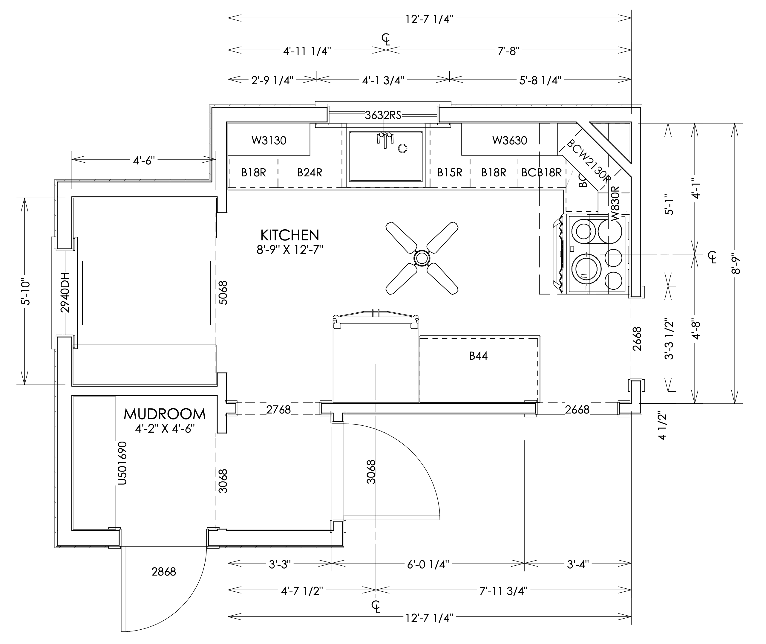
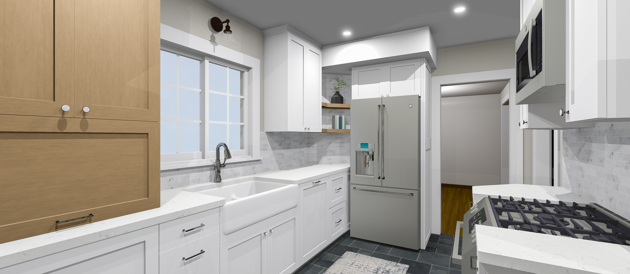
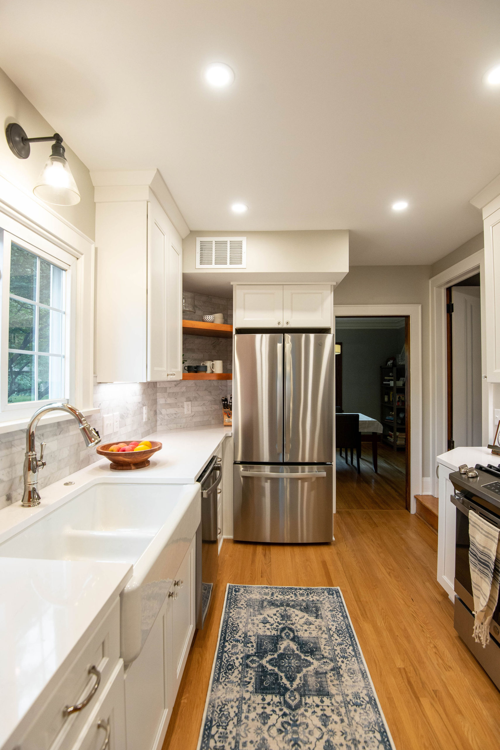
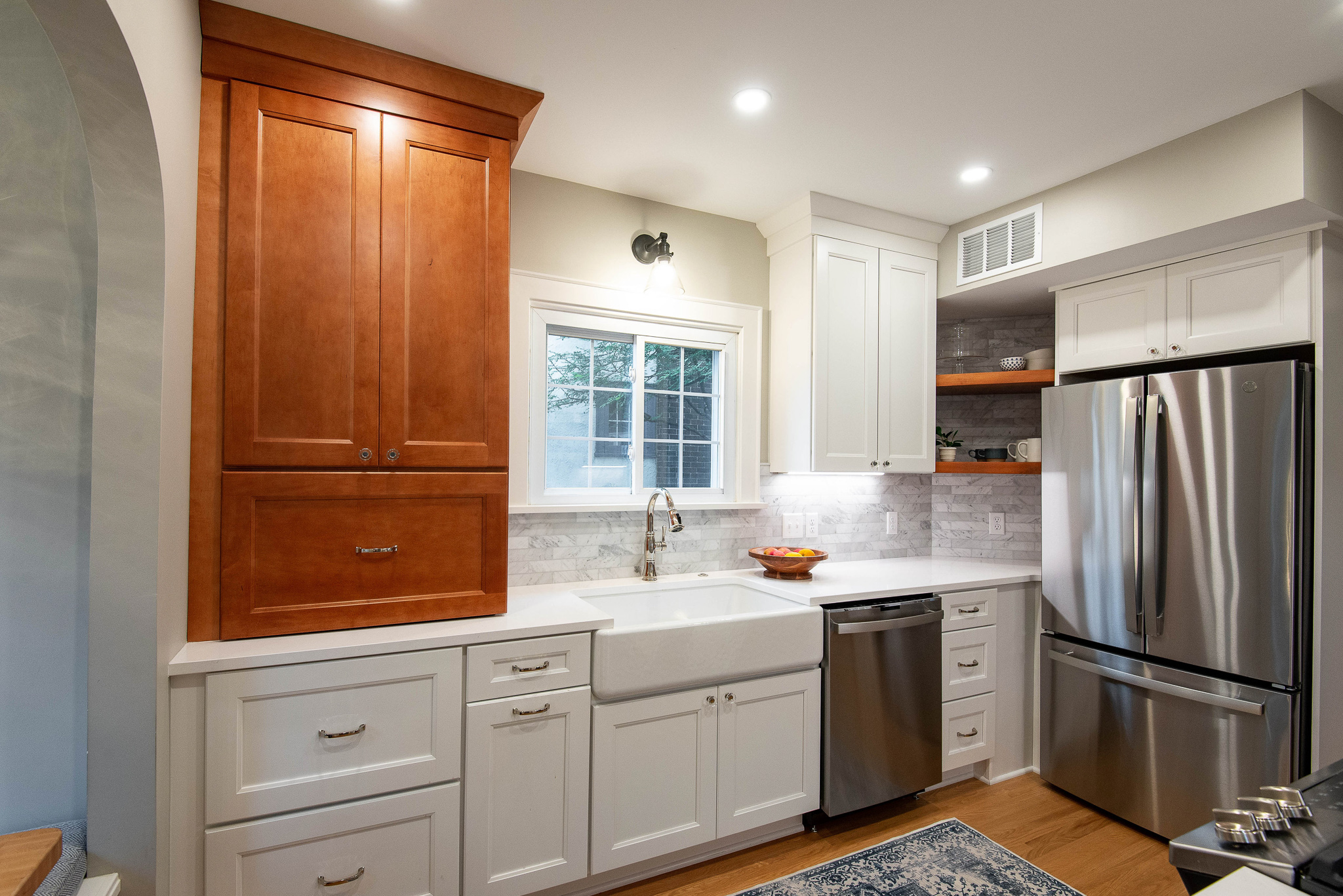
With the new layout, the range is opposite the sink and has countertop space on either side. The fridge is now a counter-depth size and opposite the breakfast nook, making more room in the walkway. To the left of the sink is a drawer for trash and recycling. An appliance garage goes down to the counter, providing a spot to tuck away countertop appliances. Below that is base cabinet with 2 drawers for deep storage. The fridge is now counter-depth and opposite the breakfast nook to clear up the walkway space.

Renderings
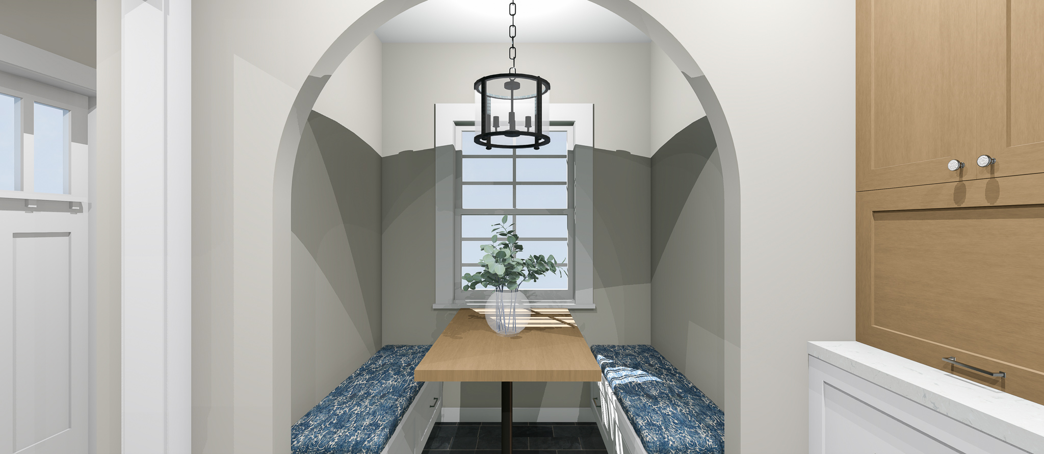
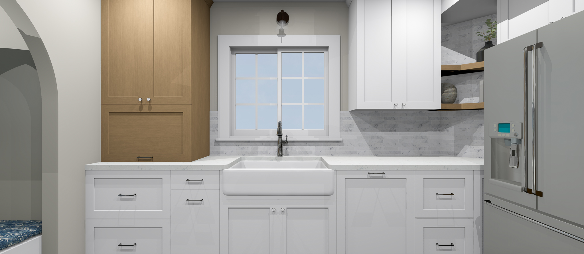
In the renderings below, you’ll see how the design and layout started to come to life. Originally, we were thinking of tile for the floor to add a darker element, but in the end, hardwood floors were installed to continue the material from the rest of the home.



After
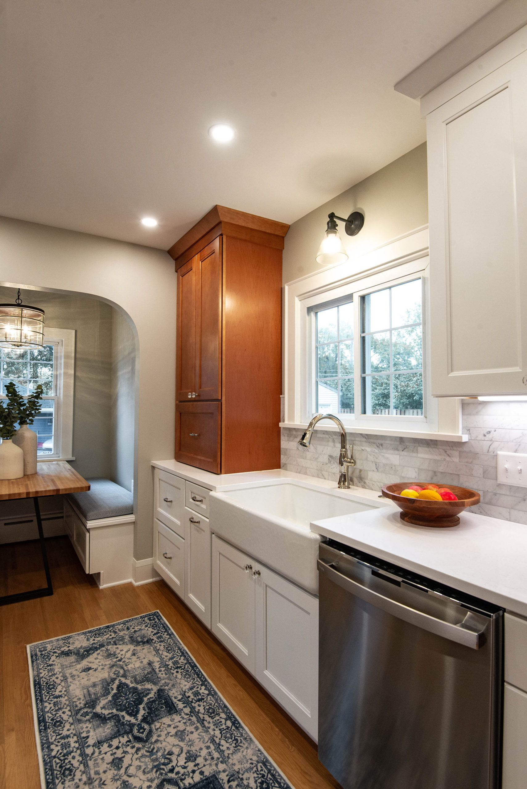
Now, it’s time for the reveal of this kitchen remodel! The new layout functions so much better and the flow works really well in this home. The fridge is now easy to access from multiple areas of the kitchen and no longer blocks traffic flowing through.


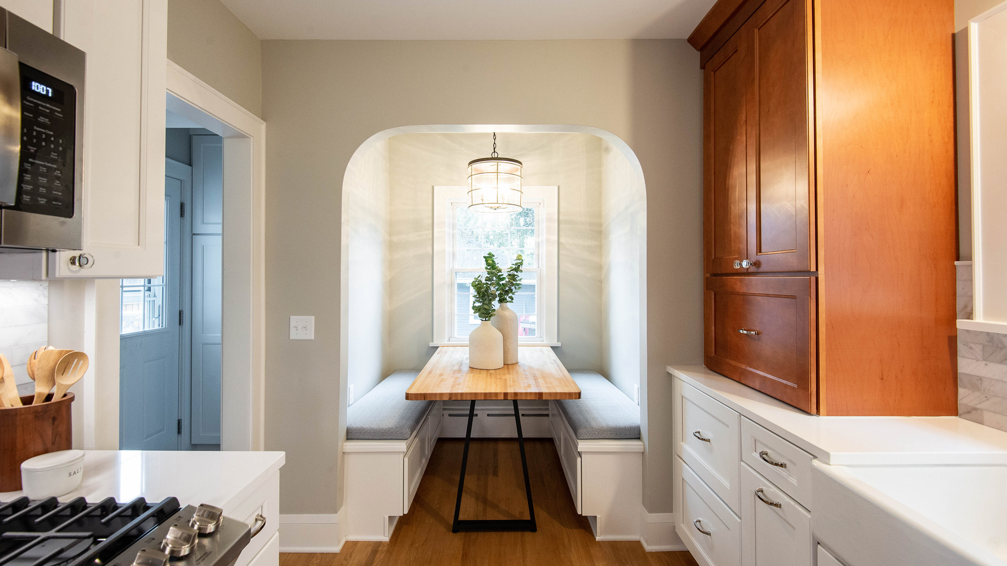
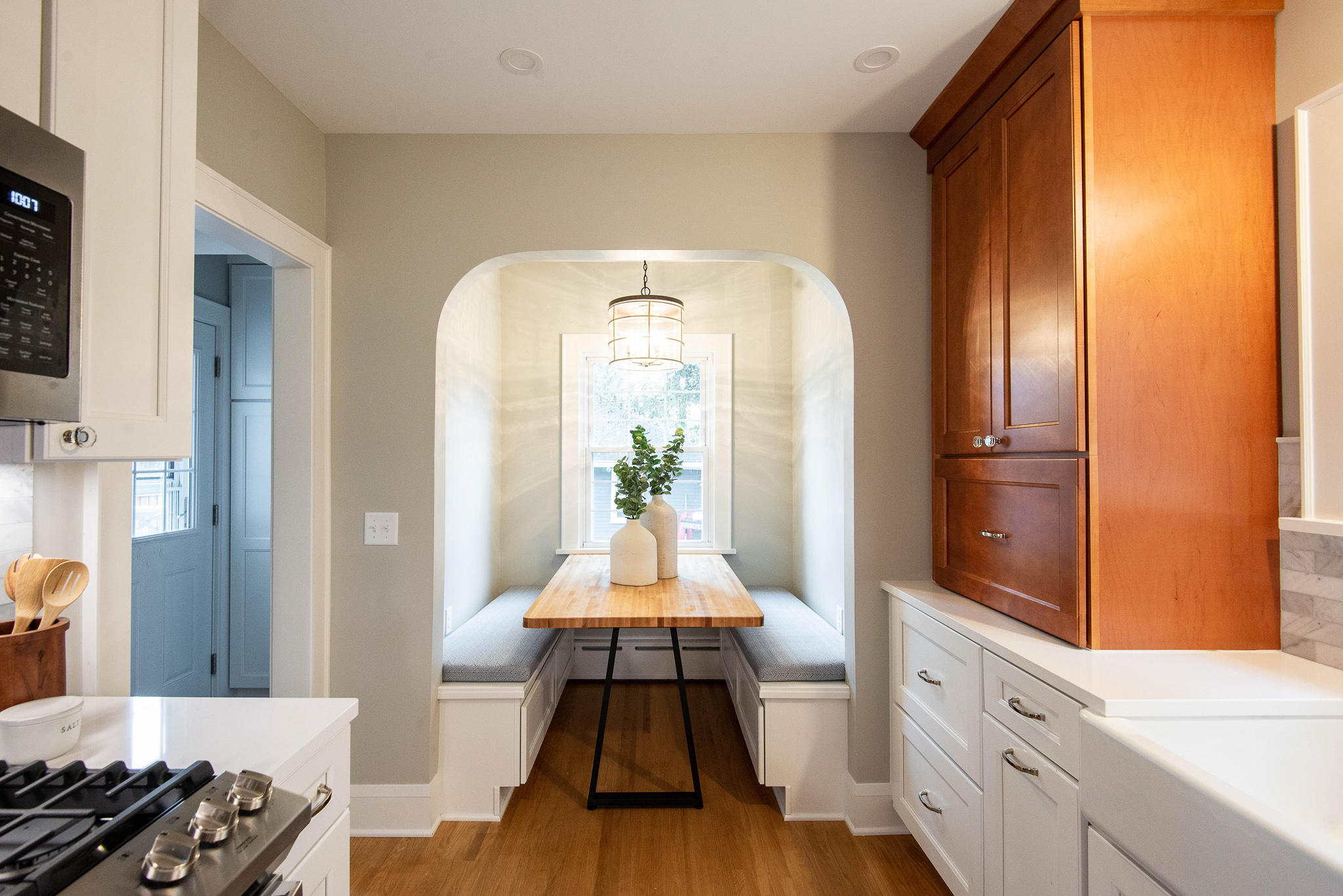
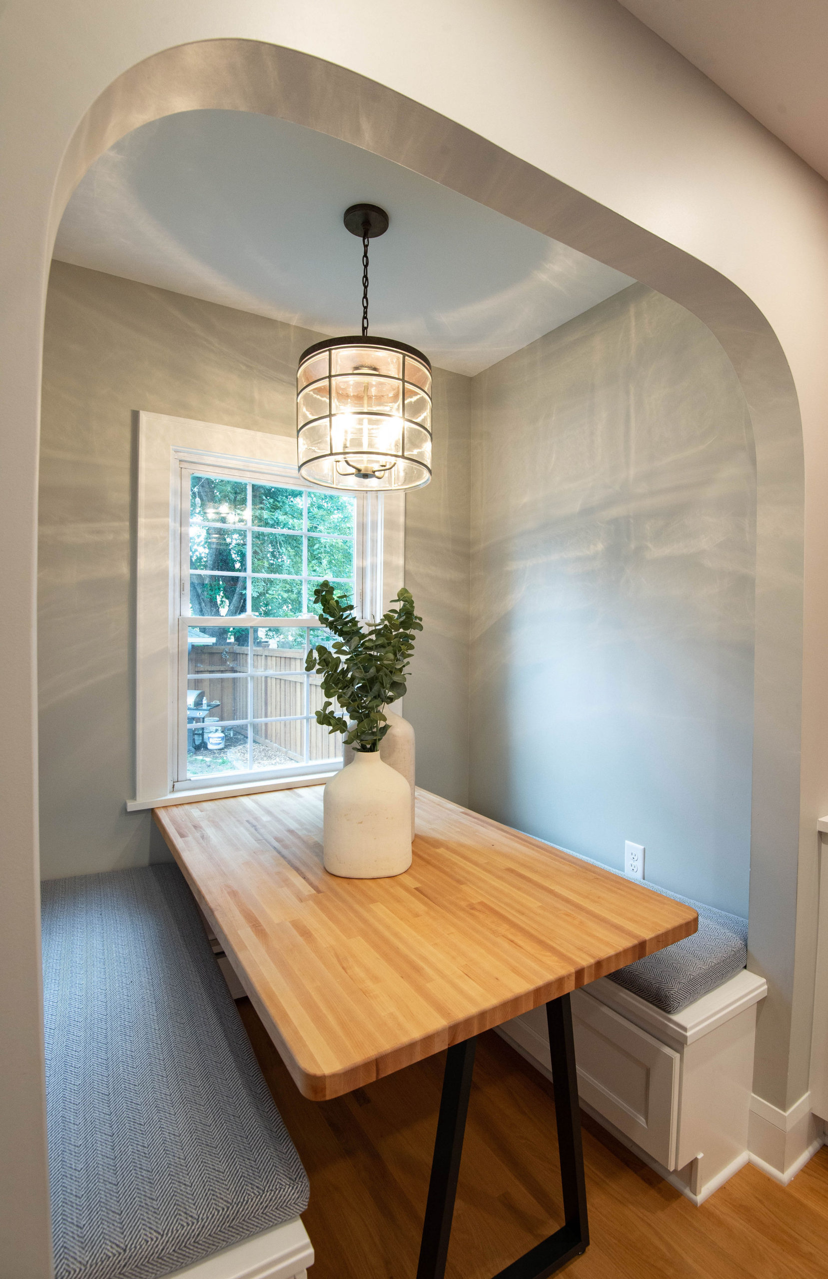
This breakfast nook looks like it’s always been meant to be in this home. Although it has a fresh and updated feel, it nods back to the character and charm this hundred year old home has.
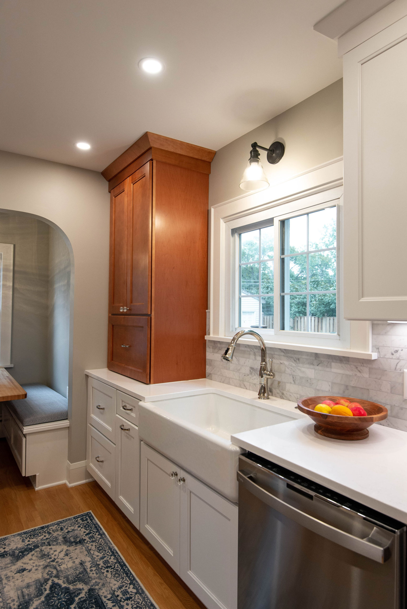
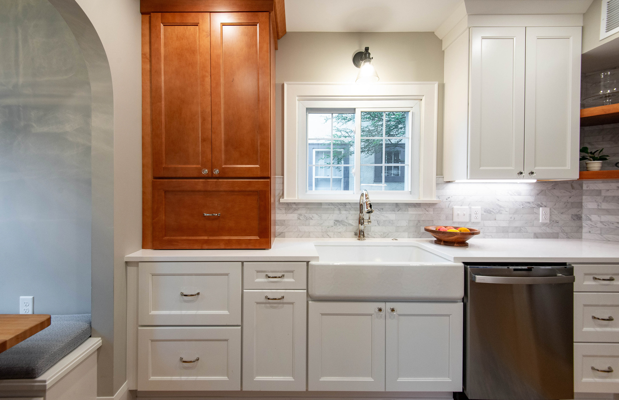
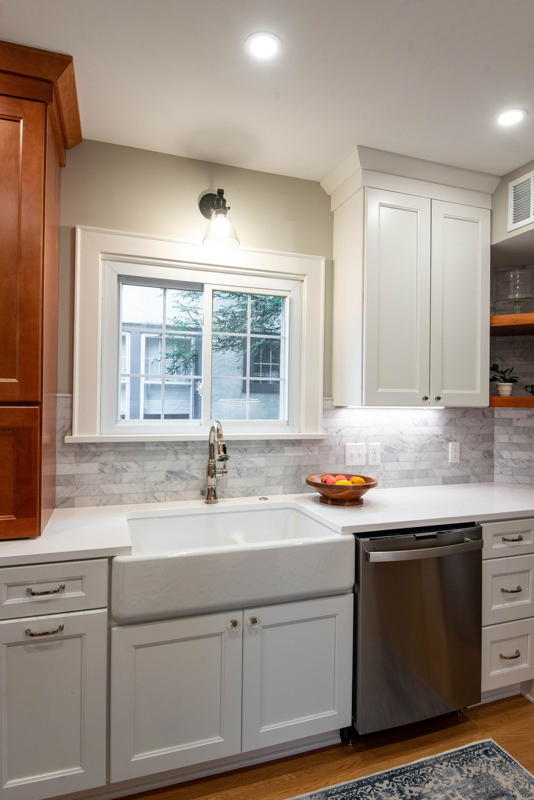
We worked with ProSource on the cabinetry for this kitchen remodel. The line we used is a semi-custom option, which allowed us to work some unique features into this space like the appliance garage. To the left of the sink, the appliance garage houses the coffee maker and toaster that sit on the countertop. The bottom is a hinge top door that opens up for easy access when needed and the ability to close it off when not in use.
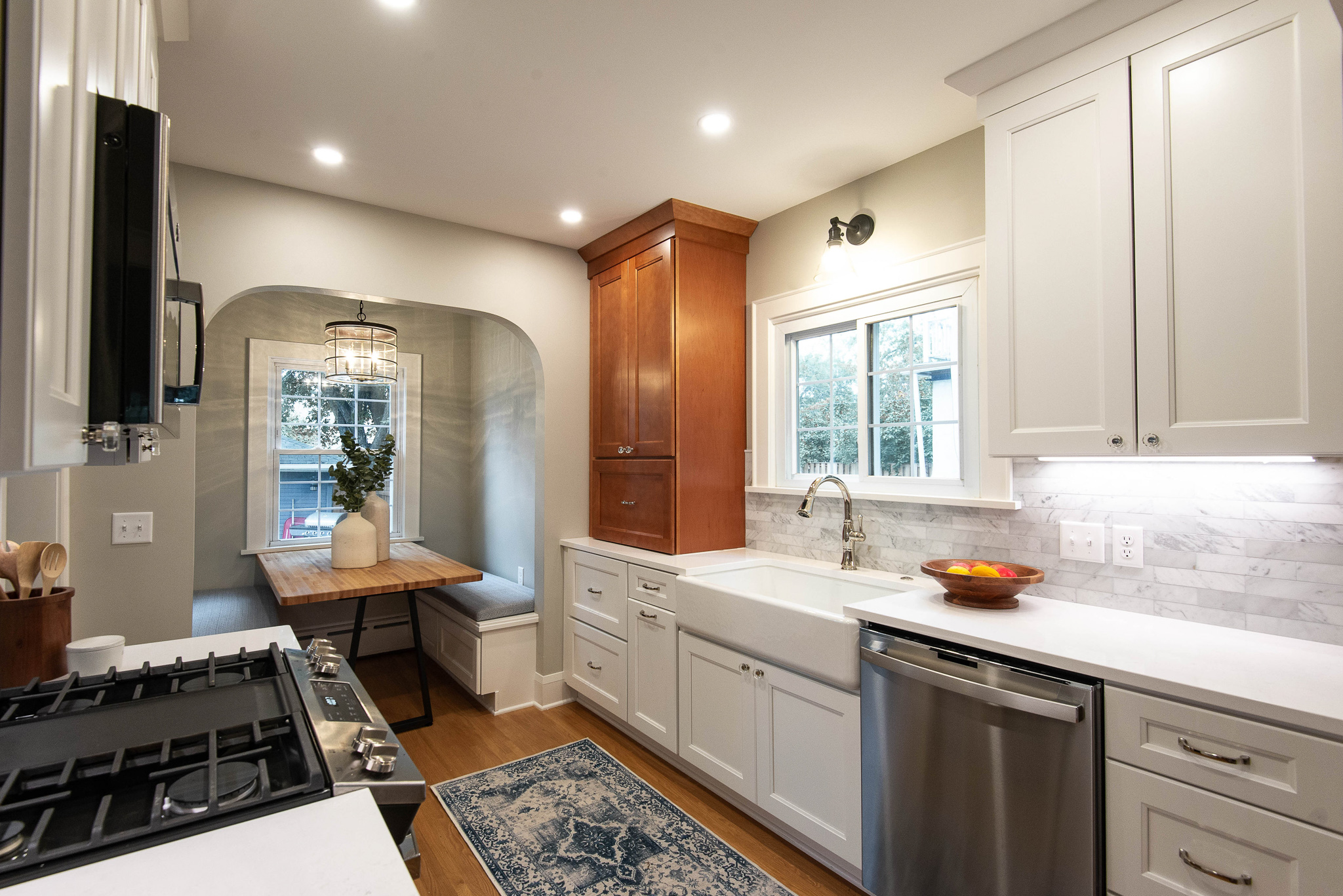
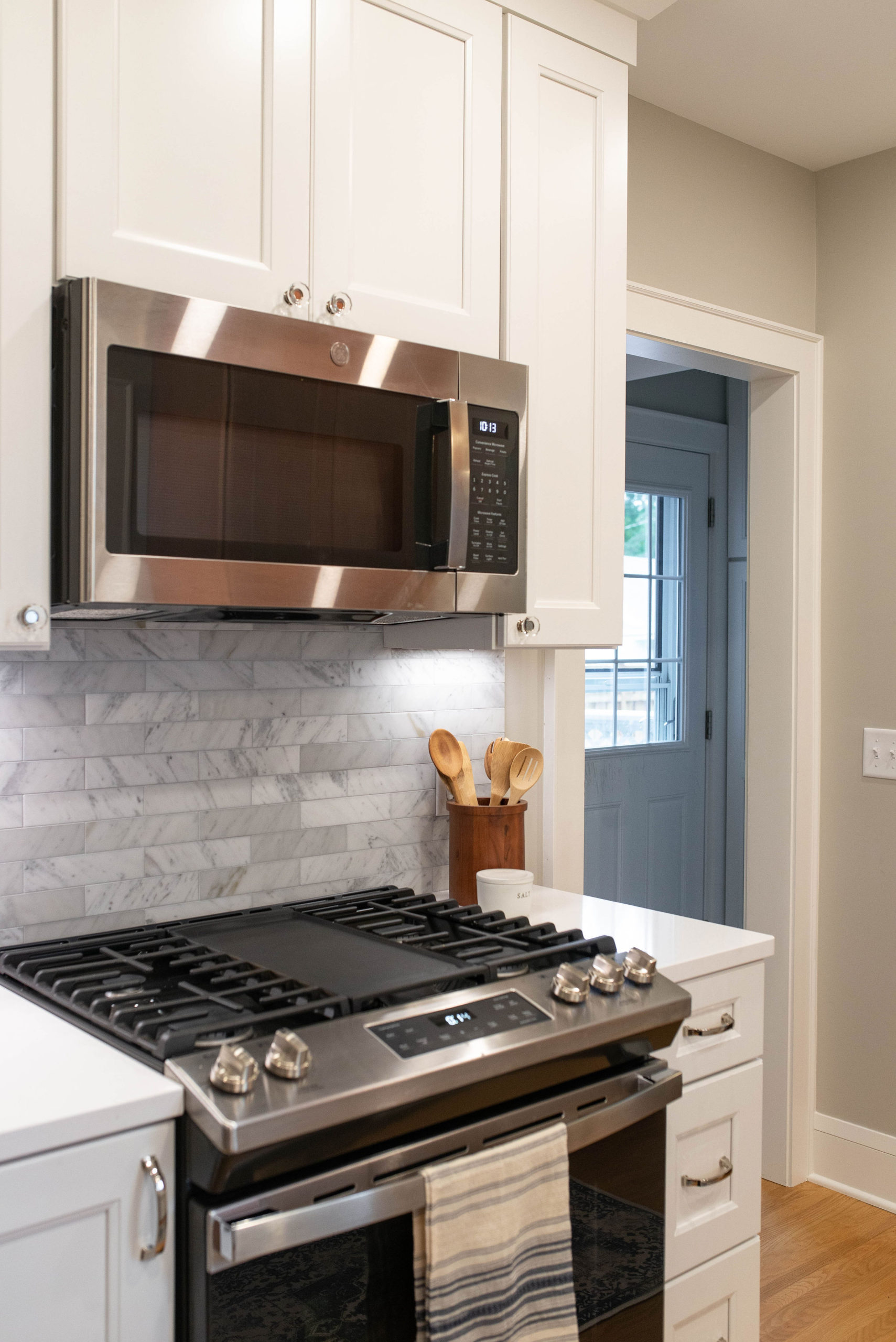
Opposite the sink, the range wall feels much more intentional with countertop space and storage on either side. Putting the microwave above the range saves space in this smaller city kitchen and allows for easy access for this busy family as well.

By installing shelving in the corner, it feels the spot feel more open, while also providing storage for everyday items. The wood shelves tie into the wood appliance garage, which both bring in warmth and a contrast from the rest of the white cabinetry.
The Details
The upholstered benches in the breakfast nook conceal the radiators with venting in the toe kicks. Paired with the benches is a custom table built by Rascher & Co. A stunning light fixture illuminates this area and creates a warm glow.
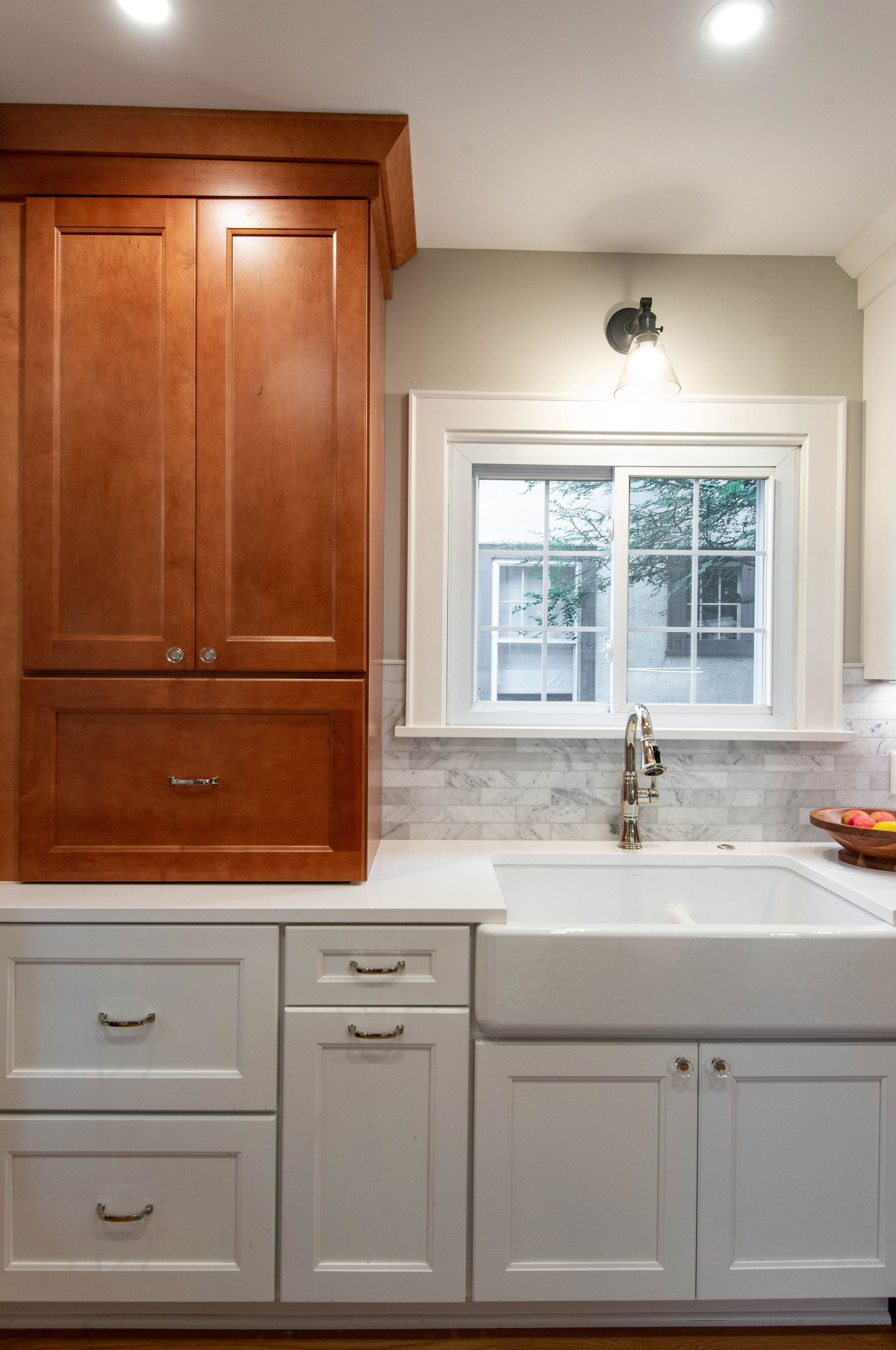
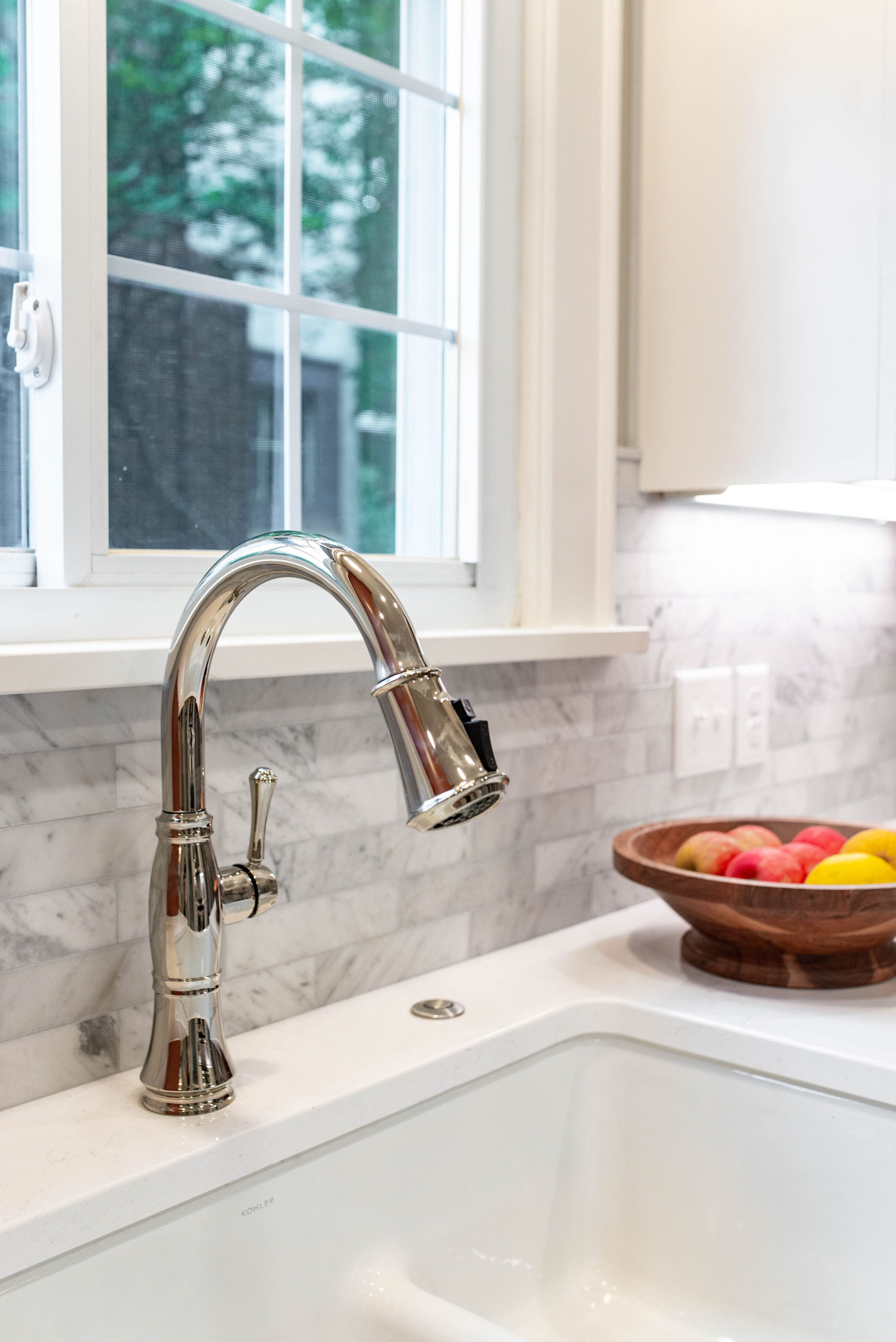
A farmhouse sink with a low divide brings a timeless and classic feel to the kitchen, especially when paired with a polished nickel faucet.
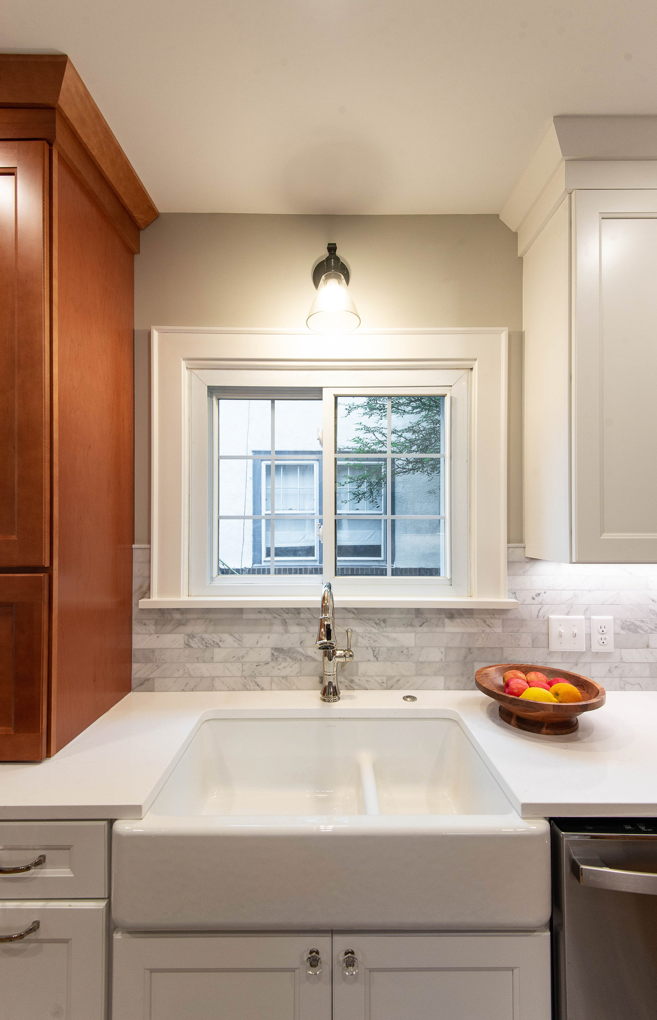
A timeless glass and oil rubbed bronze sconce provides ambient lighting over the sink, while new can lighting brings necessary illumination throughout the space.
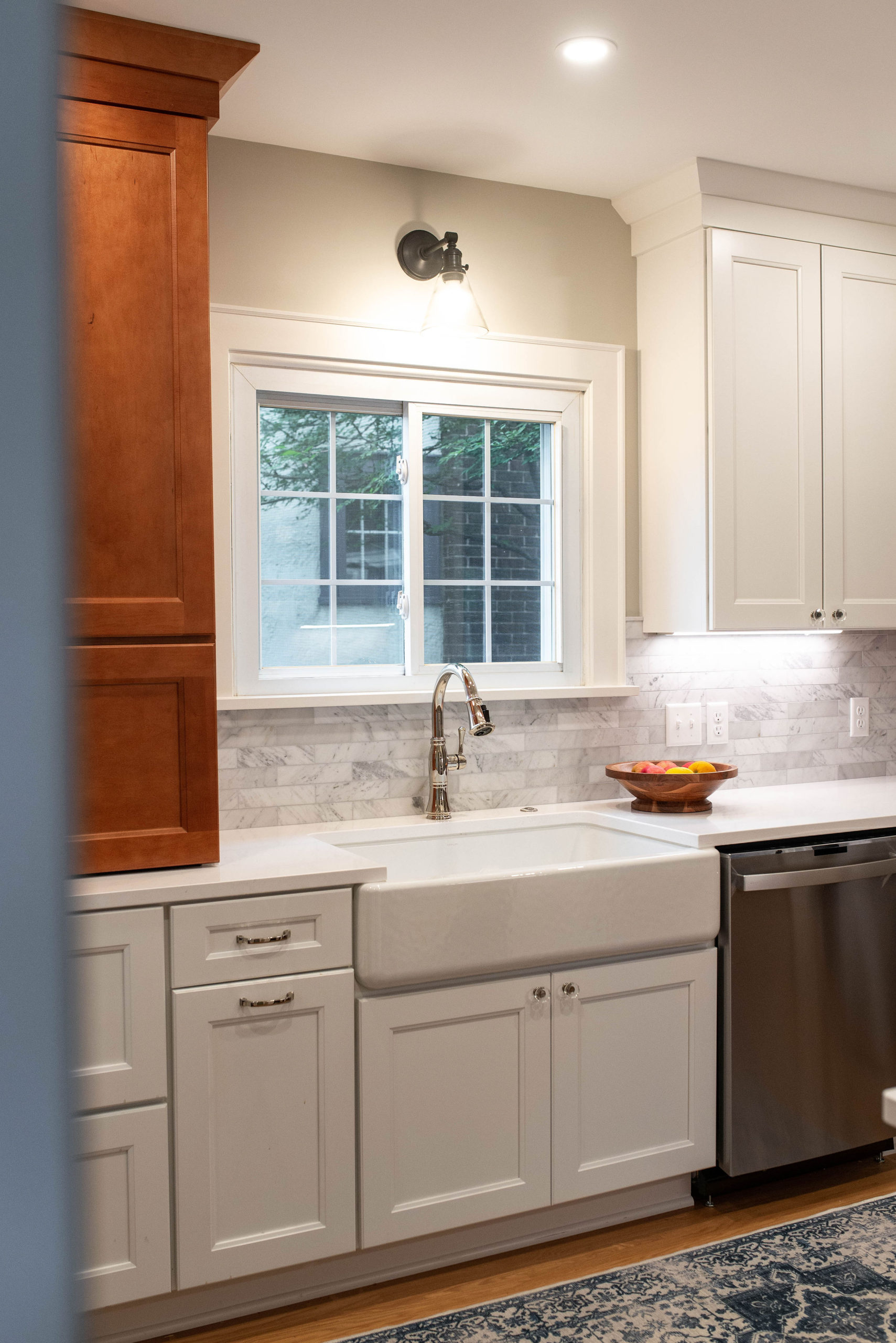
The cabinet hardware was inspired by the crystal knobs on the doors. By bringing a similar look into the kitchen, it brings consistency and a cohesive feel to the home.

The marble backsplash has both blue and gray tones, which play beautifully into the simple and classic quartz countertops. With a busy family and lots of use, quartz countertops are the perfect choice due to their low maintenance and non-porous qualities.

And that’s a wrap! It was a joy to work with these clients on transforming their space into a kitchen they’ll use for years to come. If you’re looking for more kitchen inspiration, check out the Arden Place kitchen remodel!
