Our guest bedroom transformation is complete! I first shared the design plans almost a year ago, and now it’s time for the before & afters. We love how the space turned out, and this room has been an awesome addition to our home for guests to use, especially since it’s right by the bathroom we refreshed too.
Guest Bedroom Inspiration
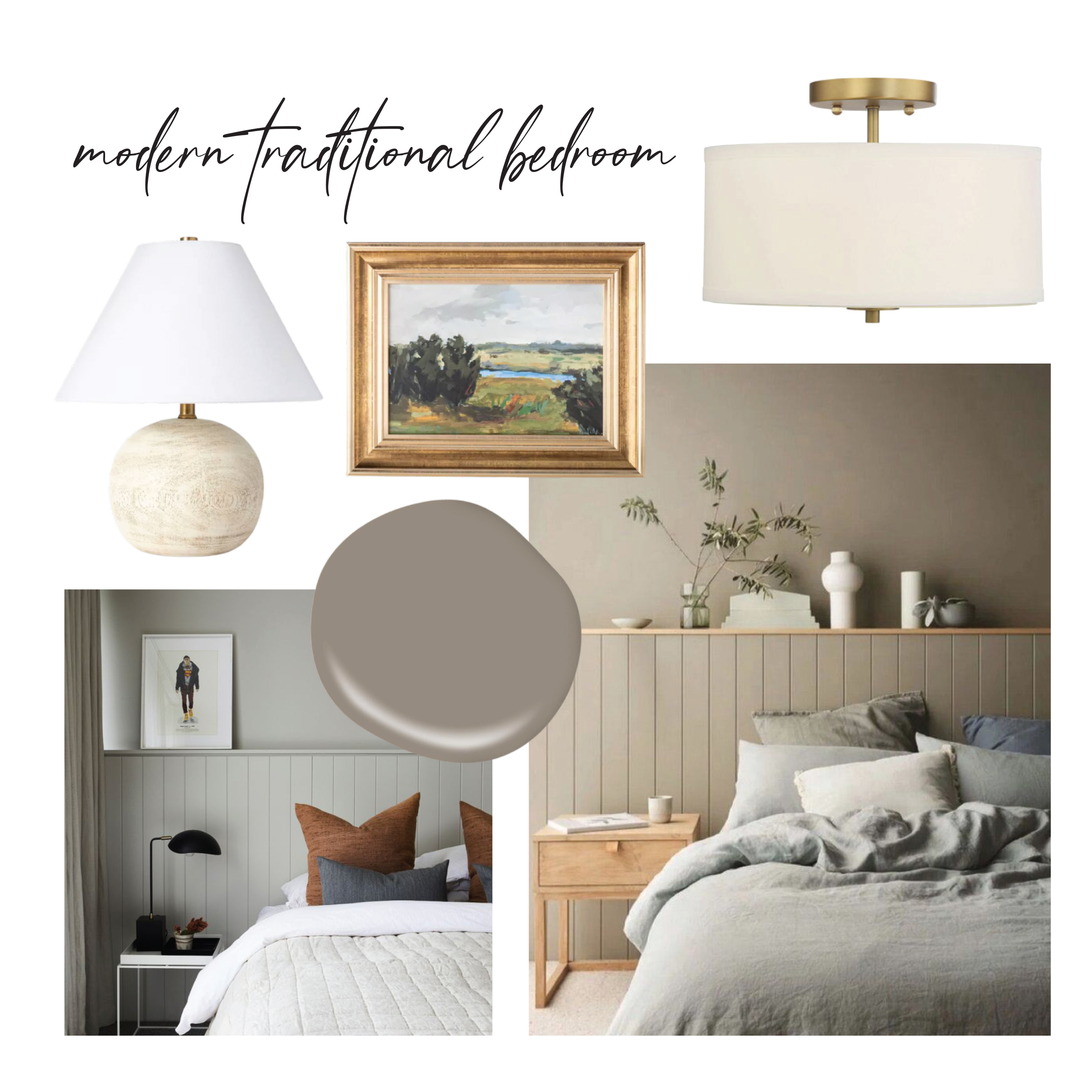
When we started dreaming about the design for this space, I knew I wanted to bring in a modern traditional feel. After searching on Pinterest, I was drawn to rooms that had the same paint for the trim, walls, and doors in a taupey color. Vertical shiplap wall behind the bed felt like the perfect alternative to a headboard. I loved how these images had a shelf above too where you could display plants, vases, and artwork.
Before + In Progress
When we bought our house, this room was in the process of being finished. In order to close on the home sooner and because we didn’t need the extra bedroom at the time, our offer said the sellers didn’t need to finish it. Now that the room is complete, I am thankful we finished it ourselves at a later date so that we could make all of the design decisions.
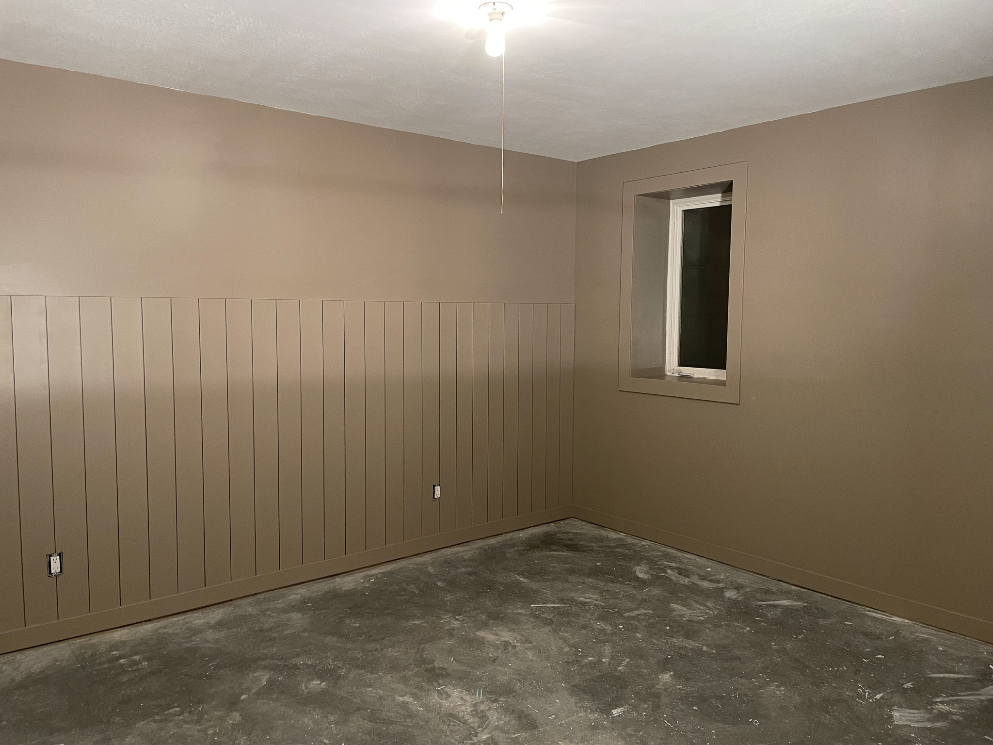
Here is what it looked like when we started this project:
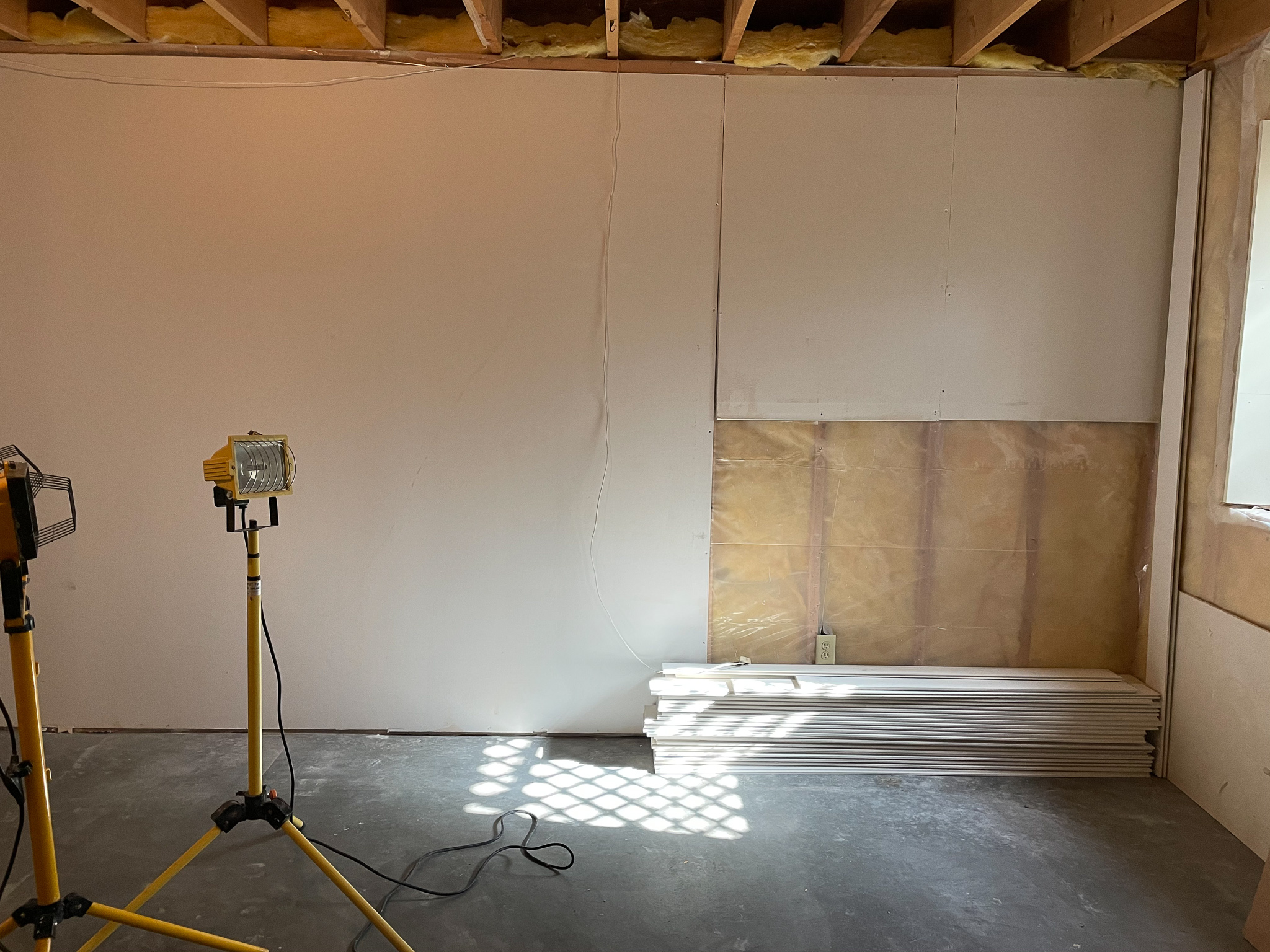
There was duct work on the ceiling that we had to work around, which was the trickiest part of the framing process. Our plan was to create a soffit and keep the height where we could in the rest of the space.
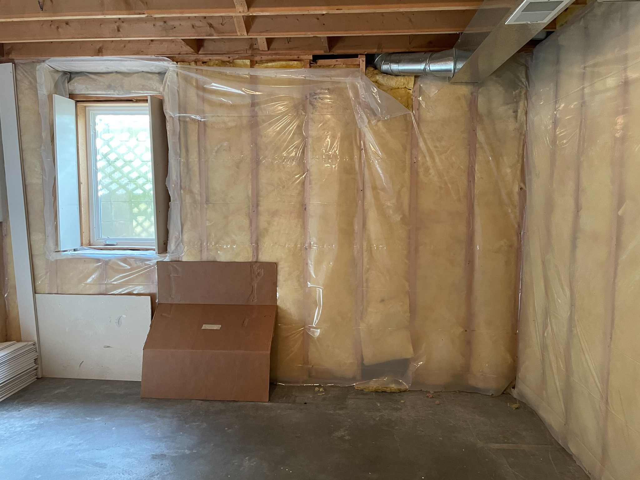
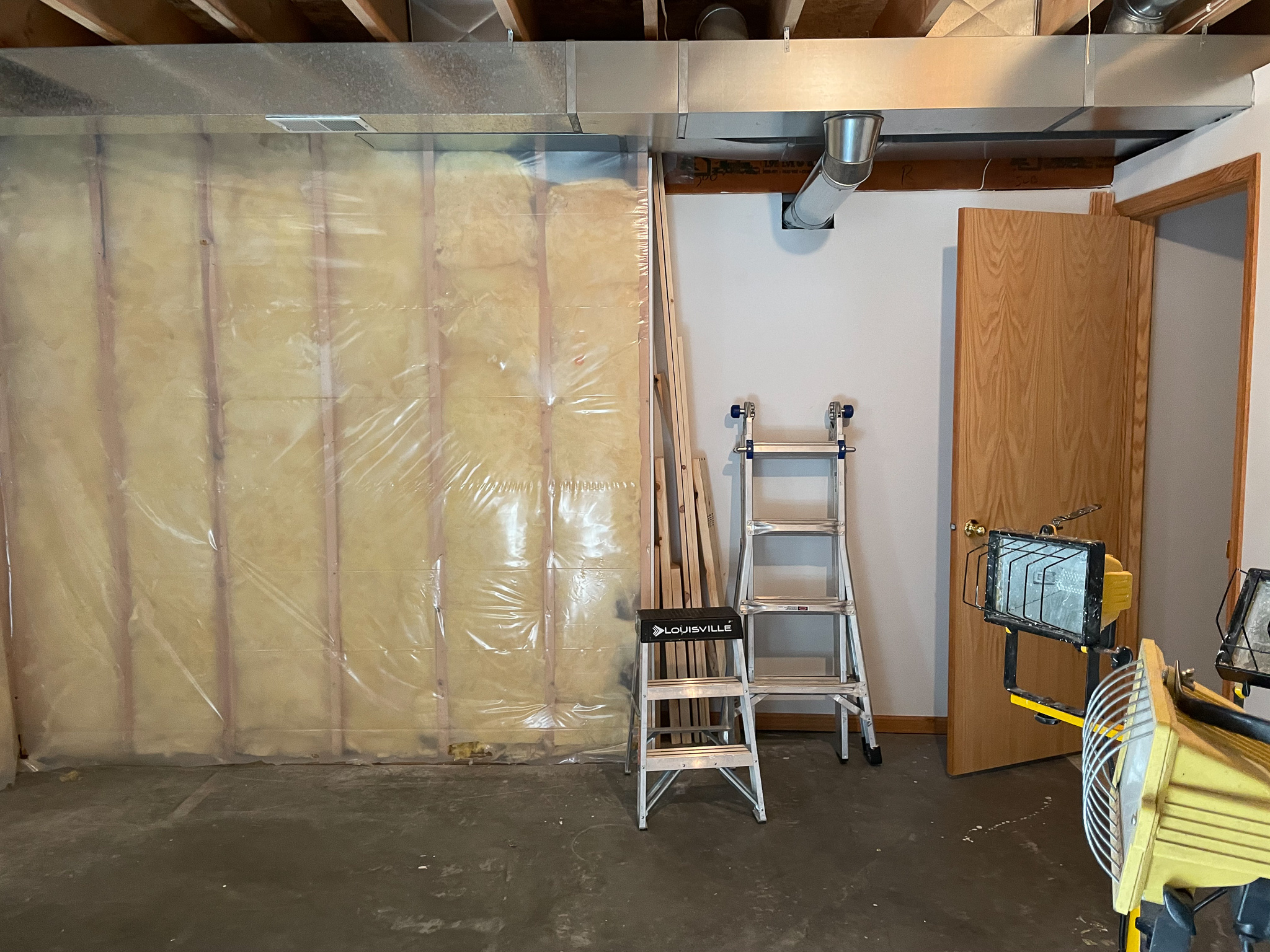
Our friend Joel is a carpenter and helped us with the framing, which was so great! Once the closet and soffit were framed out, it was time for sheetrock. Matt tackled it with the help of my dad and brother. Sheetrock made it start to feel like an actual room!

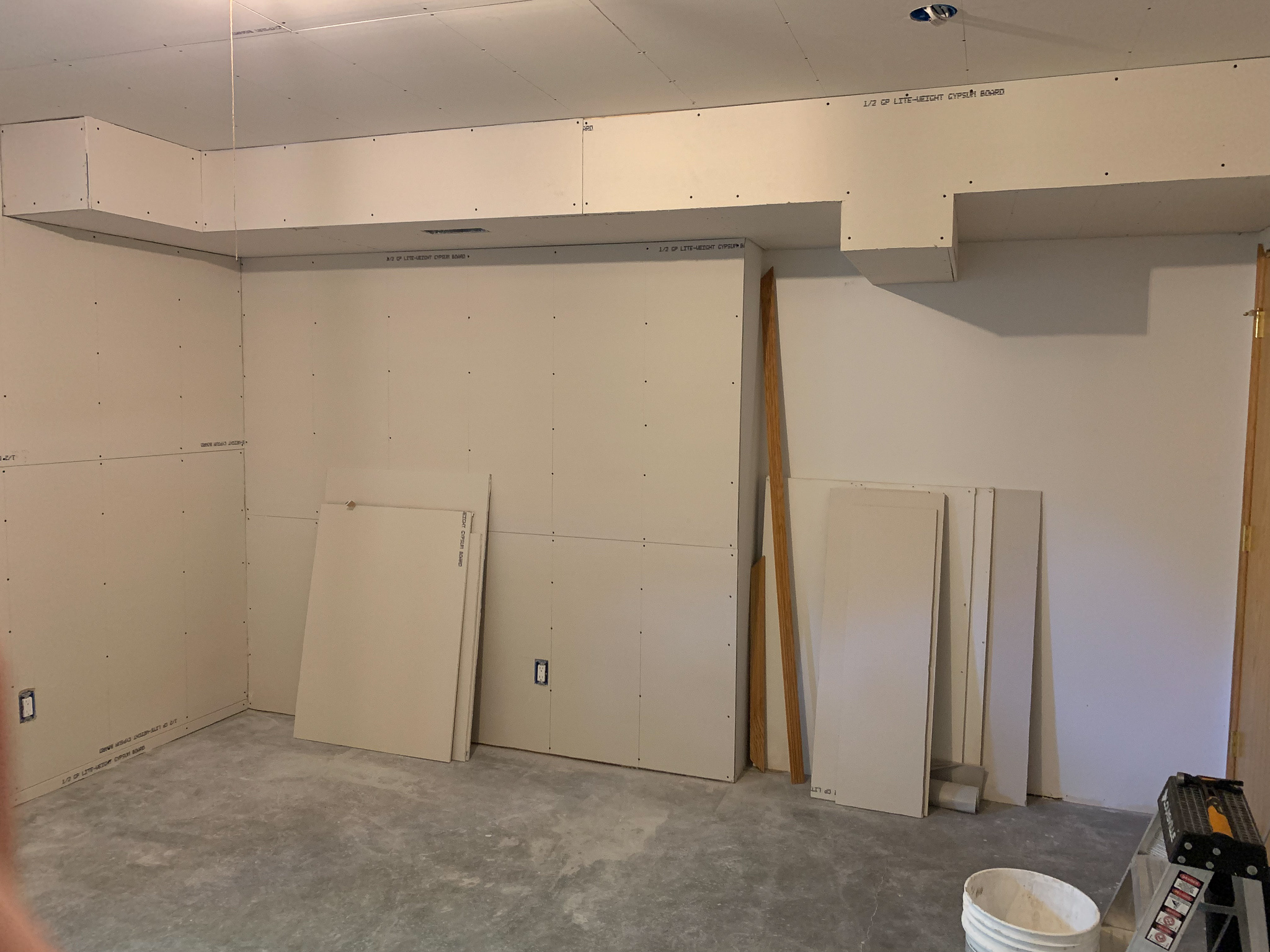
The original plan was that we were finishing this room so my brother could live with us for the summer, but he ended up taking a job back home. Two days after the sheetrock was completed, we found out that we were expecting a baby! That news meant that we would be turning the room into our new guest room and also gave us a hard deadline to complete the project.

It was so fun to see the progression of this room. After sheetrock came mudding and taping, which is a tedious process and took a lot of time. When I shared about how we were DIYing the mudding and taping on Instagram, so many of you said that you always hire that part out! Now that Matt’s done it, he would definitely agree.
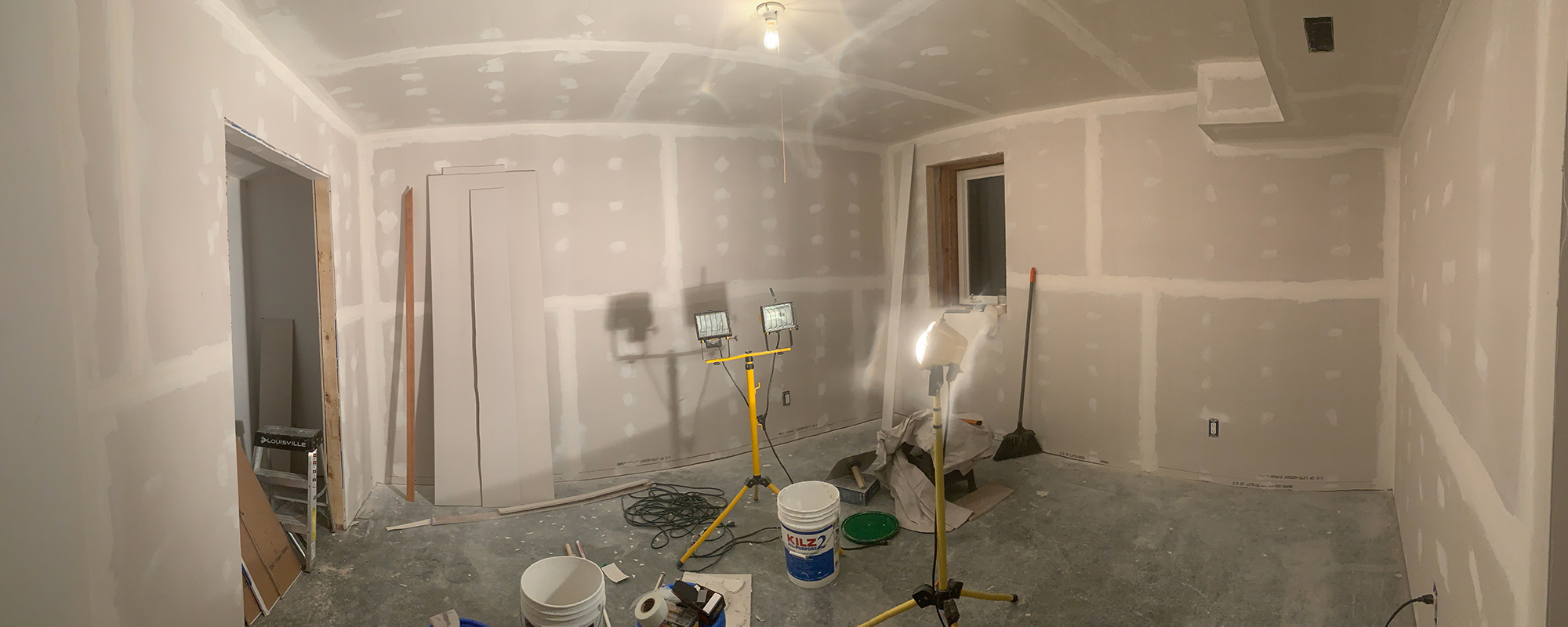
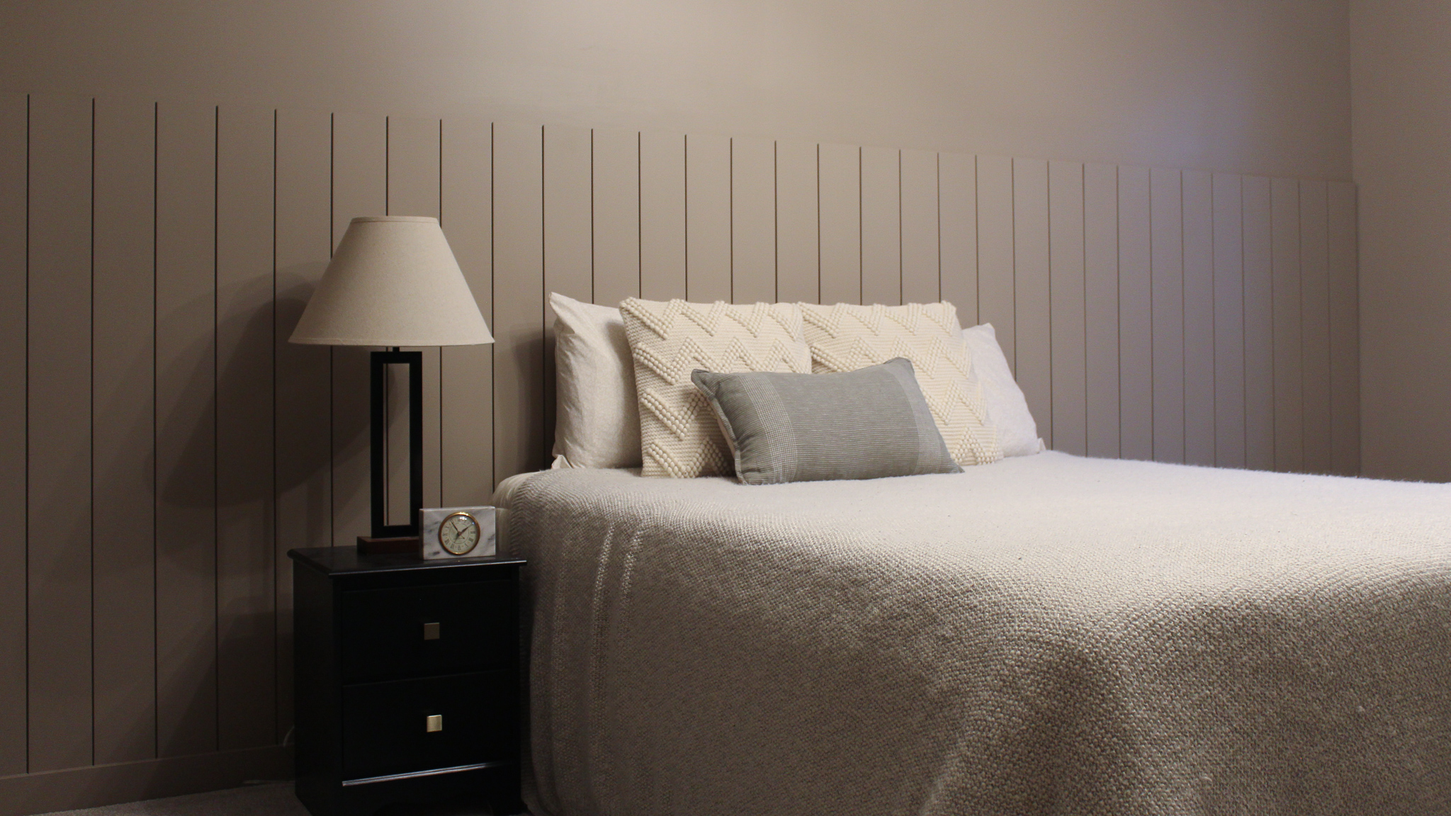
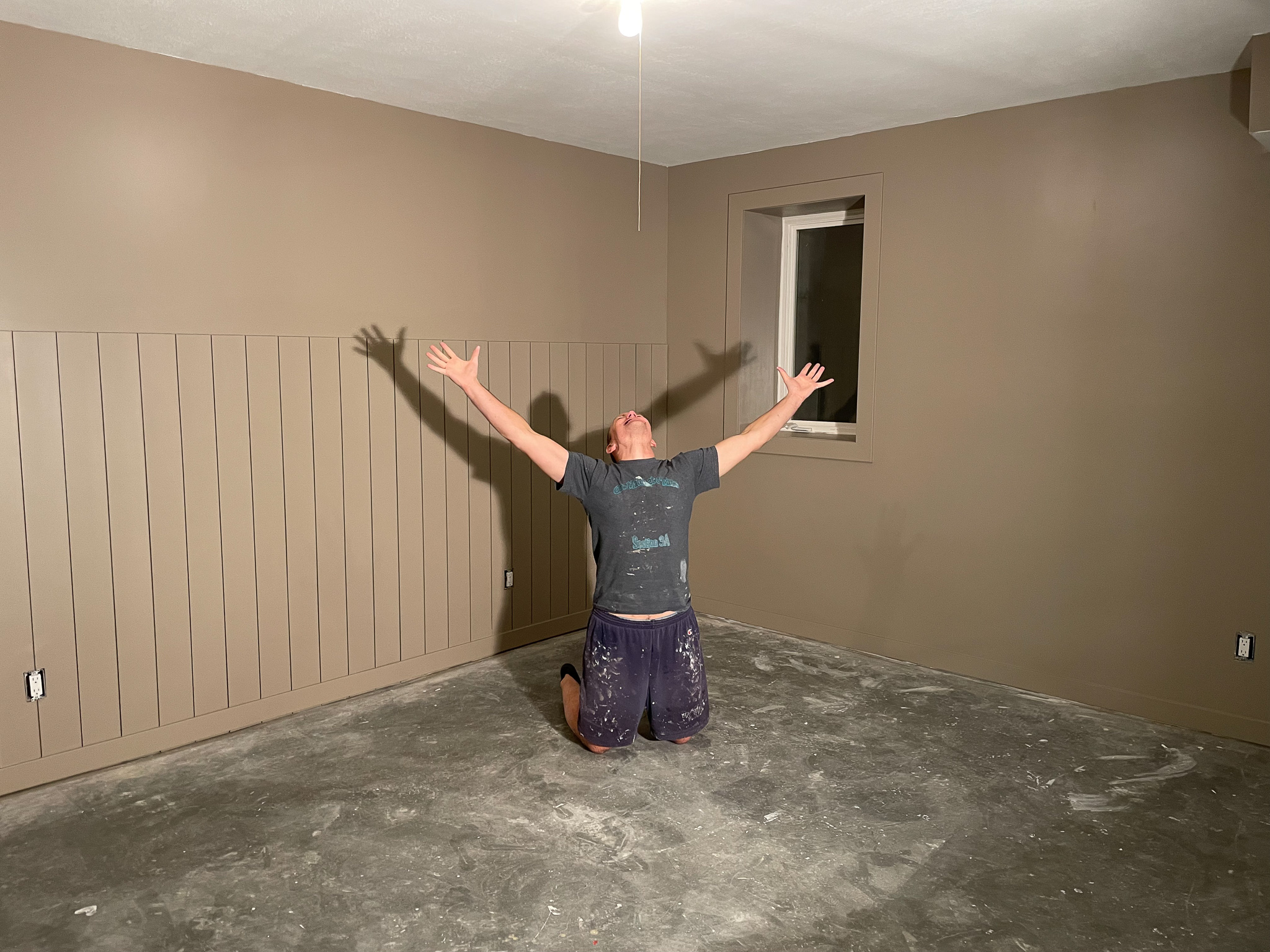
The next step was to paint the room and install the vertical shiplap, baseboards, and trim around the window. Studio Taupe was the paint color we went with, and it turned out beautifully!
Matt wrapped up the project just in time for our new carpet to be installed, and he was pumped!
Here is the space with the new carpet from ProSource! They were having a sale in the fall, so it was the perfect time to purchase the carpet. The brand we chose was Dream Weaver in the Deere Runstyle and Clam Shell color. We ended up having it installed in our entire basement, which gave the whole space a fresh and updated feel.
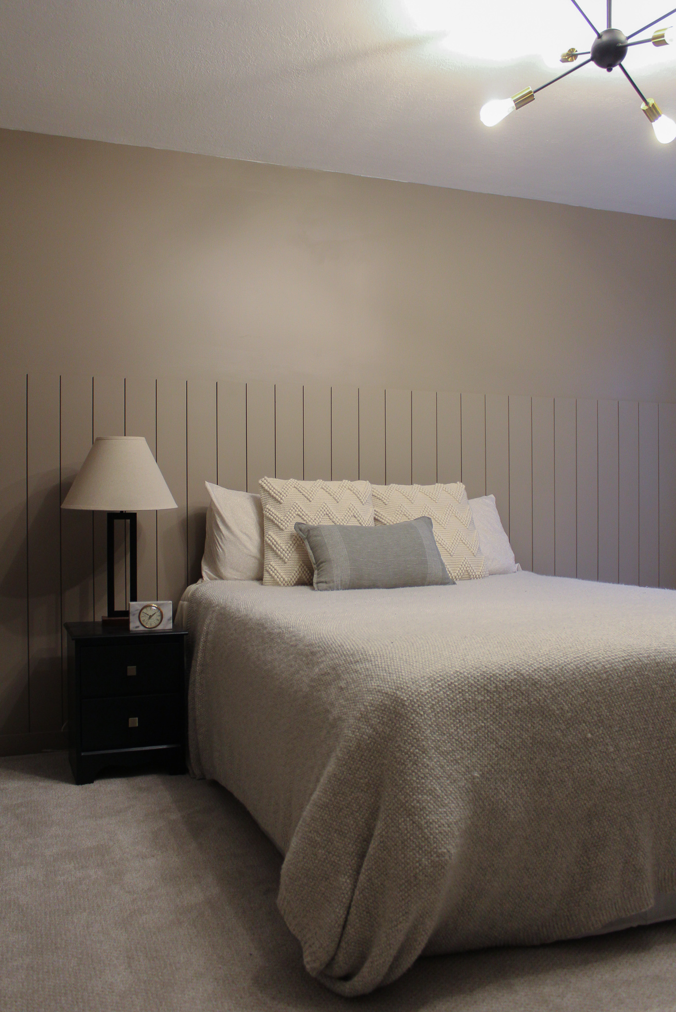
The sputnik light was previously in our upstairs, and we moved it down here when we made the previous guest bedroom into the nursery.

After
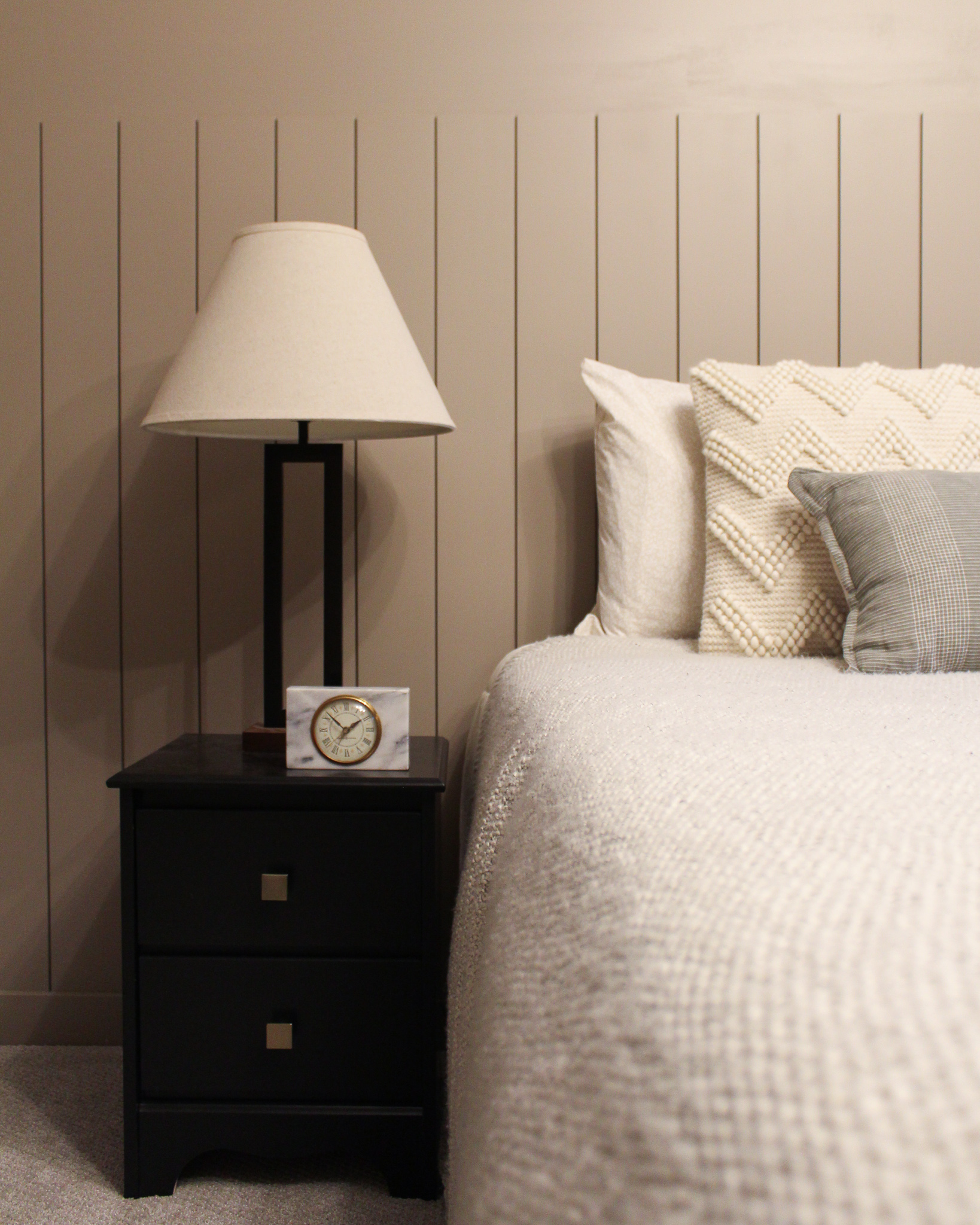
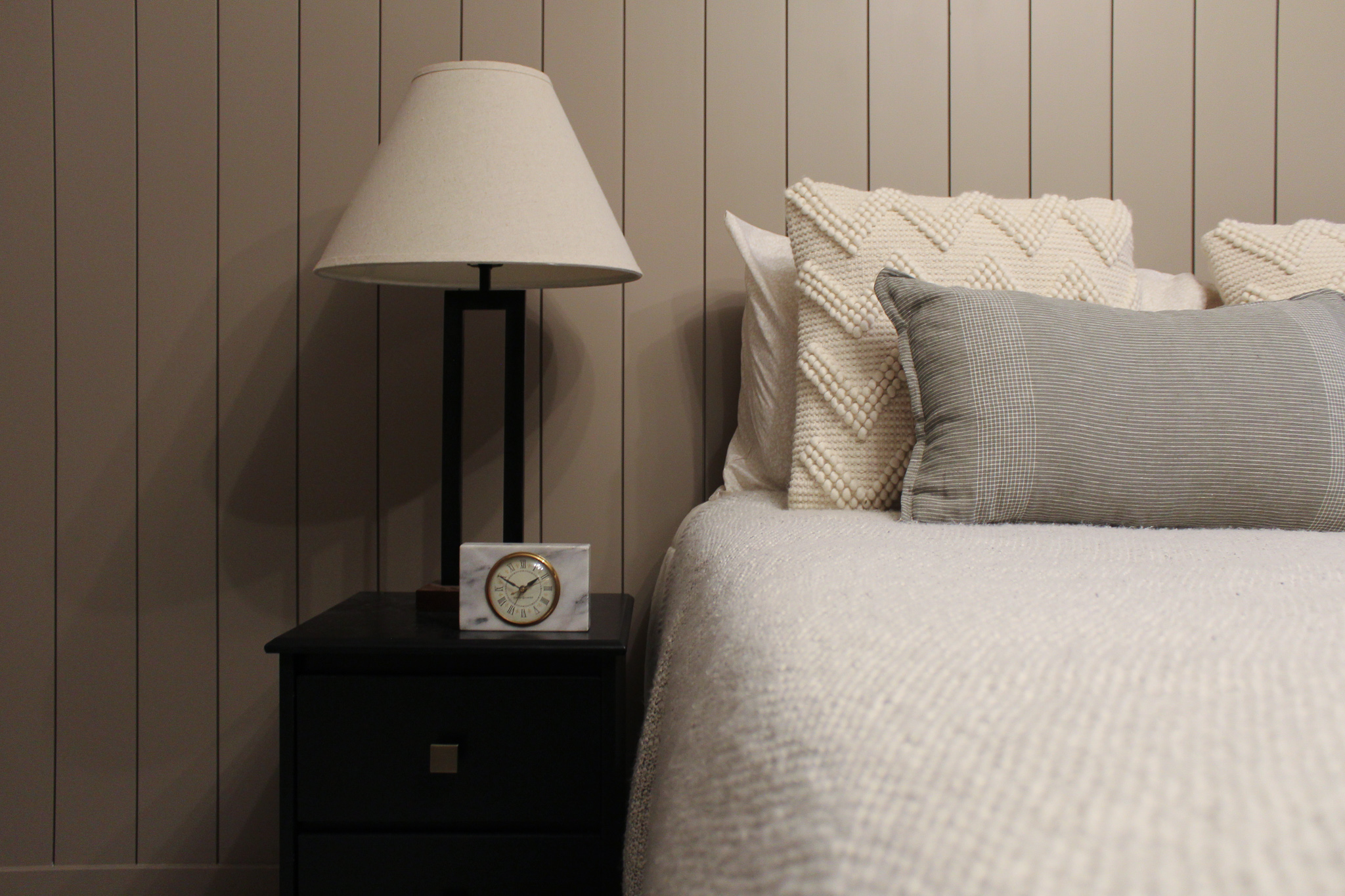
Now this guest bedroom is the perfect retreat for our parents as they have been visiting more since becoming grandparents! I love how the paint color gives the room a warm and cozy feel. Eventually, we will install a ledge on top of the vertical shiplap for artwork and decor, but for now it looks great as the “headboard” for the bed.
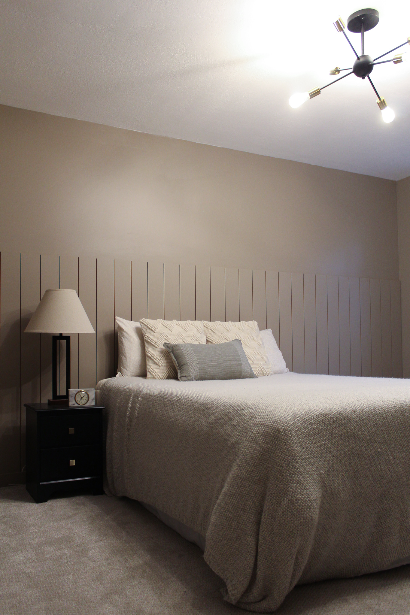
This nightstand got painted black, and we swapped out the hardware (transformation HERE), so that it now coordinates with the light. I found the antique marble clock at The Kindred Space‘s summer occasional shop and love how it adds a pretty detail to this spot.
