This beautiful home in St. Paul is over a hundred years old and is in great shape, but the kitchen was needing some love. It’s only a few blocks away from the Jefferson Ave Kitchen remodel that was completed earlier this year, so it was fun to be back in this neighborhood. By reworking the kitchen within the same footprint, the clients were able to get a much more efficient and effective space for their family.
Rascher + Co did an amazing job on the remodeling of this space. Regal Wood Cabinets built and installed the custom cabinets that match the original millwork that you see in the dining and living room beautifully. Chelsie Lopez captured the space perfectly in the photos. It always takes a team to complete a project like this and I am grateful to partner with other great small businesses.
Before
Let’s check out what this space looked like before. The kitchen is fairly small like most older homes in St. Paul. Before the remodel, the doorway was in a corner, which blocked off usable space for countertops or appliances. The white cabinets lacked interest and blended with the walls and appliances.
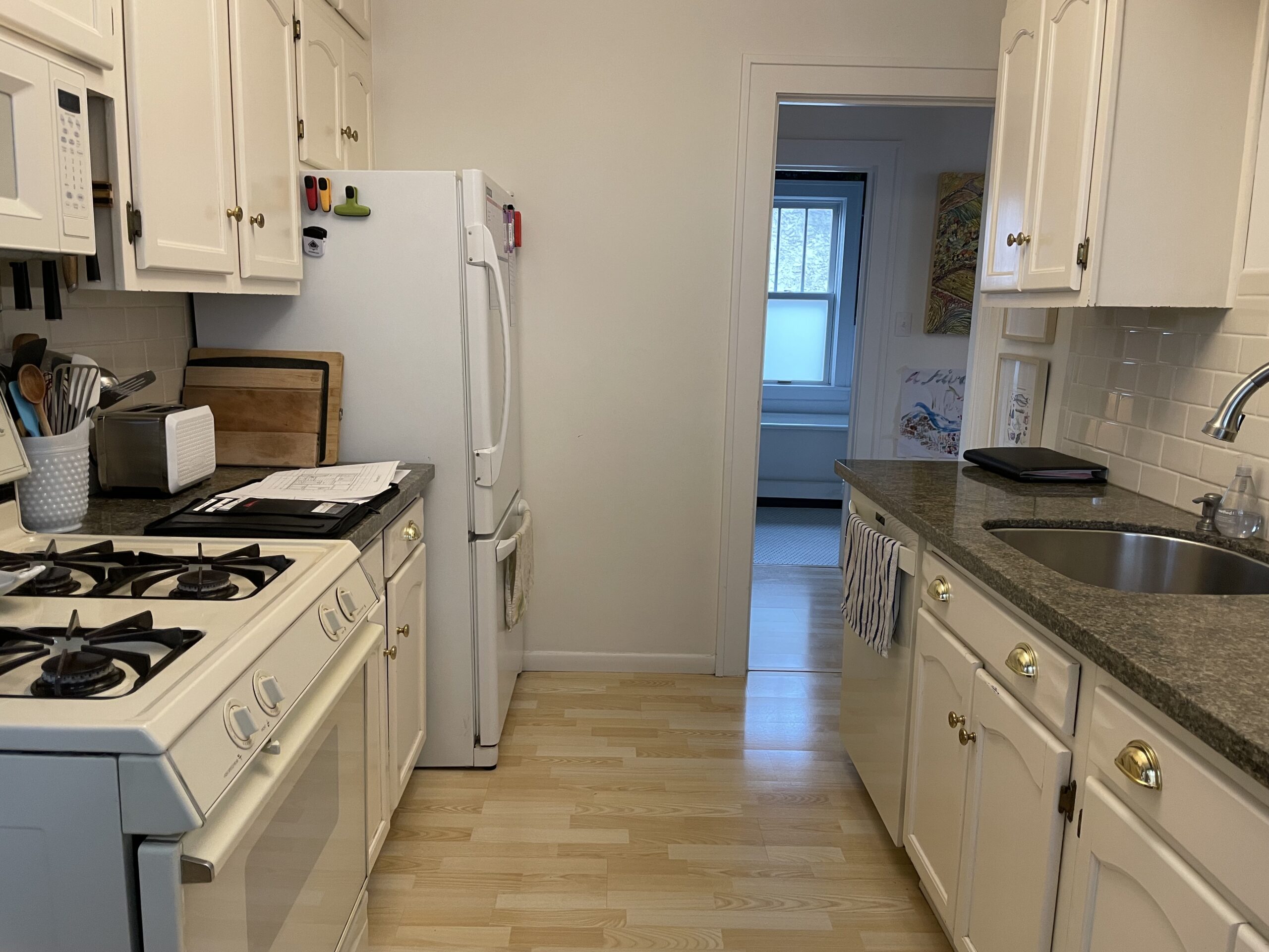
This doorway placement also made it tricky to enter the kitchen since you would walk right into the side of a cabinet. The goal was to move the entrance to the middle to gain better flow.

The other side of the kitchen housed both the stove and fridge, making this wall feel cramped and tight.
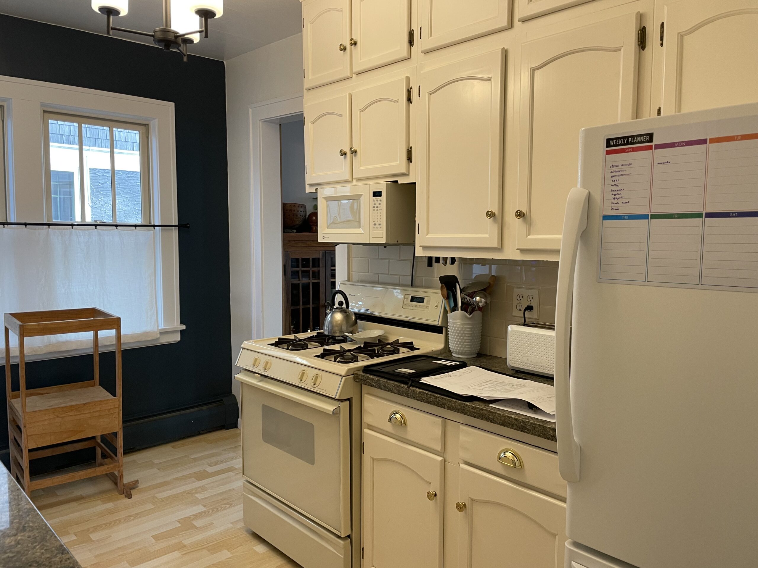
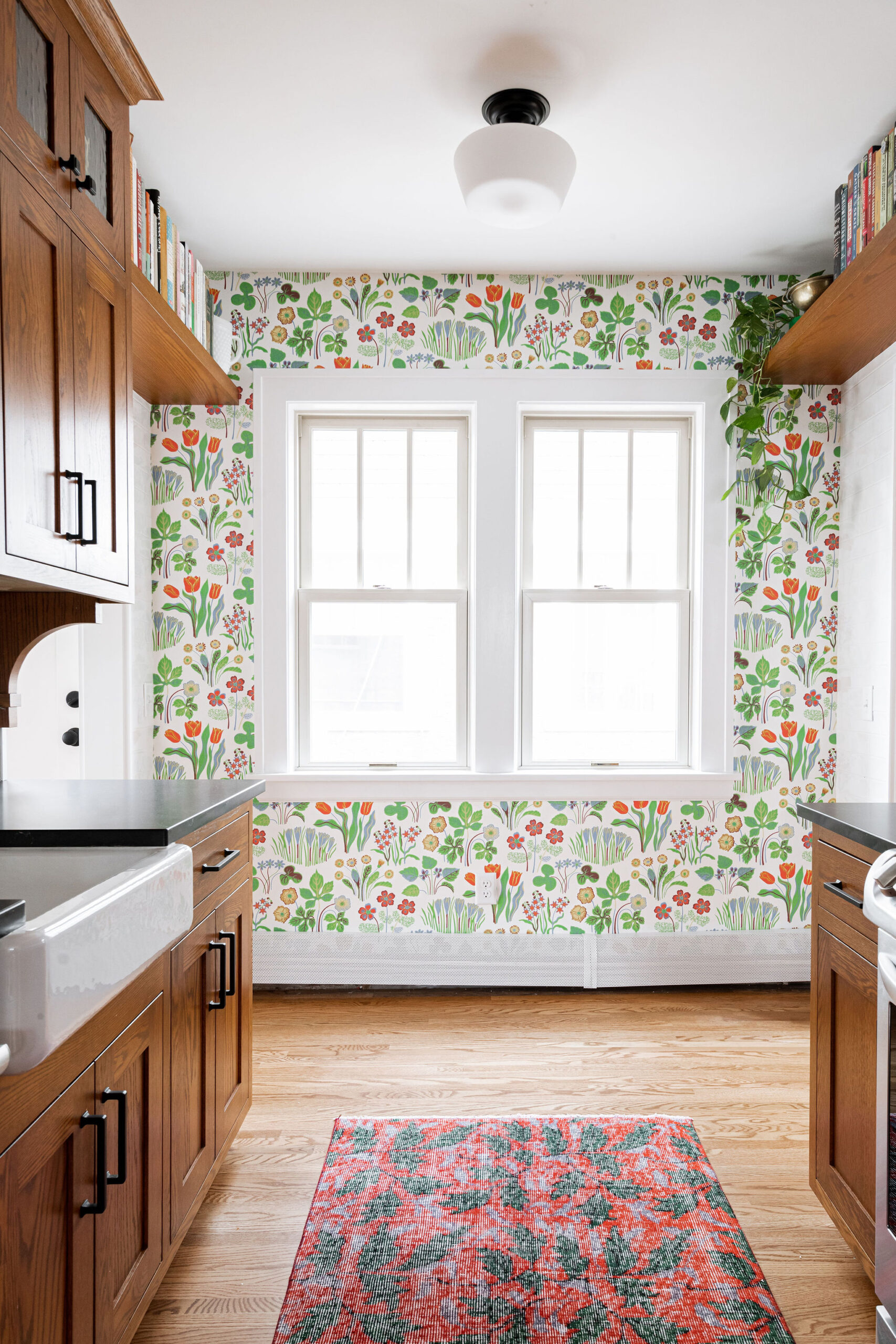
The clients had previously painted the back wall an accent color, but wanted to bring in wallpaper for it to really pop.

Floor Plan + Renderings
Before
Here is what the layout looked liked before:

Proposed Plan
As you can see in the proposed plan, the doorway will be moved to the middle of the kitchen, right across from the window. This allowed for the fridge to move to the same wall as the sink.
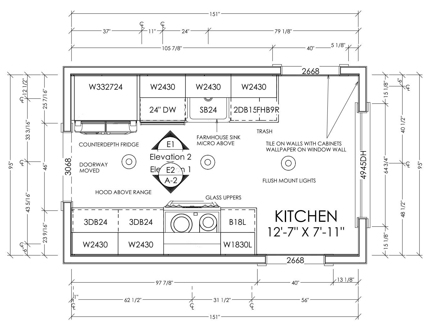
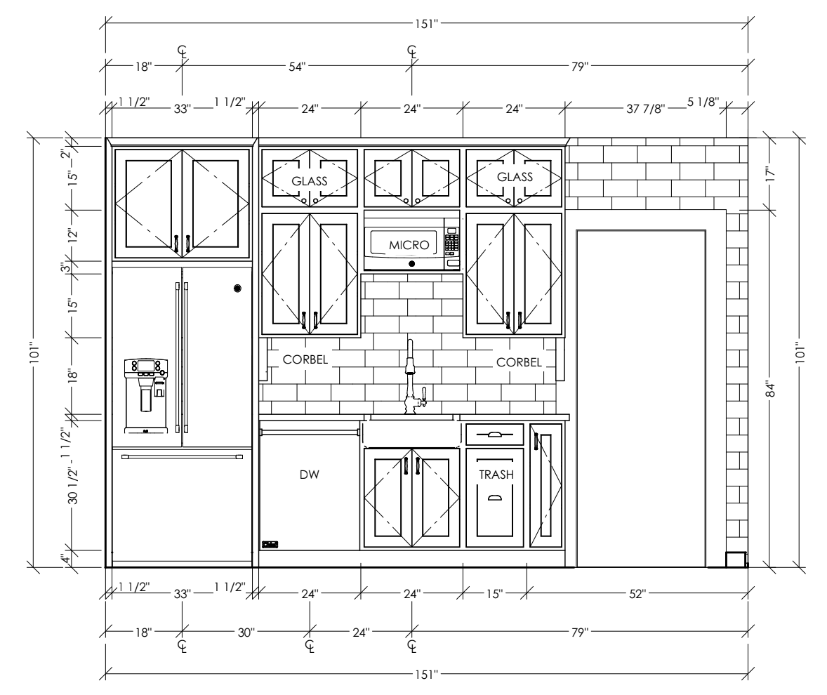
In the cabinet elevation below, you can see that to the left of the sink would be the dishwasher and to the right, the trash and recycling pull out. When designing a kitchen, a dedicated cabinet to trash and recycling is always a must. We originally planned on having the microwave above the sink and a stainless hood above the range, but later changed to a microwave over the range.
On the other wall, we moved the range to the right, which allowed there to be cabinets on either side. Glass upper cabinets will add character and provide a place to display more decorative items. The corbels will bring in that character that the clients love about their St. Paul home.
Renderings
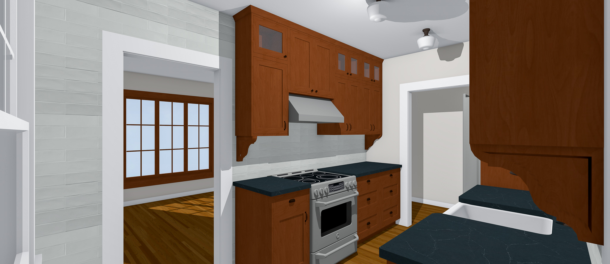
In the renderings below, you’ll see the design plan included darker wood cabinets, a subway tile backspalsh that continued the full length of the wall, and wallpaper on the window wall as an accent.
After
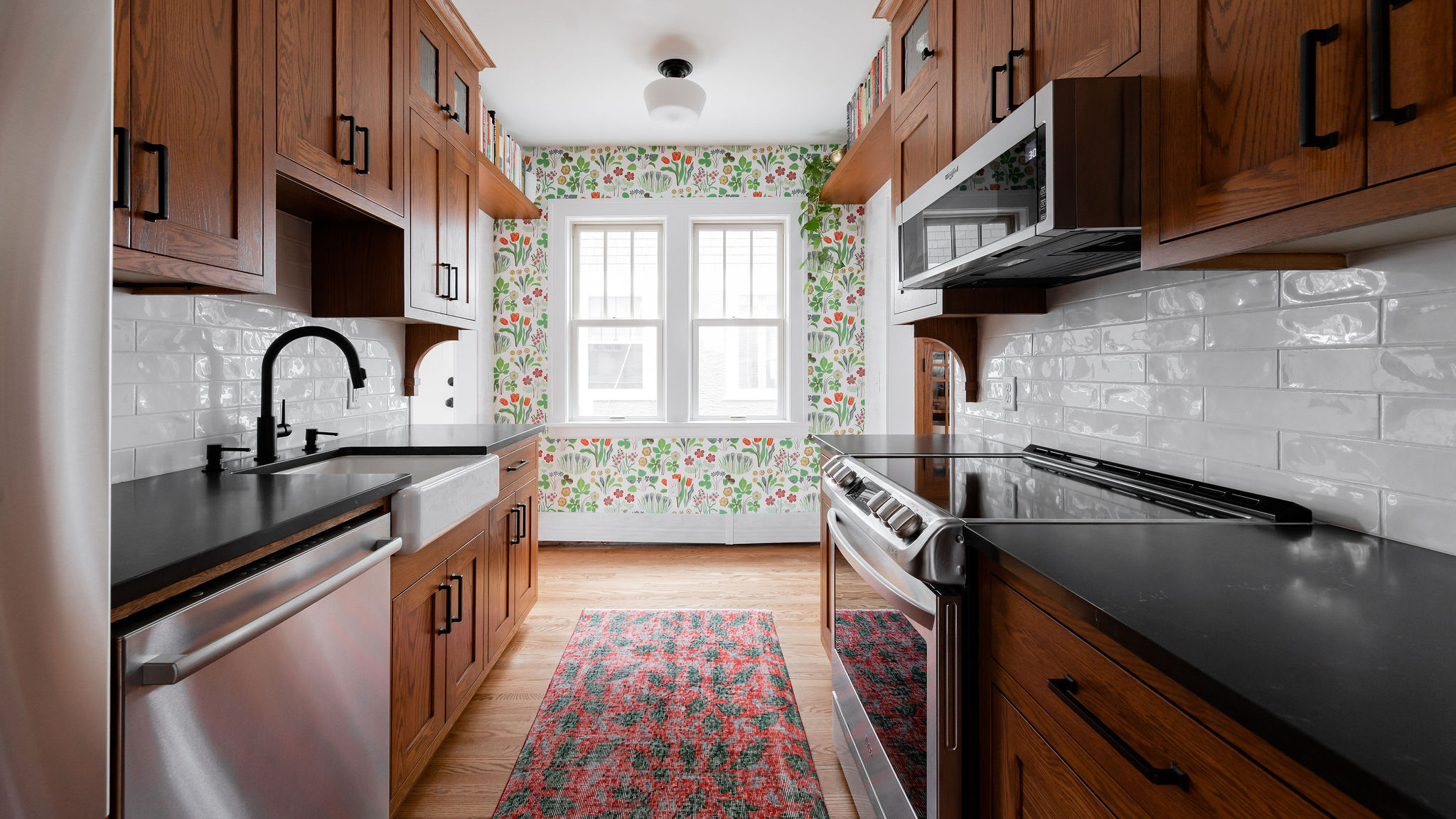
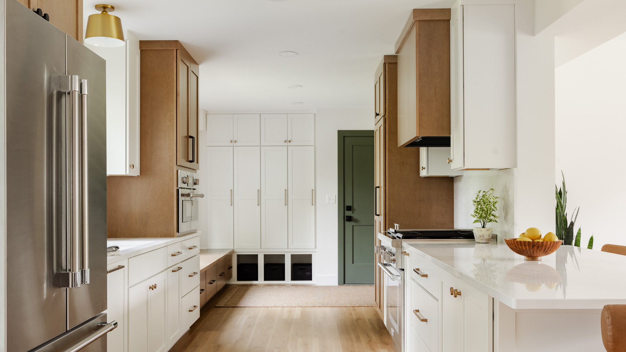
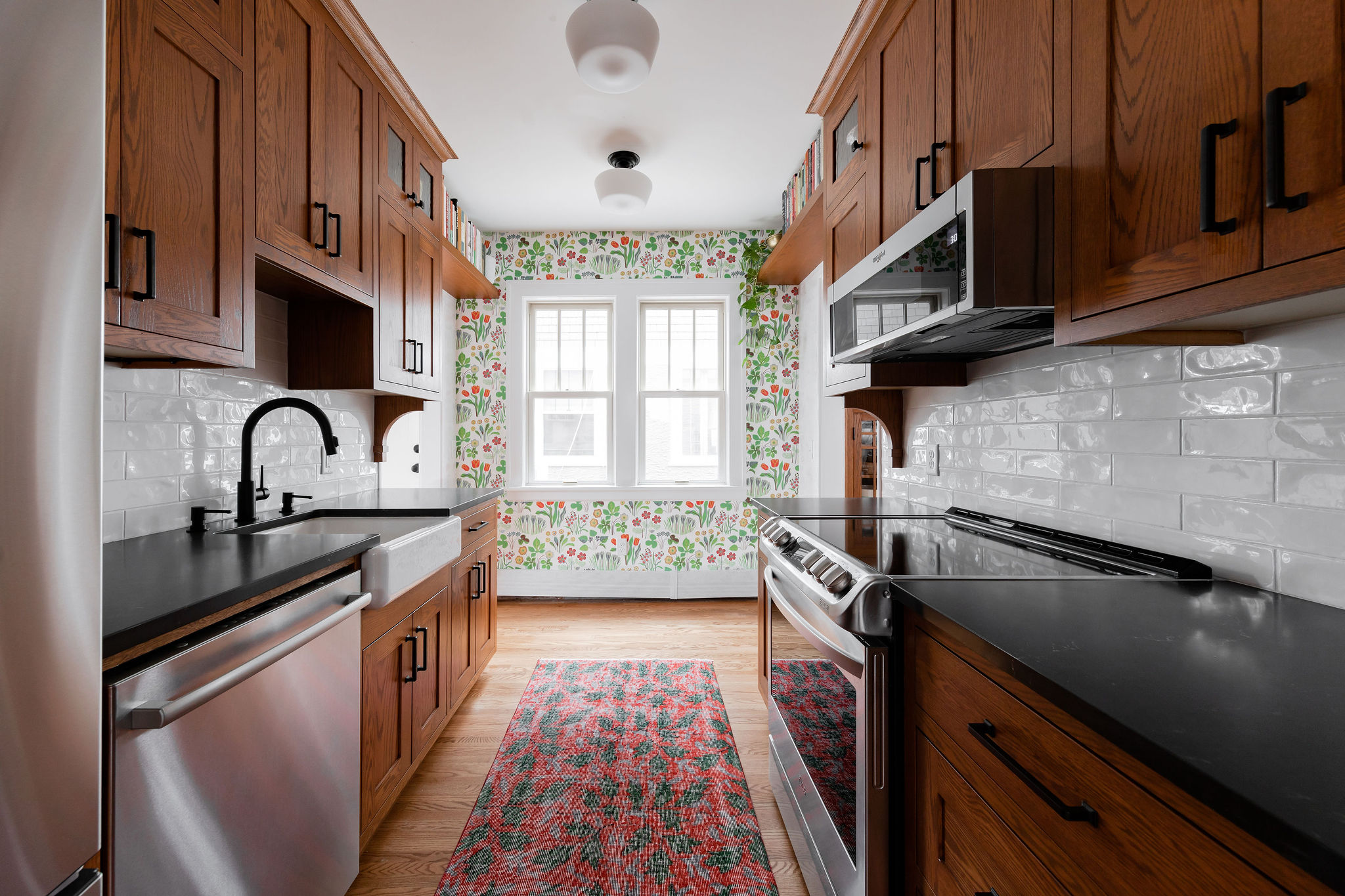
Now for the reveal! Even though the footprint didn’t get any larger, the new layout makes this kitchen feel so much bigger. Darker wood cabinets add depth and dimension to the space. Lining the ceiling with three semi-flush mount lights brought in more character and felt more original than typical recessed can lighting. Stainless steel appliances bring a clean and updated feel.
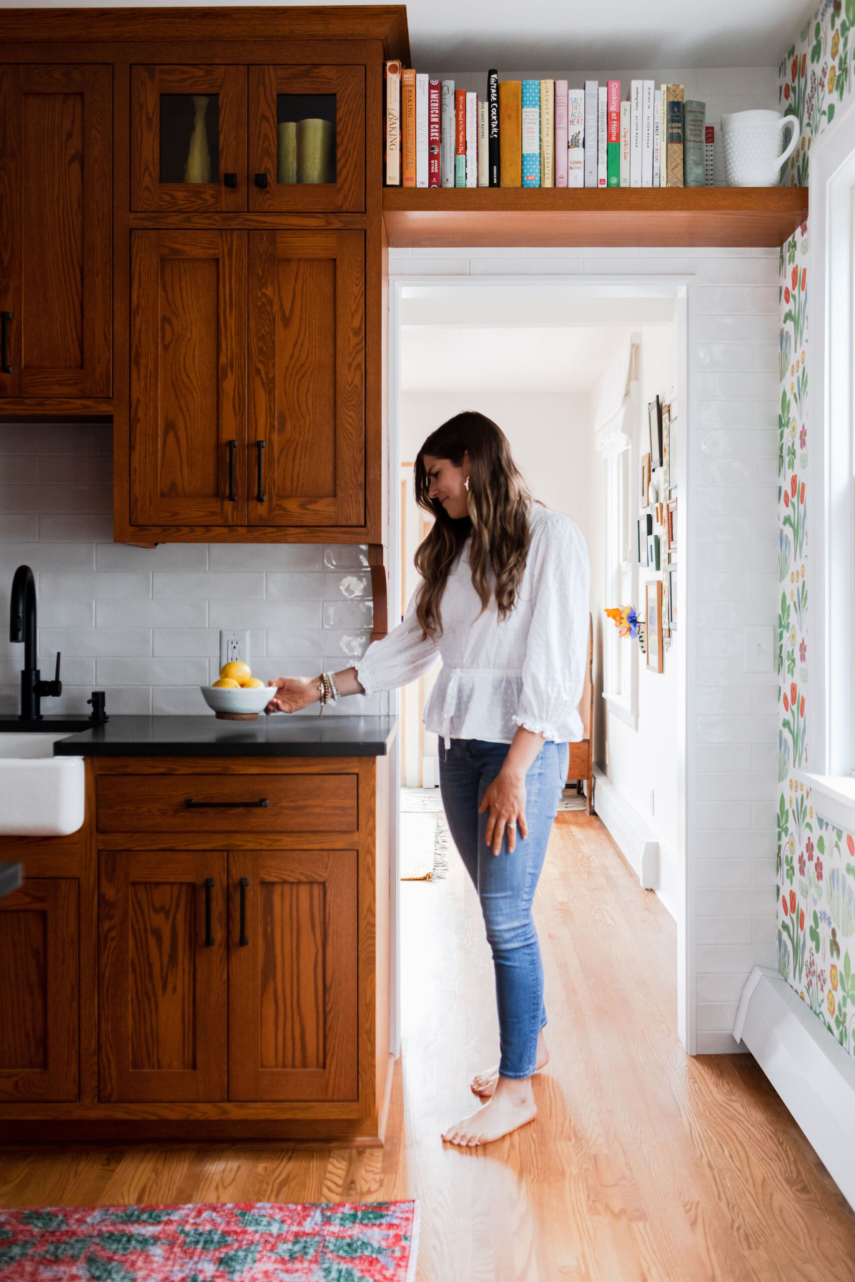
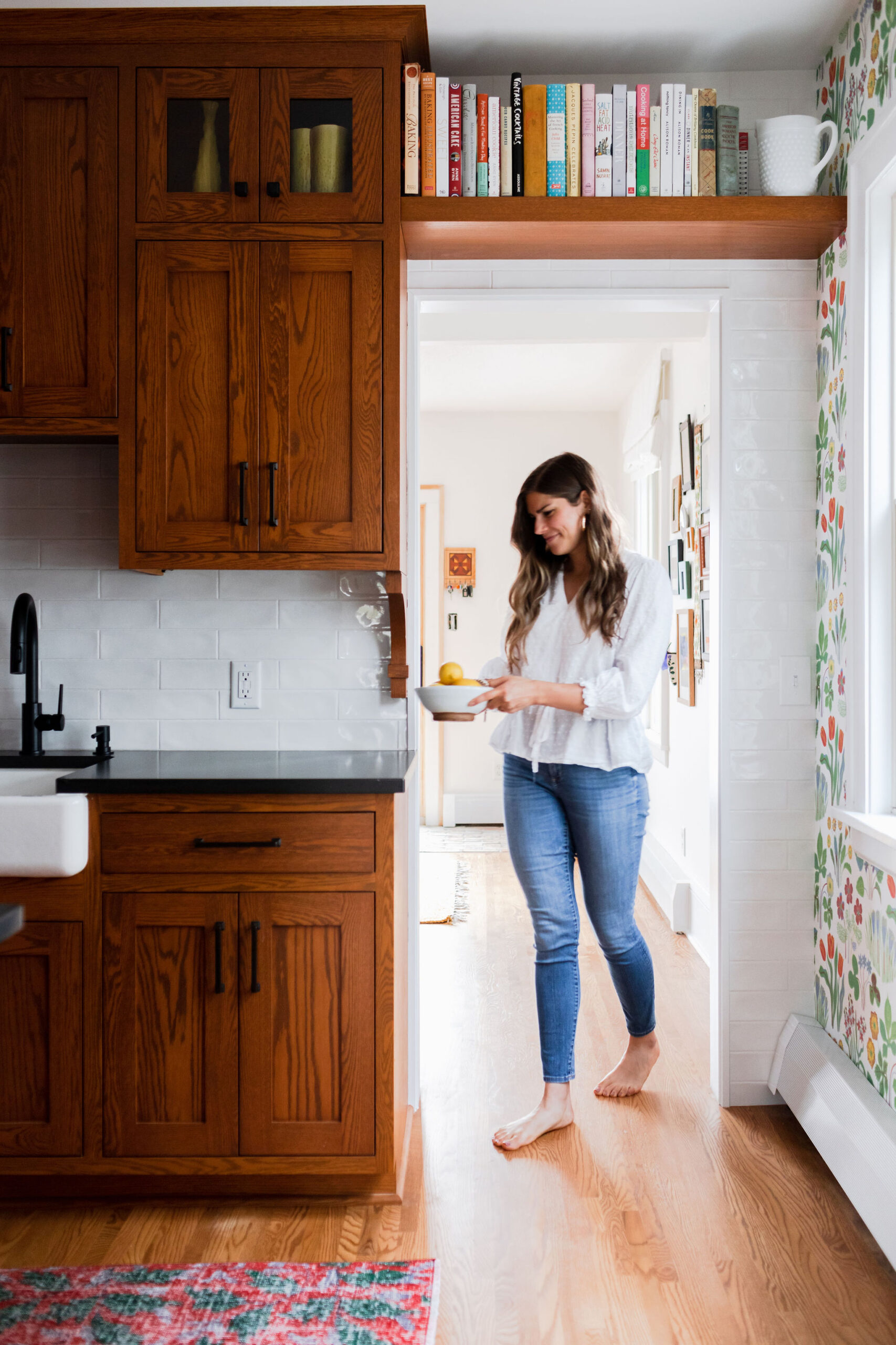
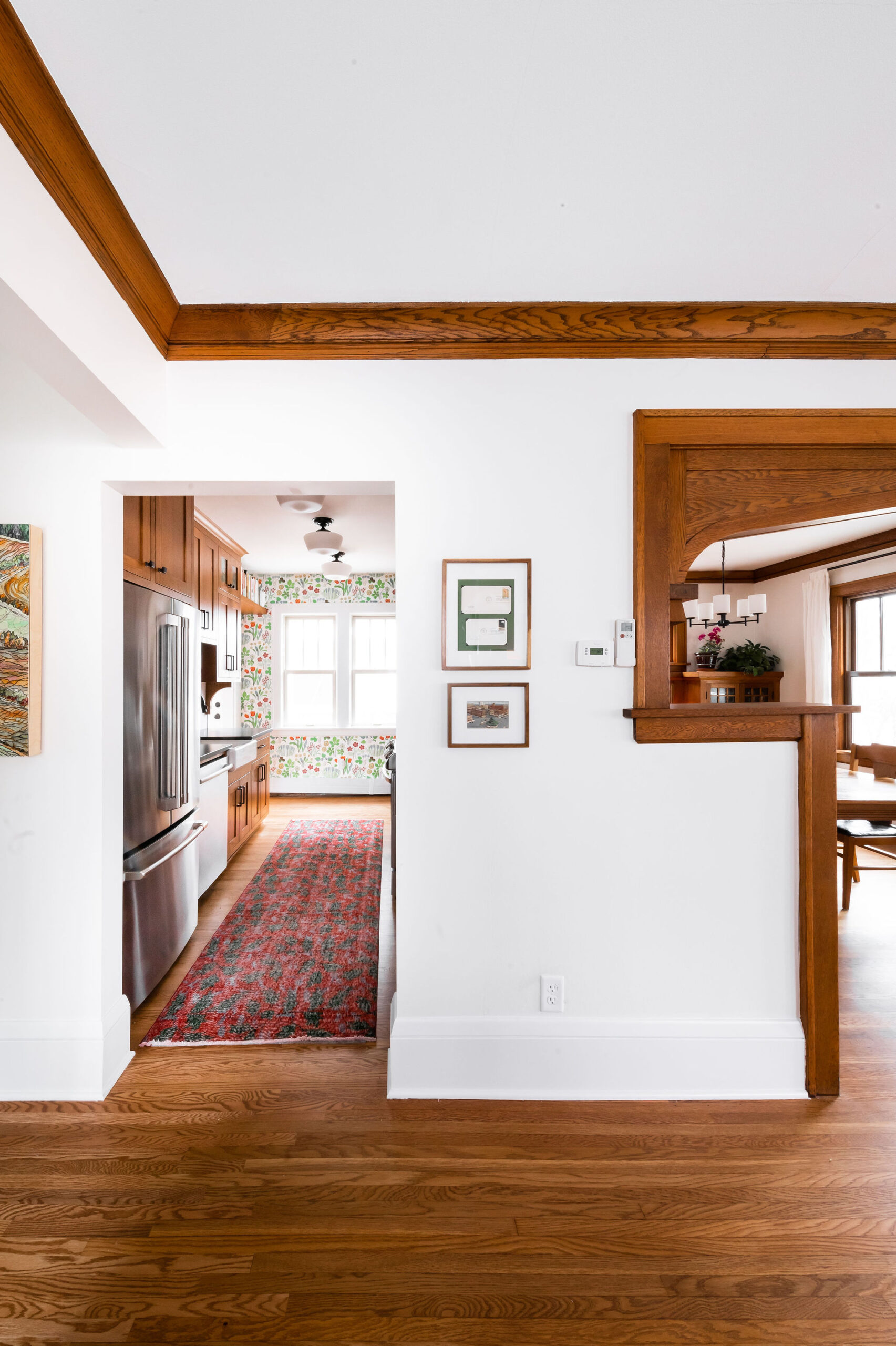
The new doorway allows you to see into the kitchen from the living room. It is better for traffic flow and also makes this home feel more open and accessible. This home has such incredible millwork that the new cabinets now match.
Now when you enter the kitchen, it is a true galley style with cabinets lining both sides. The fridge is now located next to the dishwasher and sink, allowing the range to have breathing room on the other wall.
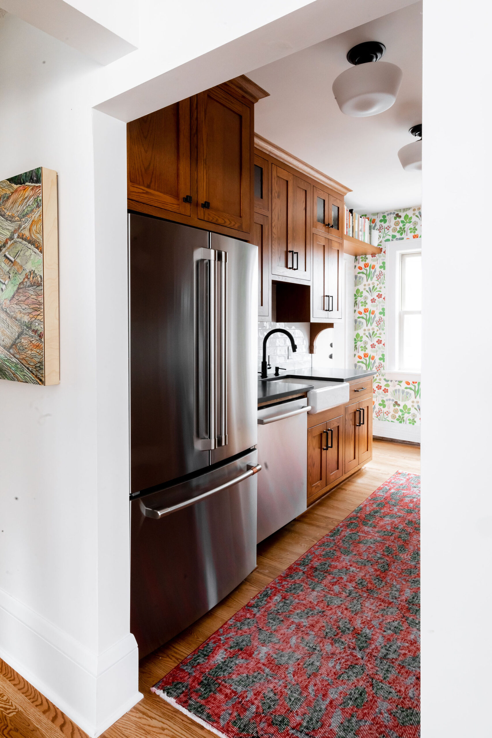

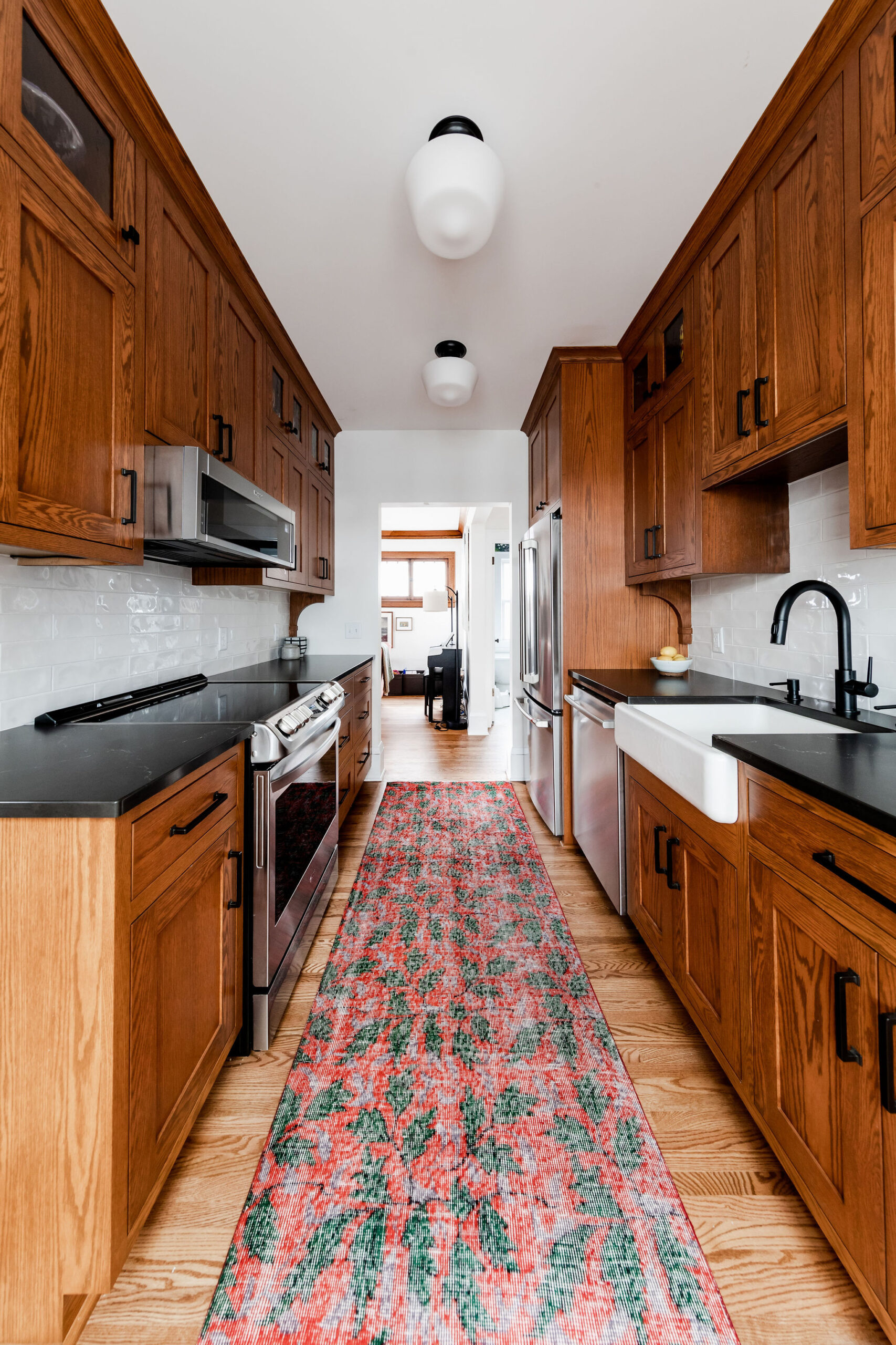
With the new layout, the clients gained countertop space on either side of the range. This allows for more prep space while cooking, along with better storage throughout the kitchen.
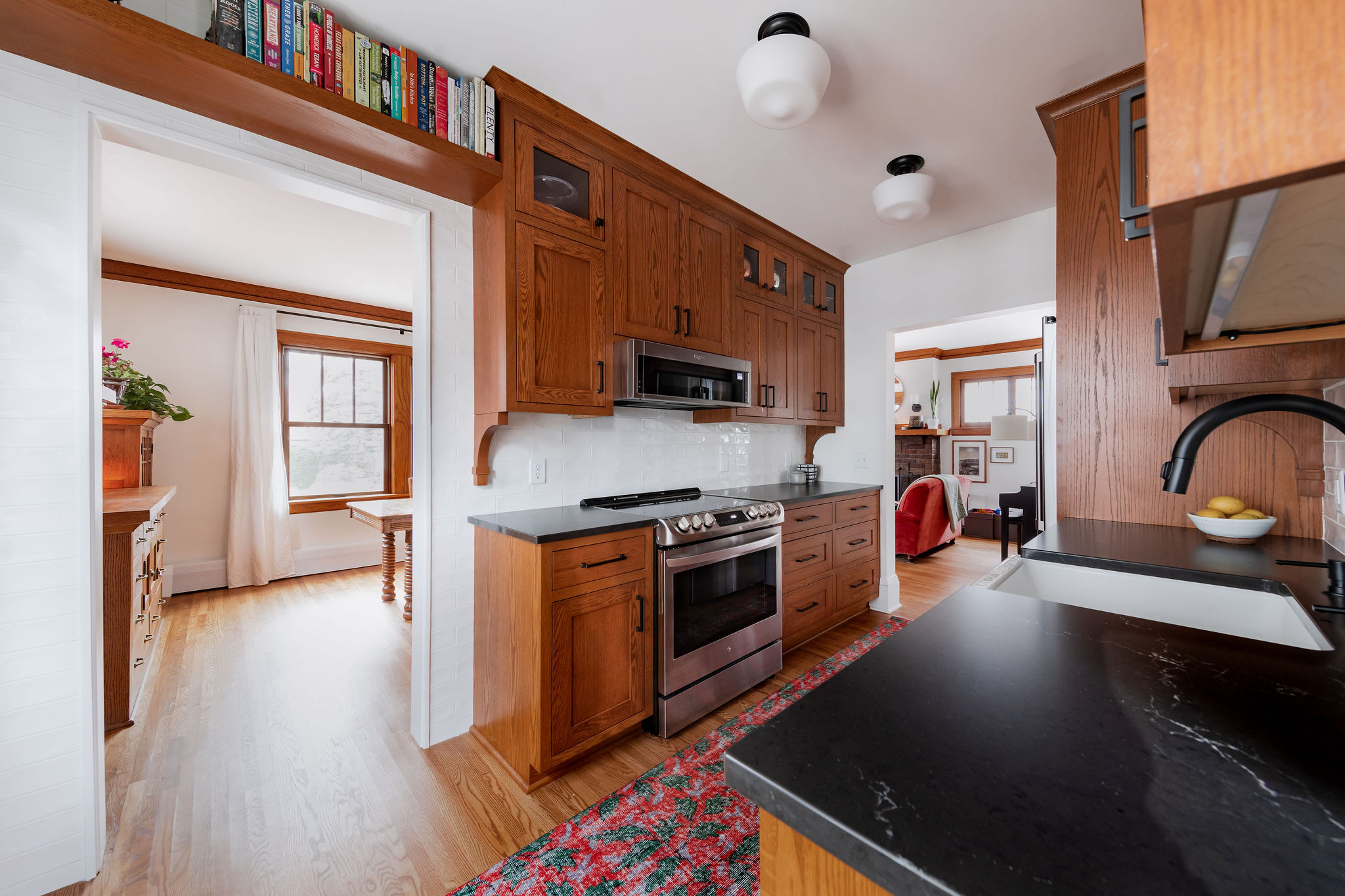
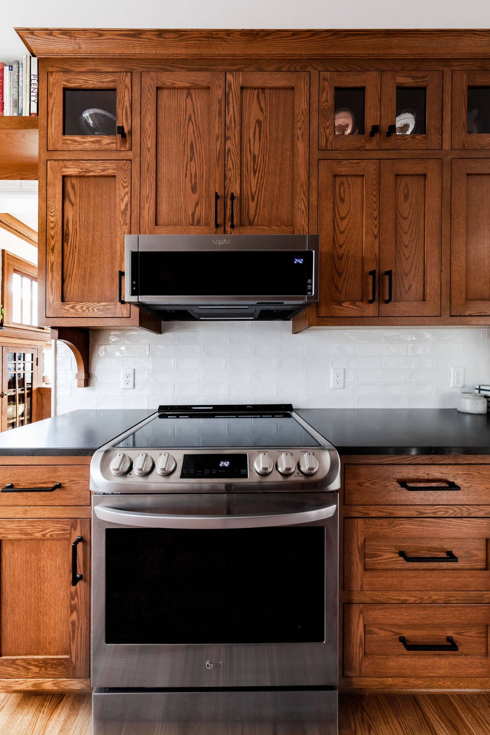
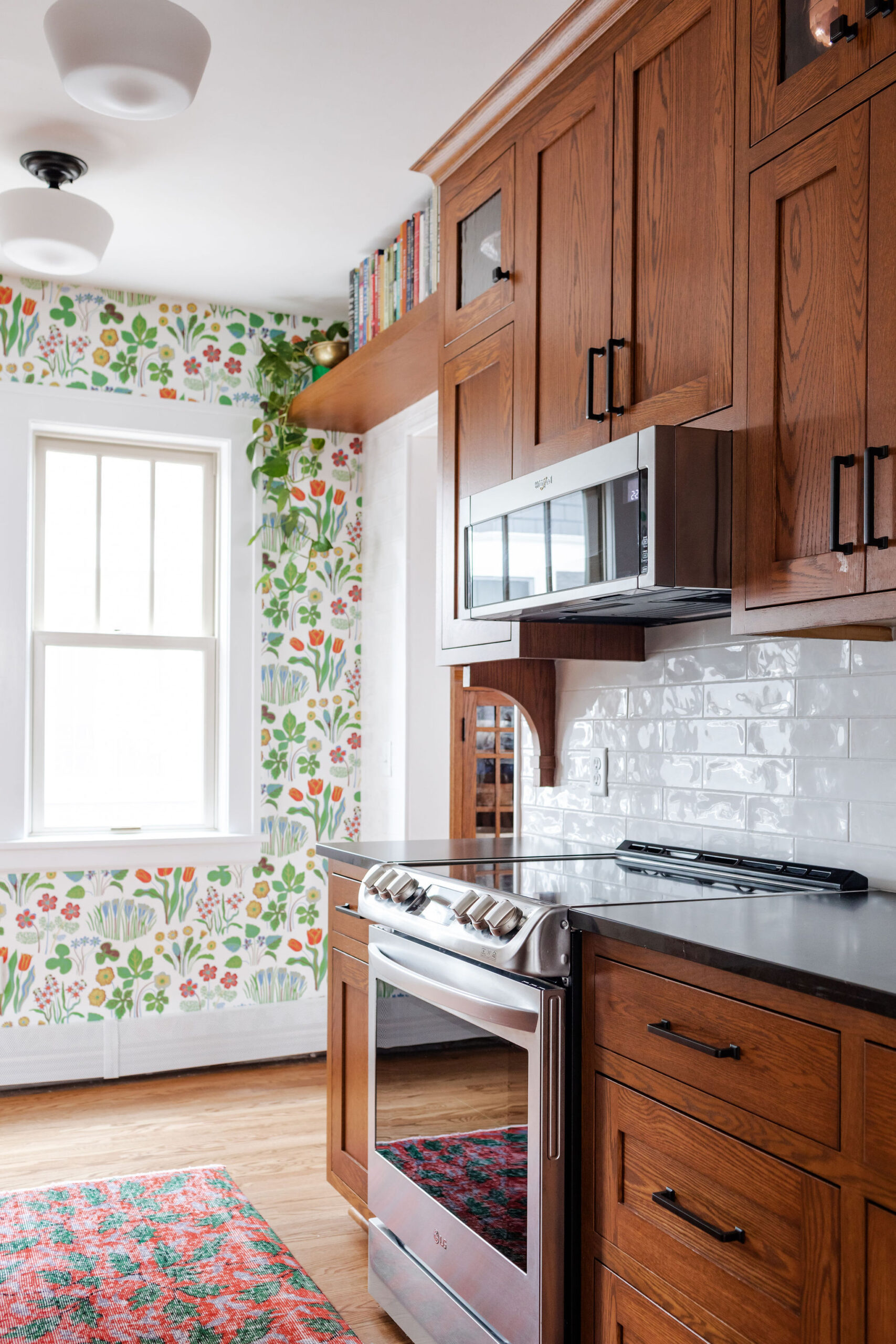
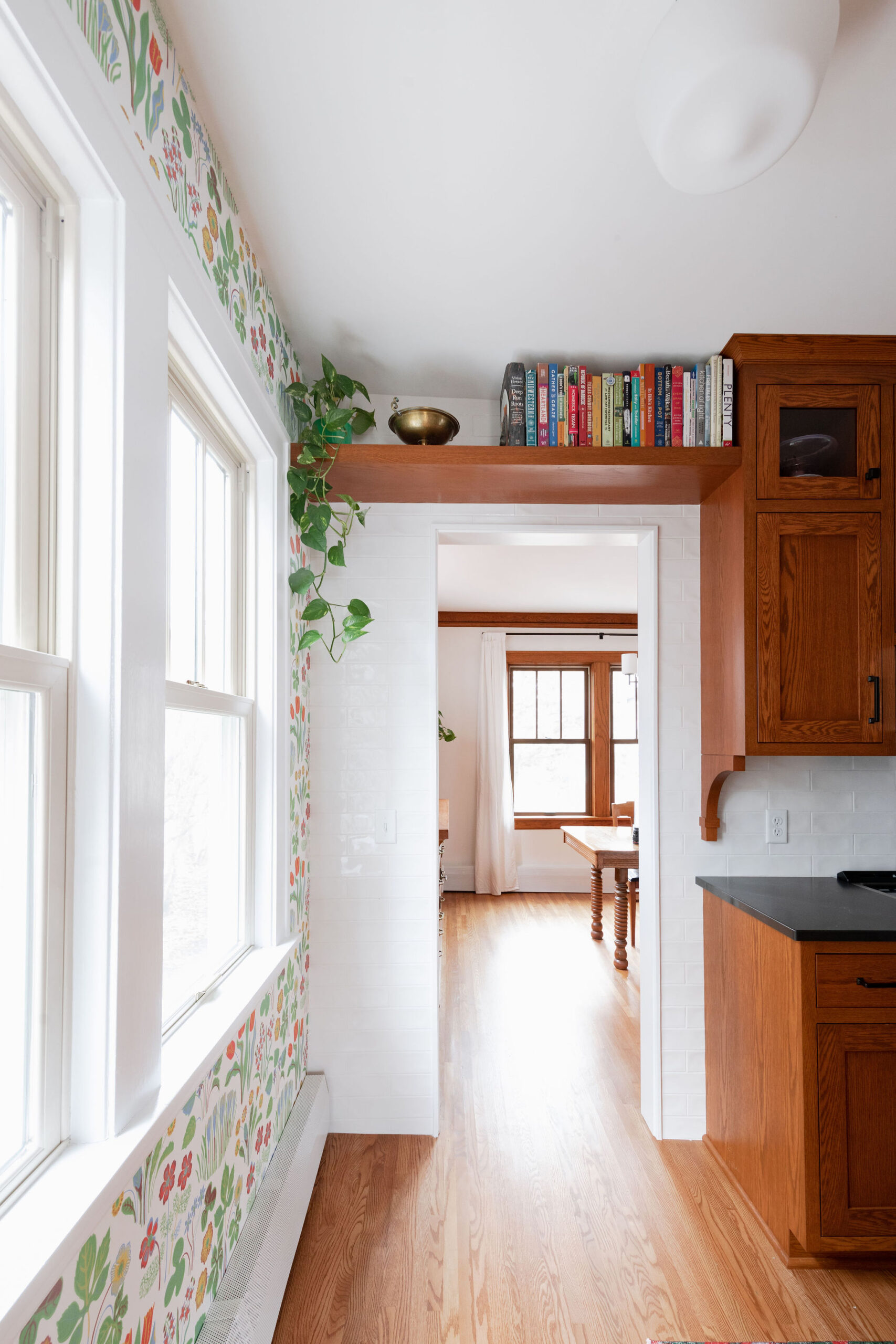
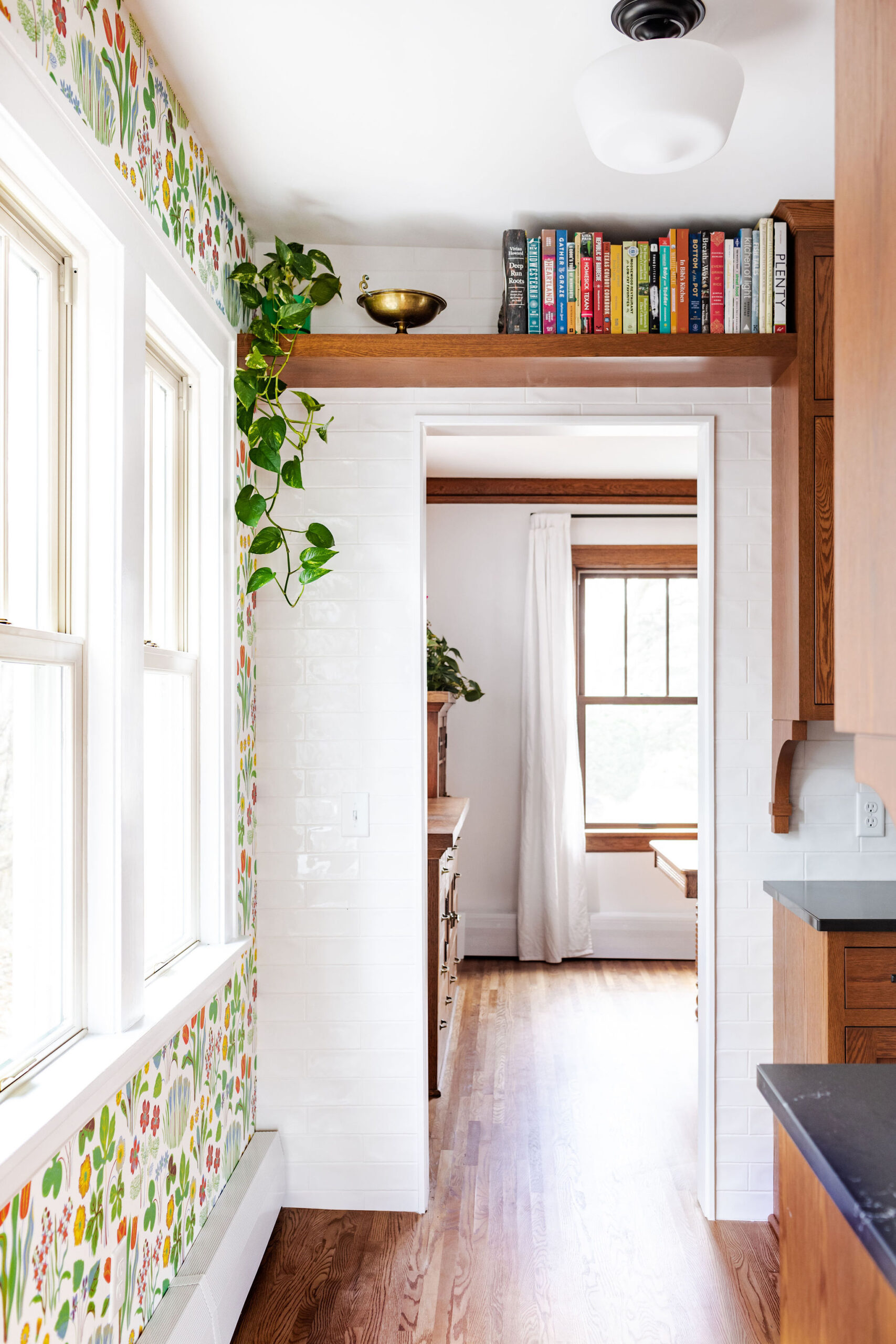
Glass cabinets bring in another character detail and provide a spot for displaying fun dishware. Regal Wood added the shelves above the door to store cookbooks, which is the perfect way to maximize space in this smaller kitchen.
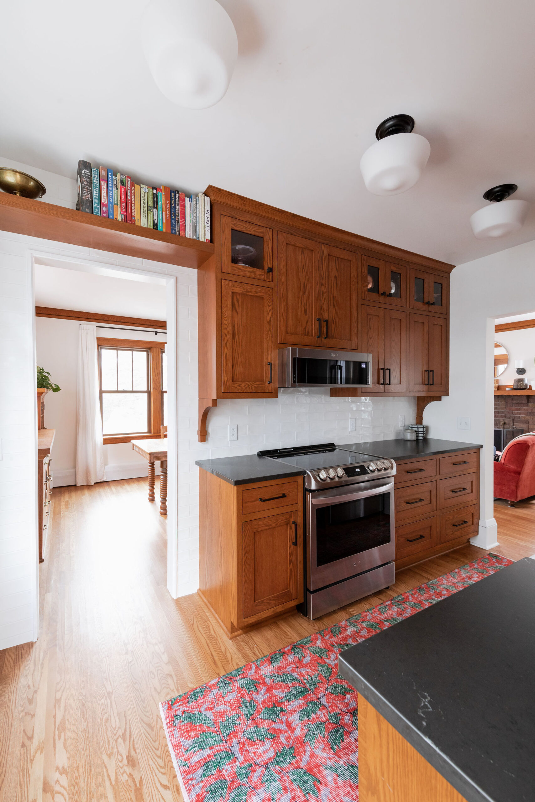
Black quartz countertops that look like soapstone are not only maintenance free, they also bring a beautiful contrast to the wood cabinets and white subway tile.

Inset cabinets are set into the cabinet frame and fit flush with the face of the cabinet when closed and they look so beautiful in this kitchen.
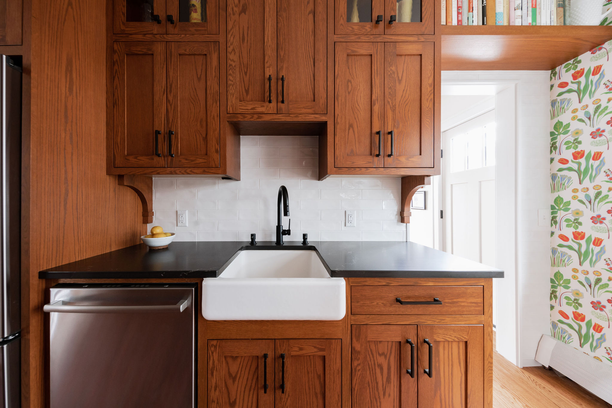
The black hardware and faucet pair well together, bringing in the darker element of the countertop. A handmade looking subway tile with a wavy texture adds a unique element.
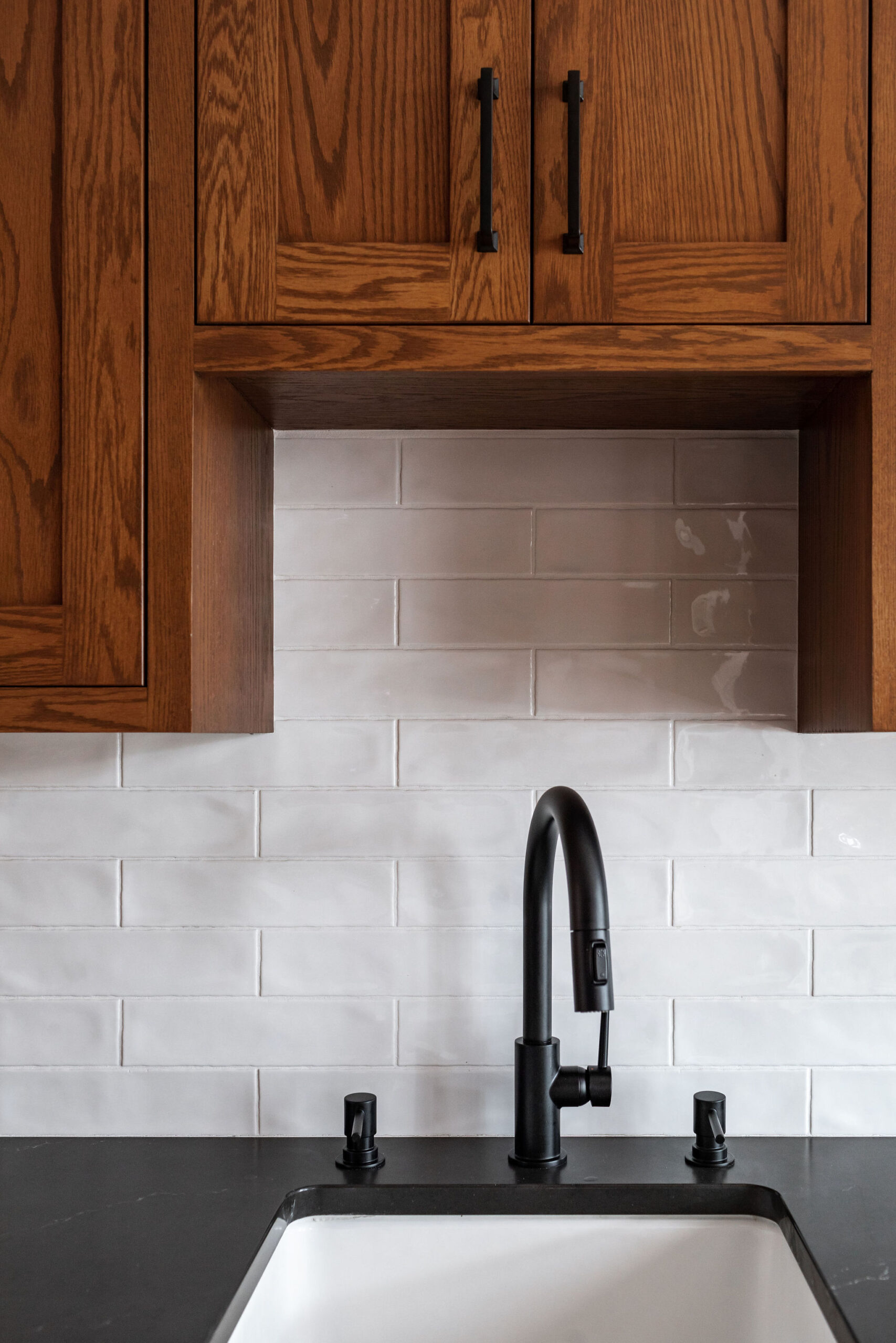
Regal Wood matched the cabinetry to the millwork in this home so well that you wouldn’t even know they weren’t installed at the same time.
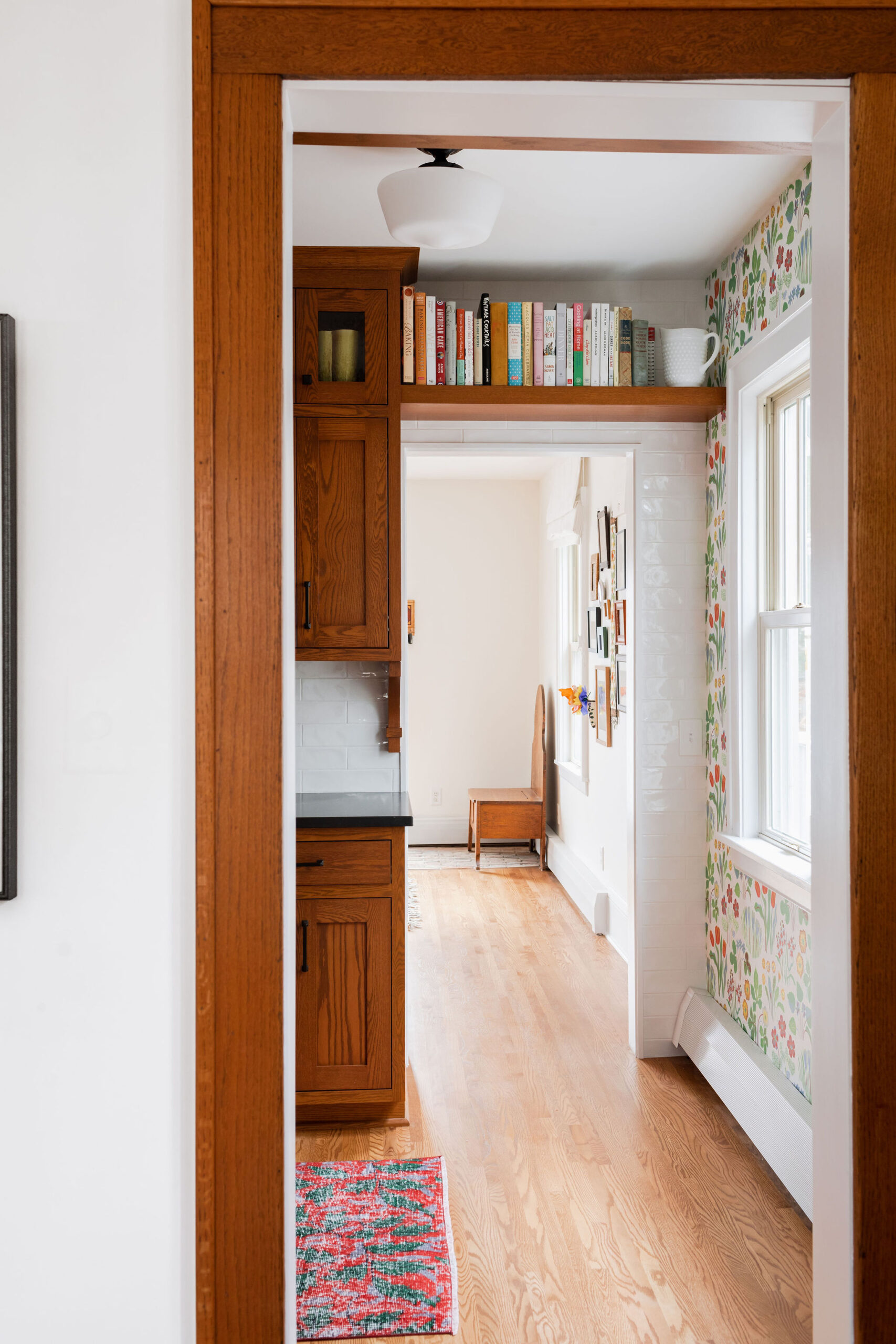
By extending the subway tile beyond the backsplash onto the full wall, the space feels bright and reflects light coming in from the windows.
Adding Character
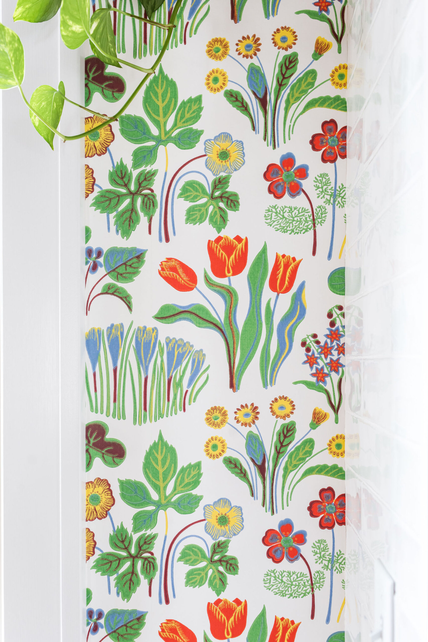
The clients have such a unique and eclectic style that brings a fresh and fun feel to this older home. They thrifted the rug on Etsy and have sourced all of the amazing wallpaper throughout their home. Framed pieces of artwork are filled with meaning and memories throughout their home.
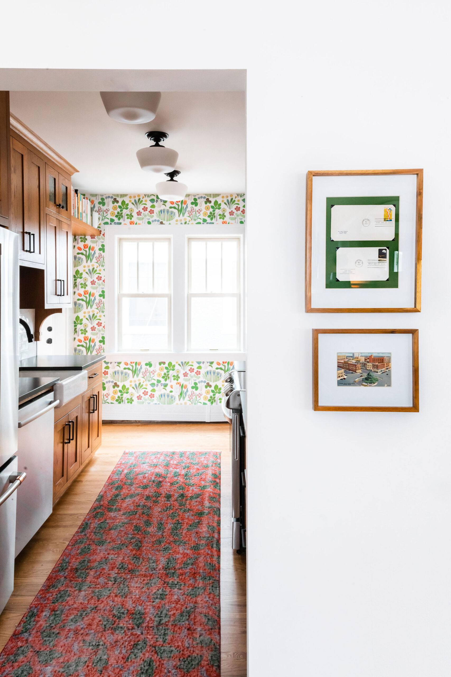
This wallpaper adds such a statement to the kitchen. It brings a light and happy feel and complements the darker cabinets and countertops perfectly.

In the room behind the kitchen, the clients built and installed custom shelving and radiators covers. They created a little reading nook with more incredible wallpaper. The cute desk below was bought and refinished for their daughter.
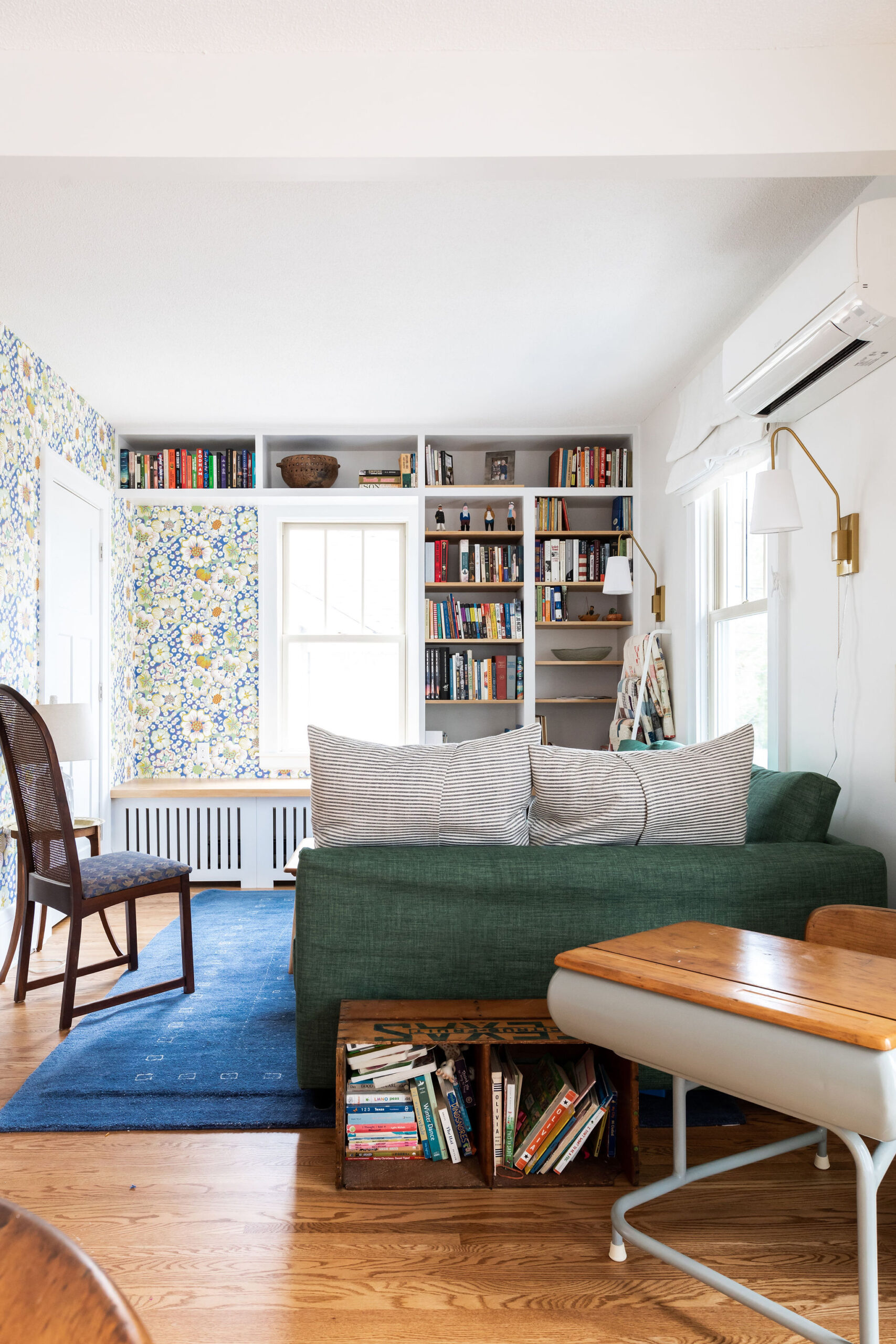
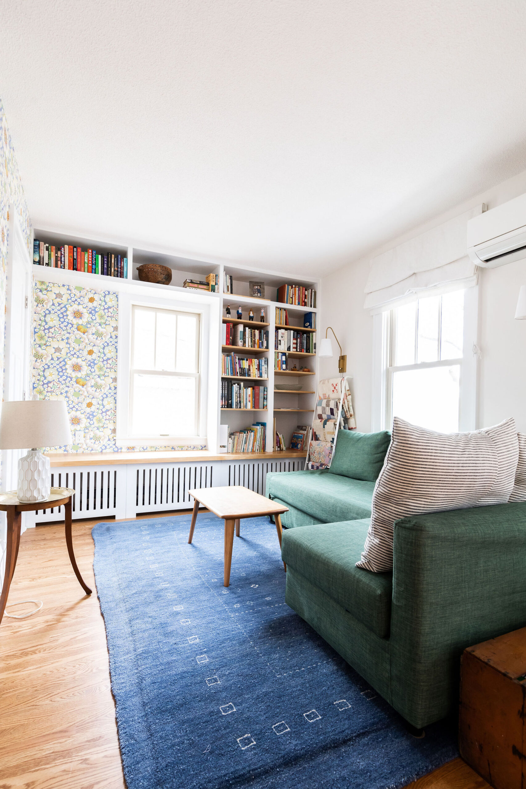
This space turned into such a cozy room and helped divide this long room into a living room and dining area.


What an honor to have been part of this project where we made the kitchen so much more functional, while also playing into the character of this hundred year old St. Paul home. I am truly so grateful to get to work with clients that trust my vision.


