It’s time for a bathroom before and after reveal! The Hidden Valley Rustic Elegance project is complete and it looks amazing. We kicked off the designs back in January and then Titus Contracting was busy working away to complete the job. Let’s check out the before photos of this space!
Before
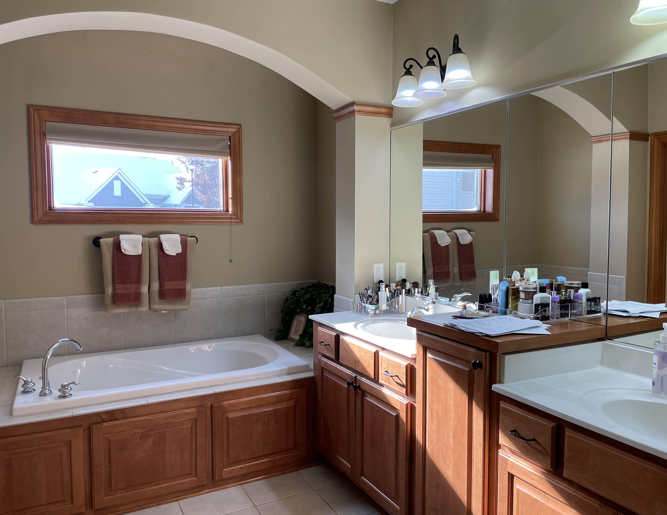
The layout of this bathroom was working well for the clients, but it was not reflecting their style. The goal was to brighten it up and create a more spa-like feel.
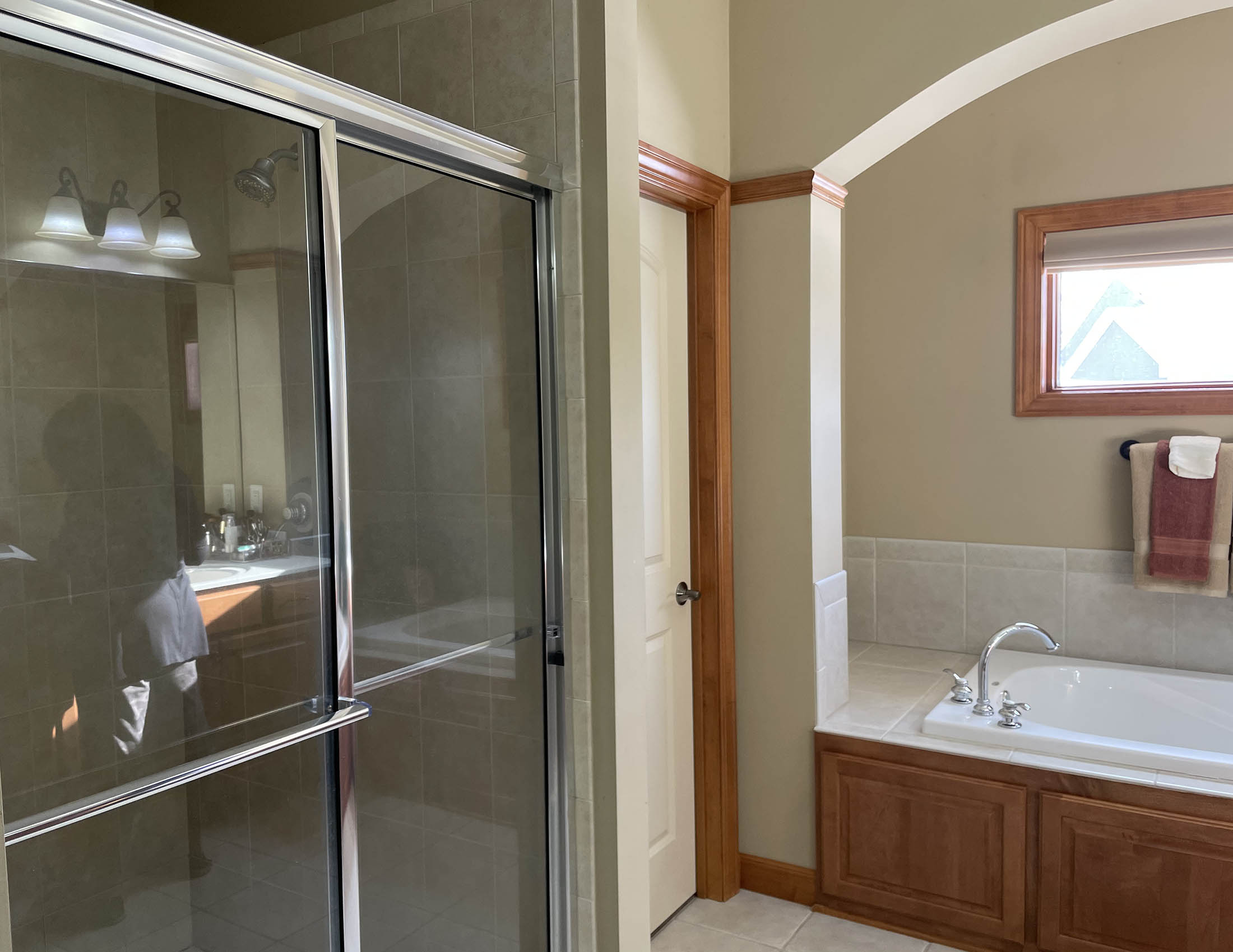
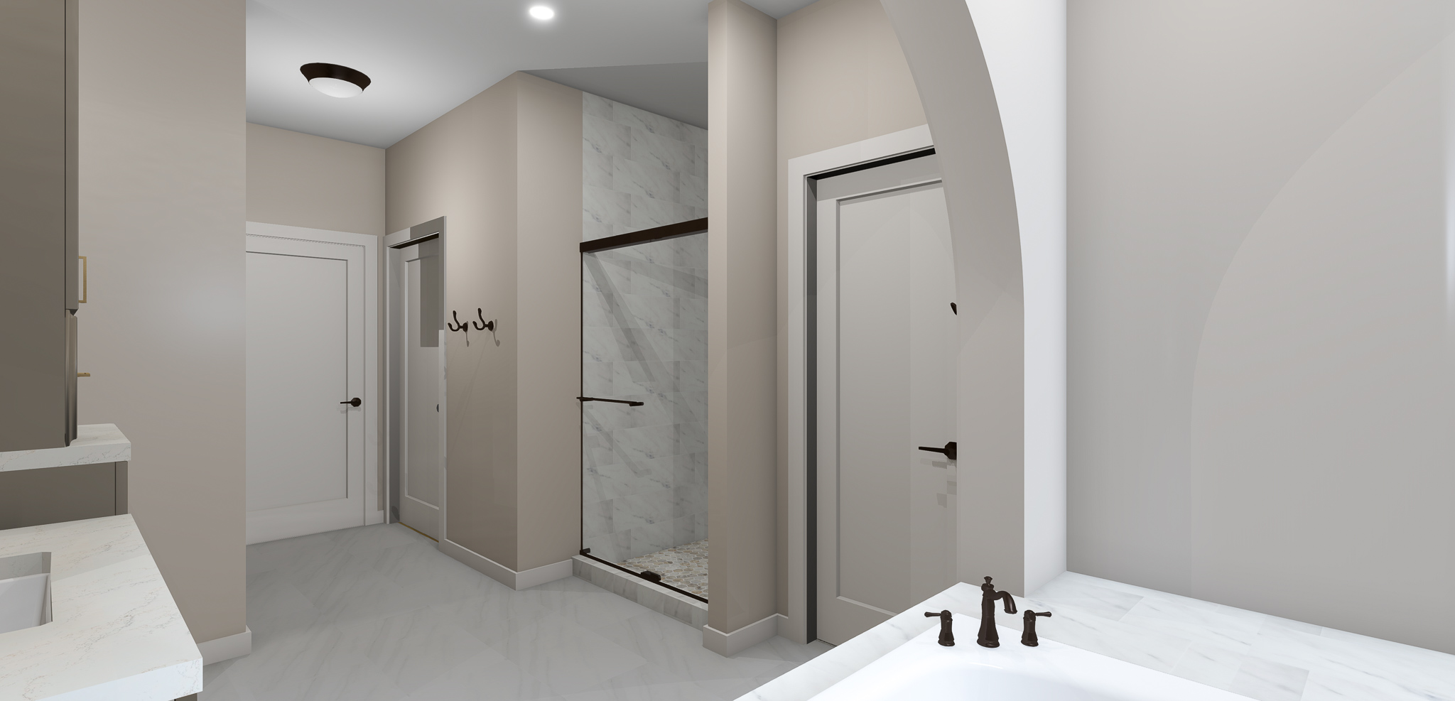
When remodeling a bathroom, you’ll be able to save costs if you can keep pluming in the same location. It’s not always possible, especially when the layout is not working for your lifestyle, but for this project it was.

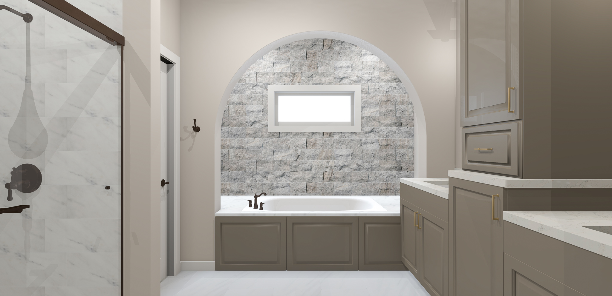
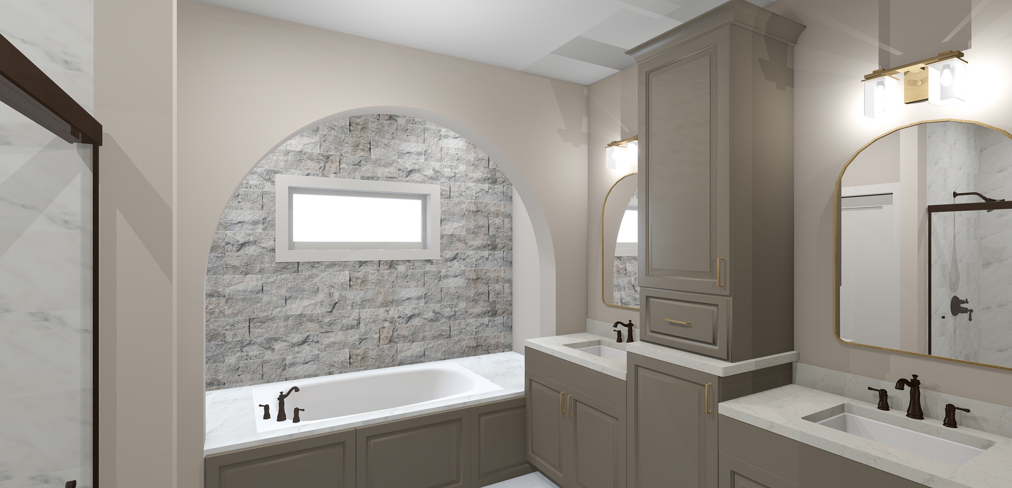
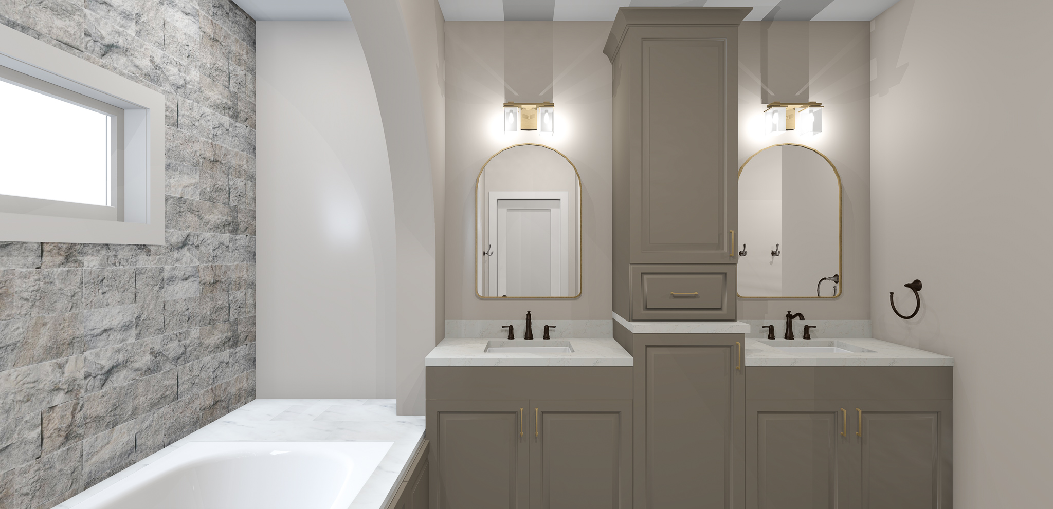
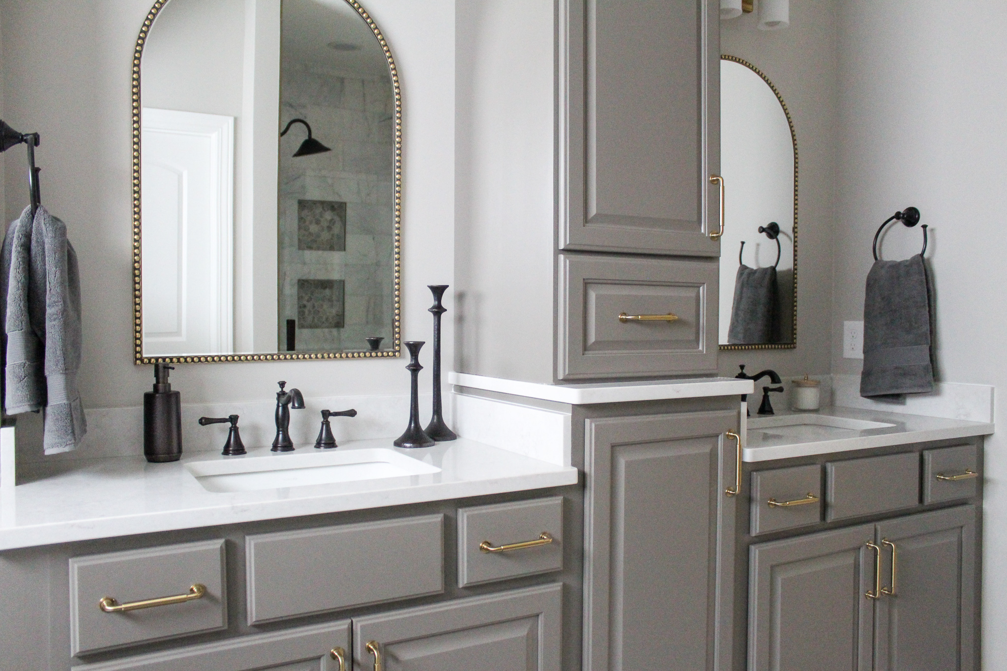
The clients loved their double vanities, but wanted to create more storage by adding a tower where the middle portion currently is.
Design Plan
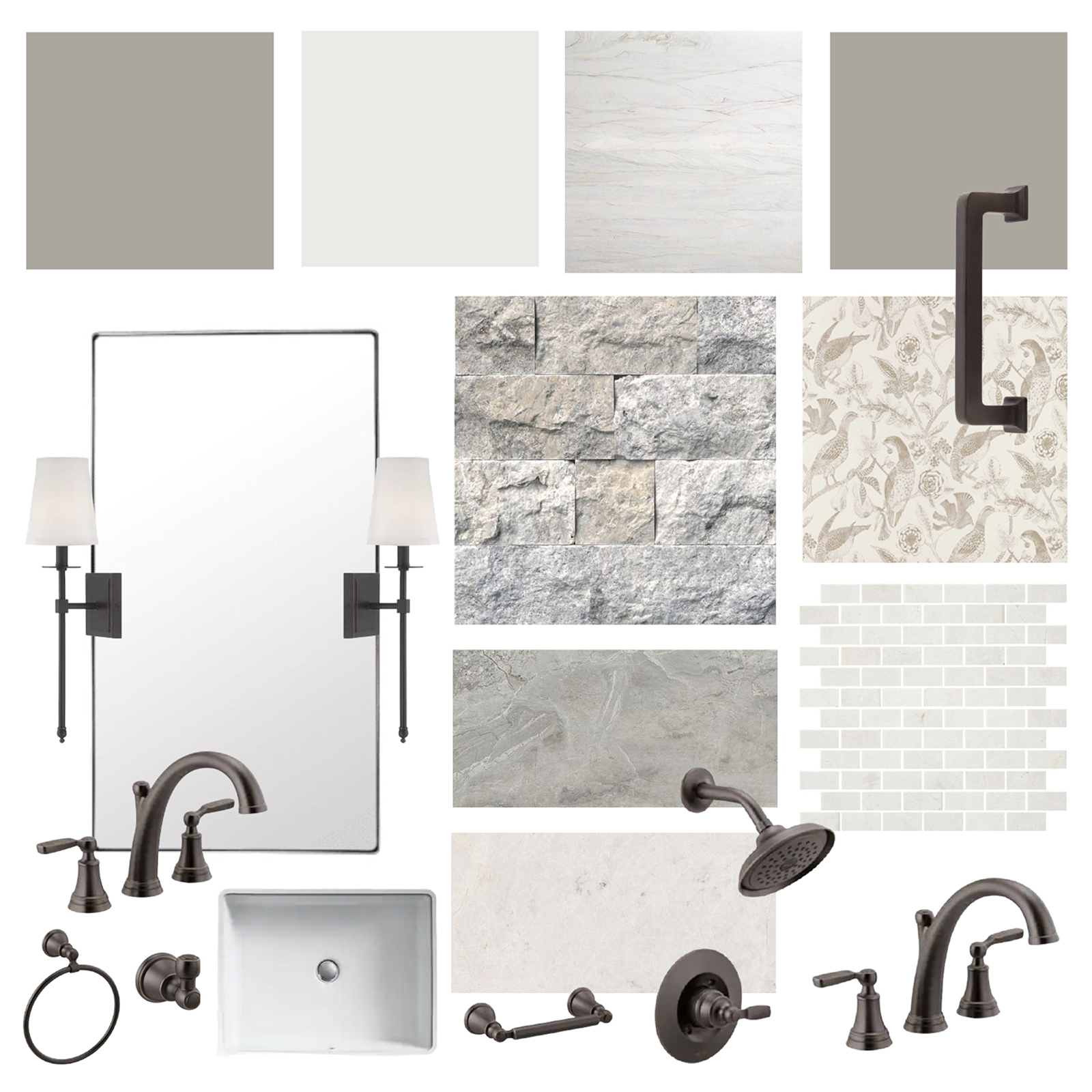
The first step in the design process was the mood board, where we gathered inspiration for the space. Some of the initial ideas were to stain the current cabinets darker for a more rustic feel. An accent wall behind the tub was top of the list for this bathroom remodel! In addition, we wanted the space to feel brighter, so you’ll see lighter finishes in the mood board below.

With a rustic elegance feel in mind, we moved into these concepts where the clients were shown two options with varying selections.
Option One

Option Two
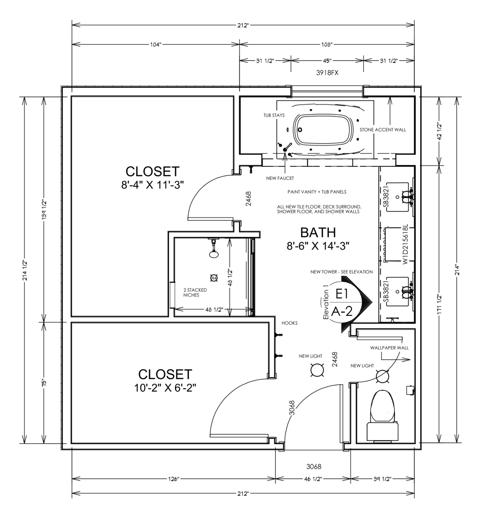
Then, it was time for the floor plan and cabinet elevation. Although we kept the layout the same, this floor plan allowed us to get bids for cabinets, countertops, and more. It also provided details notes for the contractor and subs to work off of.

Renderings
And now for the best part of the design process – the renderings! This is when the design really starts to comes to life. It’s also a great chance to confirm decisions and make any changes to paint color, materials, etc. before construction begins.



After
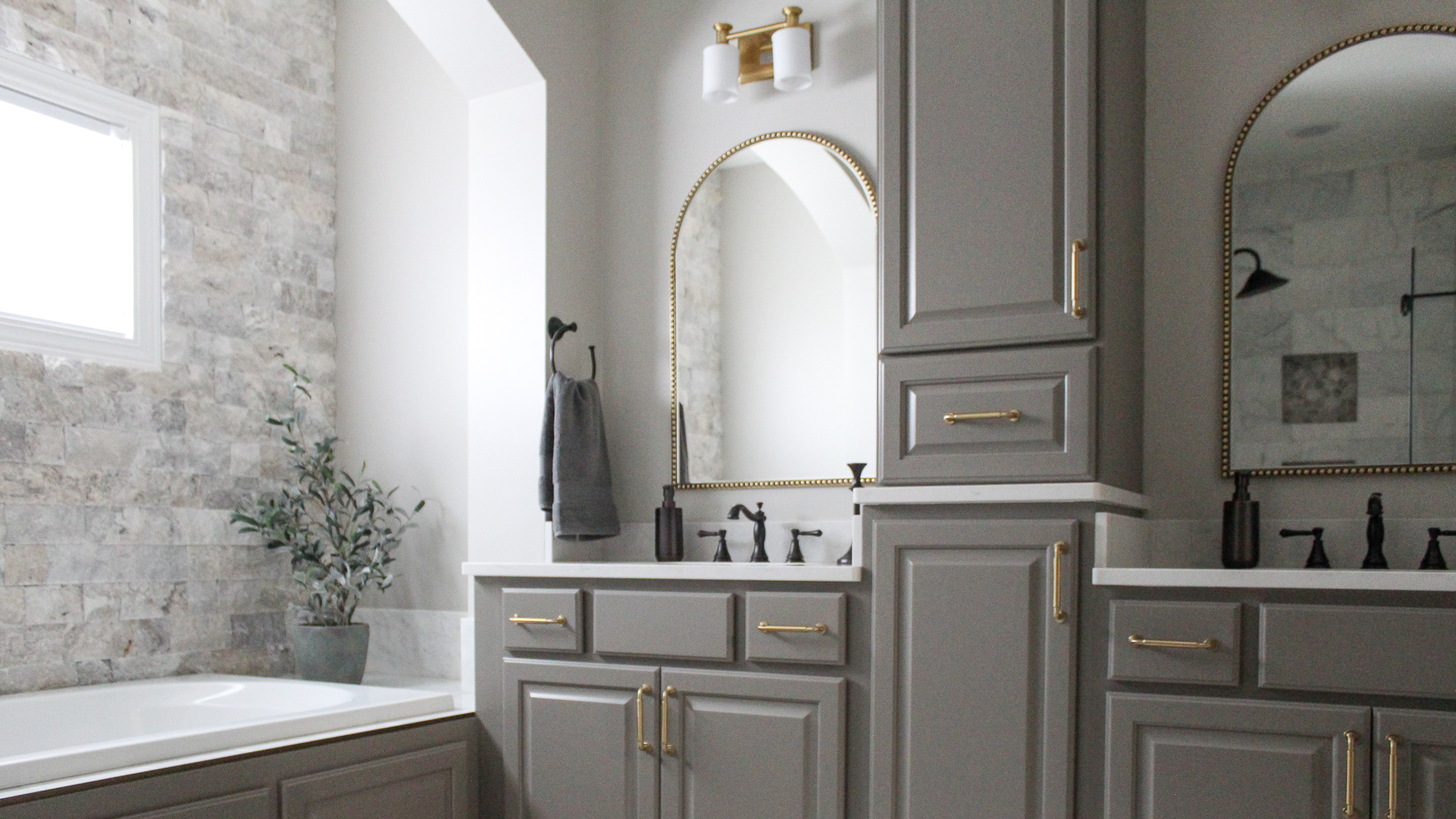
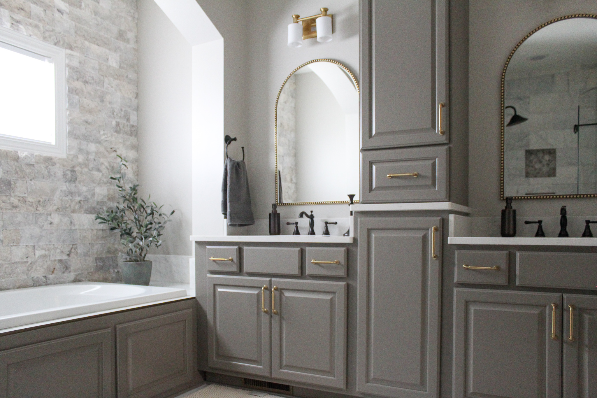
And now time for the after photos! Doesn’t this space look amazing?! Although the layout is the same, it feels like a completely different space.
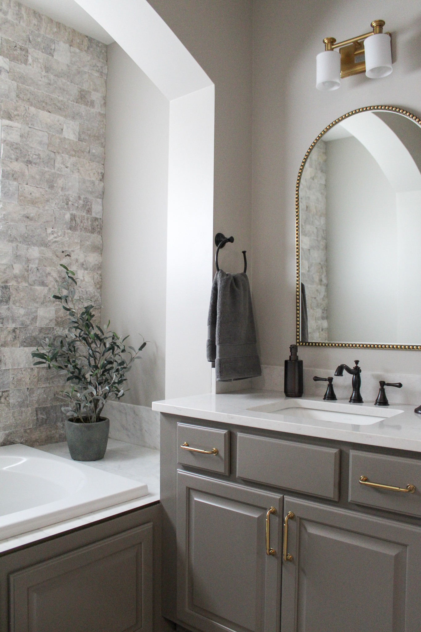
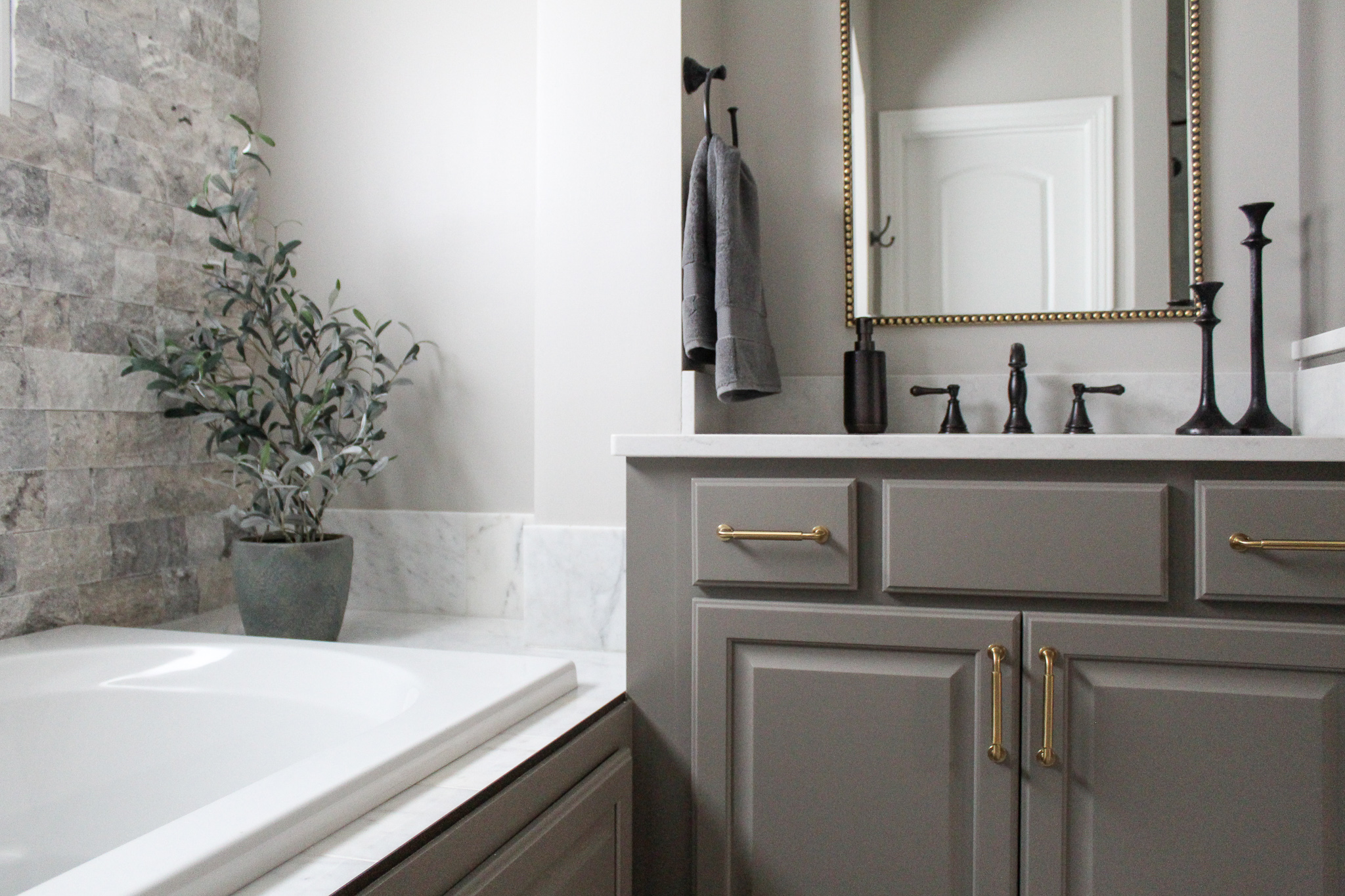
All of the cabinetry was painted SW Anonymous, which is complements the walls that were painted SW Worldly Gray and the trim in SW Snowbound.
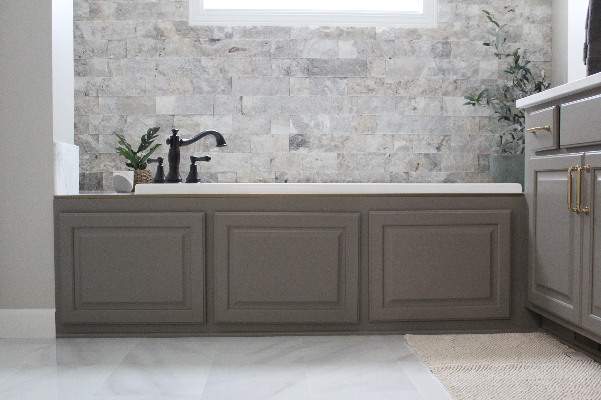
The honey bronze cabinet pulls are such a pretty addition to the vanity and play well with the Delta Cassidy faucets.

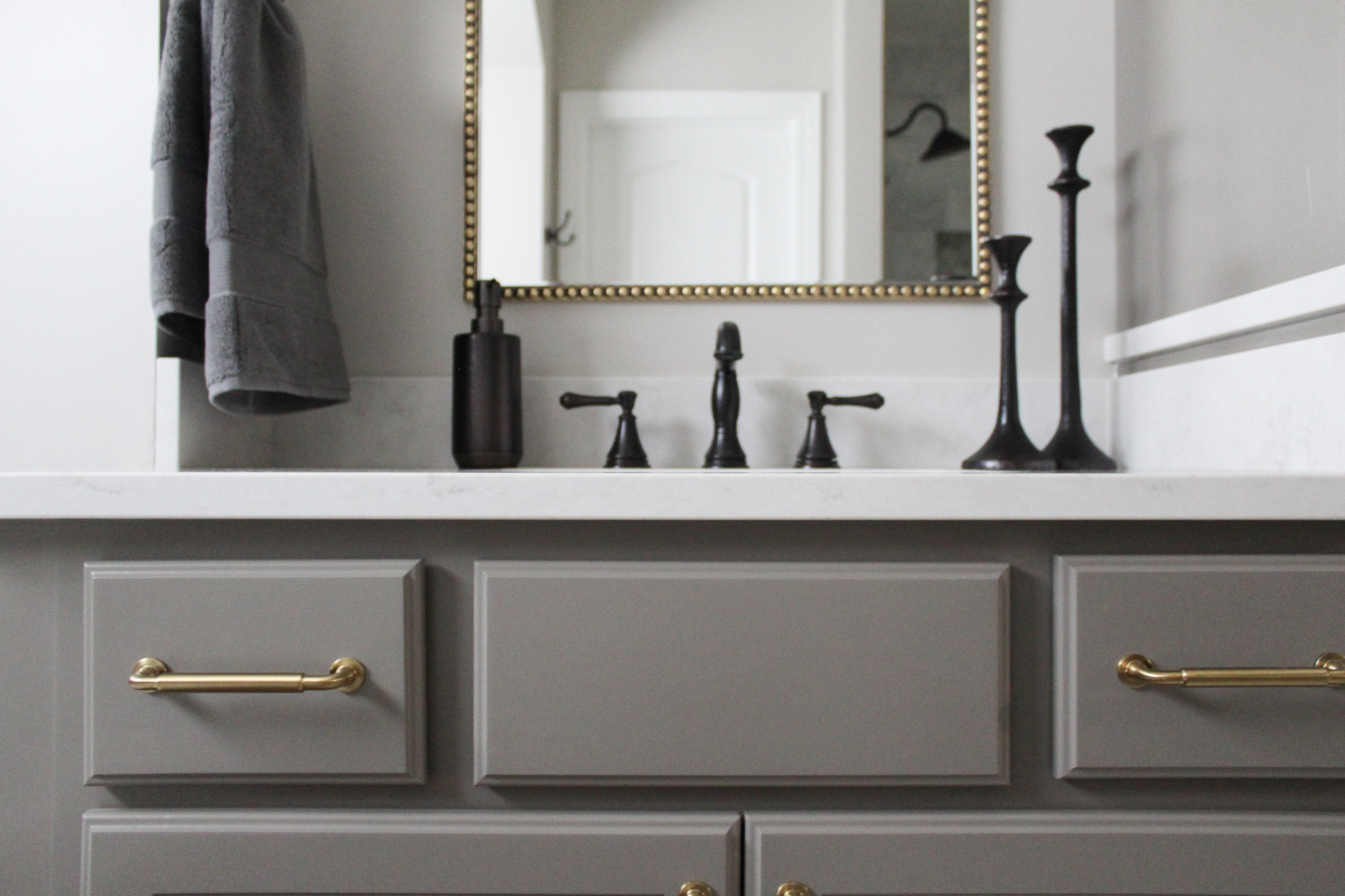
One of my favorite additions to the bathroom is the accent tile wall behind the tub. This spilt face travertine tile from The Tile Shop is just stunning!
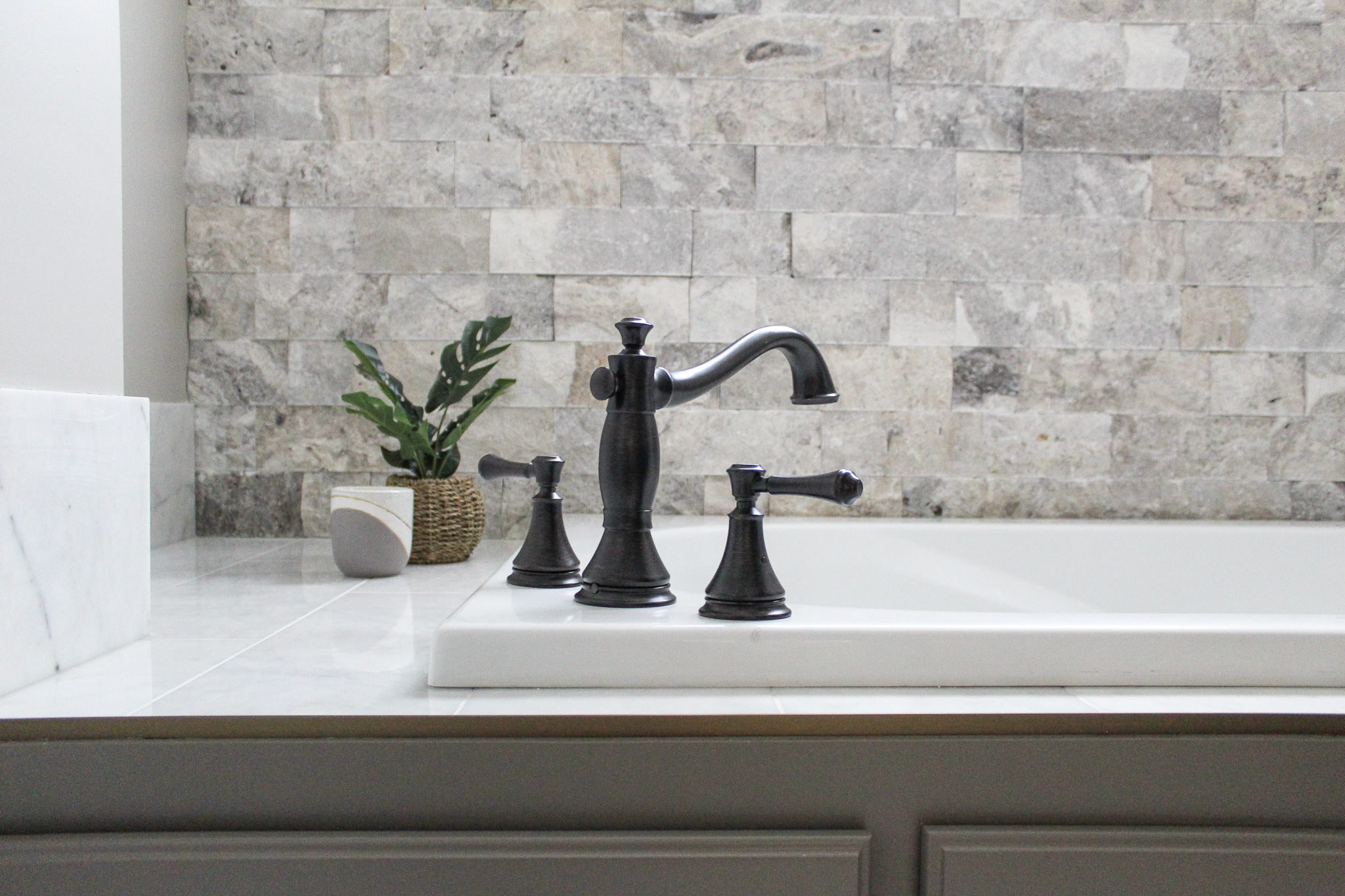

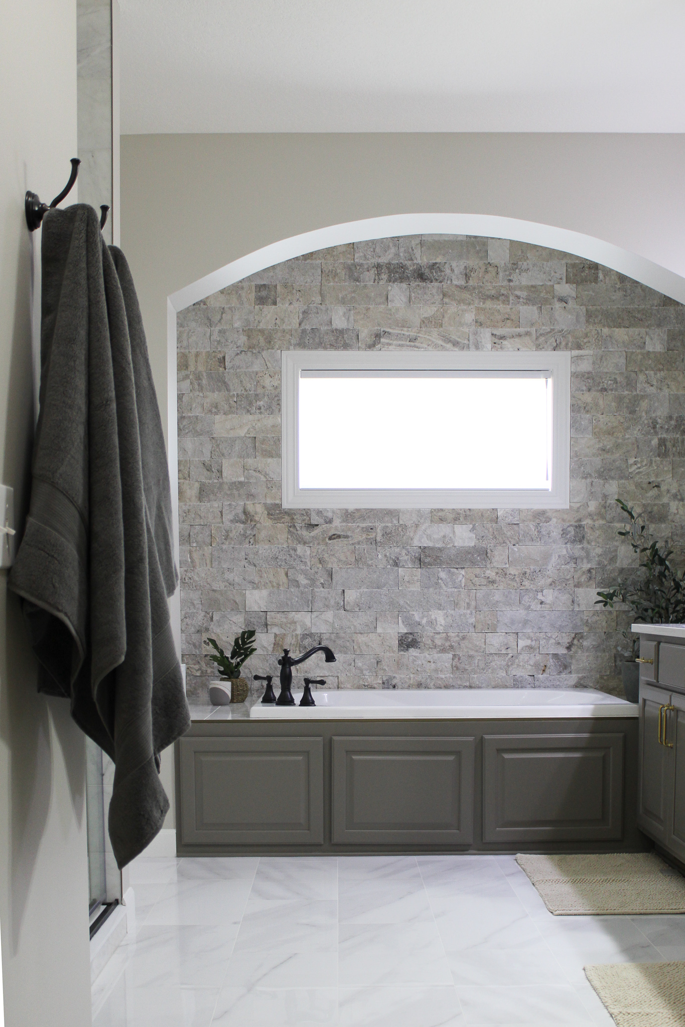
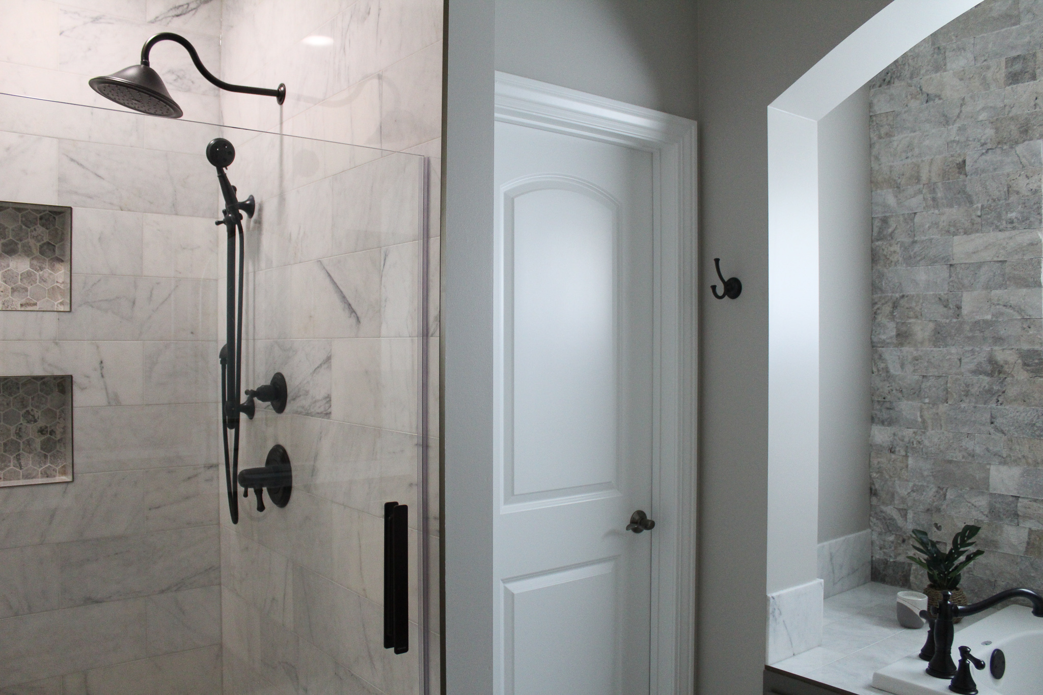
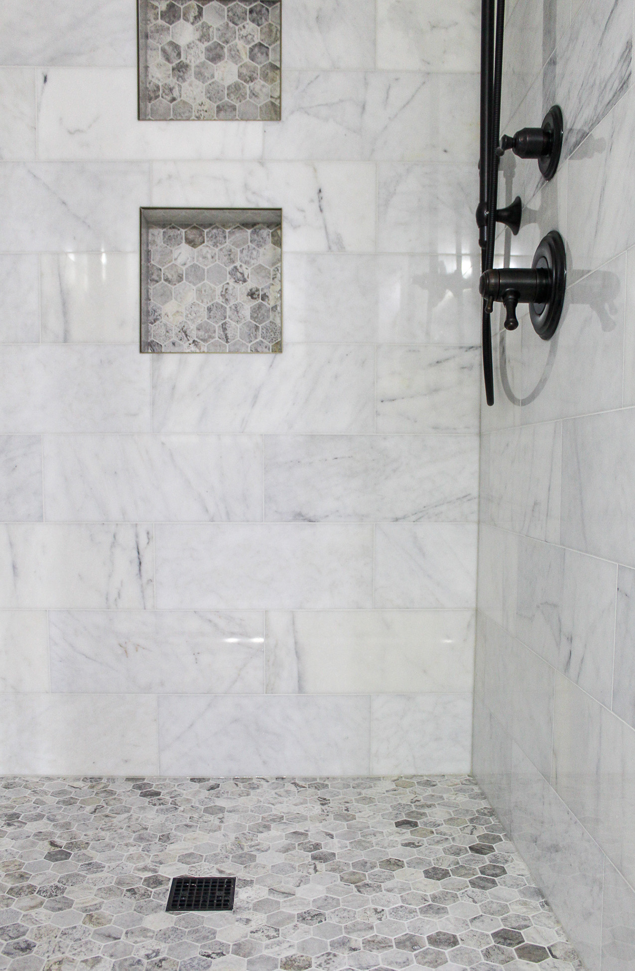
The polished marble tile around the tub carries over to the shower walls creating consistency in this space.

A hexagon travertine tile was used in the shower niche and on the shower floor to complement the accent wall behind the tub.

In the toilet room, wallpaper was added to one wall to add depth and dimension with its weaved texture.

With more storage, materials that fit their style, and a spa-like feel, this bathroom is the perfect place for the clients to begin and end each day. It truly feels like a retreat!


For more bathroom inspiration, check out the Modern Organic Bathroom Reveal.
And if you’re ready to remodel a bathroom in your home, I’d love to connect with you and talk design!

