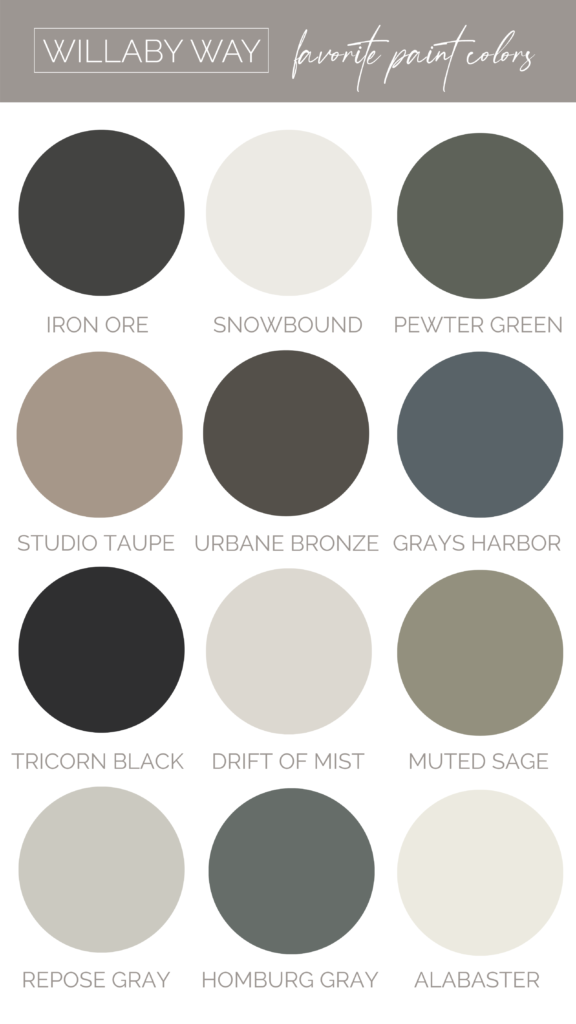
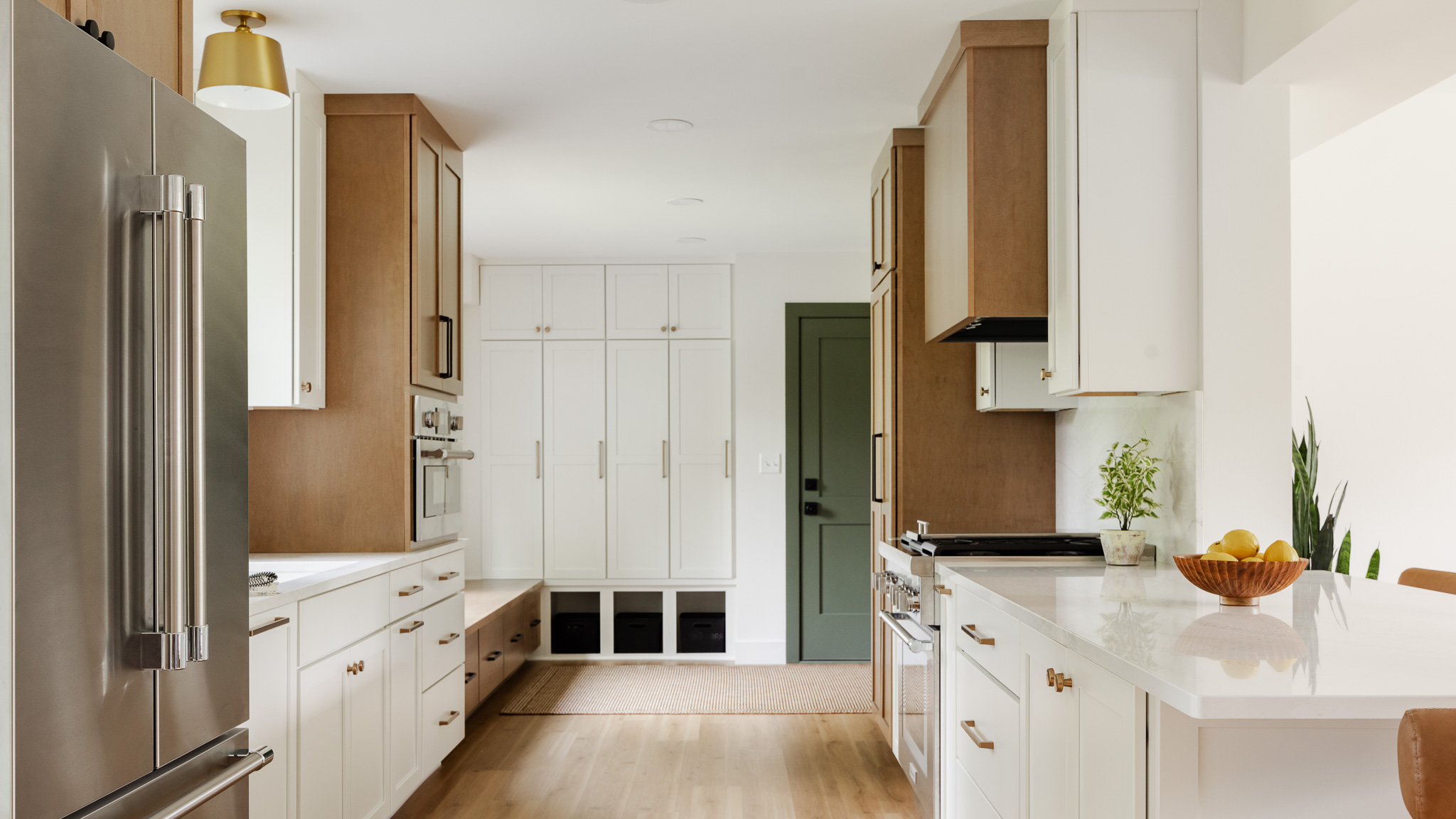
Struggling to find a paint color for your home? You’re in luck! This post will cover my 12 favorite and go-to paint colors that I use in my own home and for client projects. These colors are from Sherwin Williams and Behr, but you can get them color matched at your local hardware store too. Before you use these paint colors on your own walls though, I’d recommend getting some swatches or sample cans to do a test run.
Now, let’s get into the paint colors!
1. Iron Ore
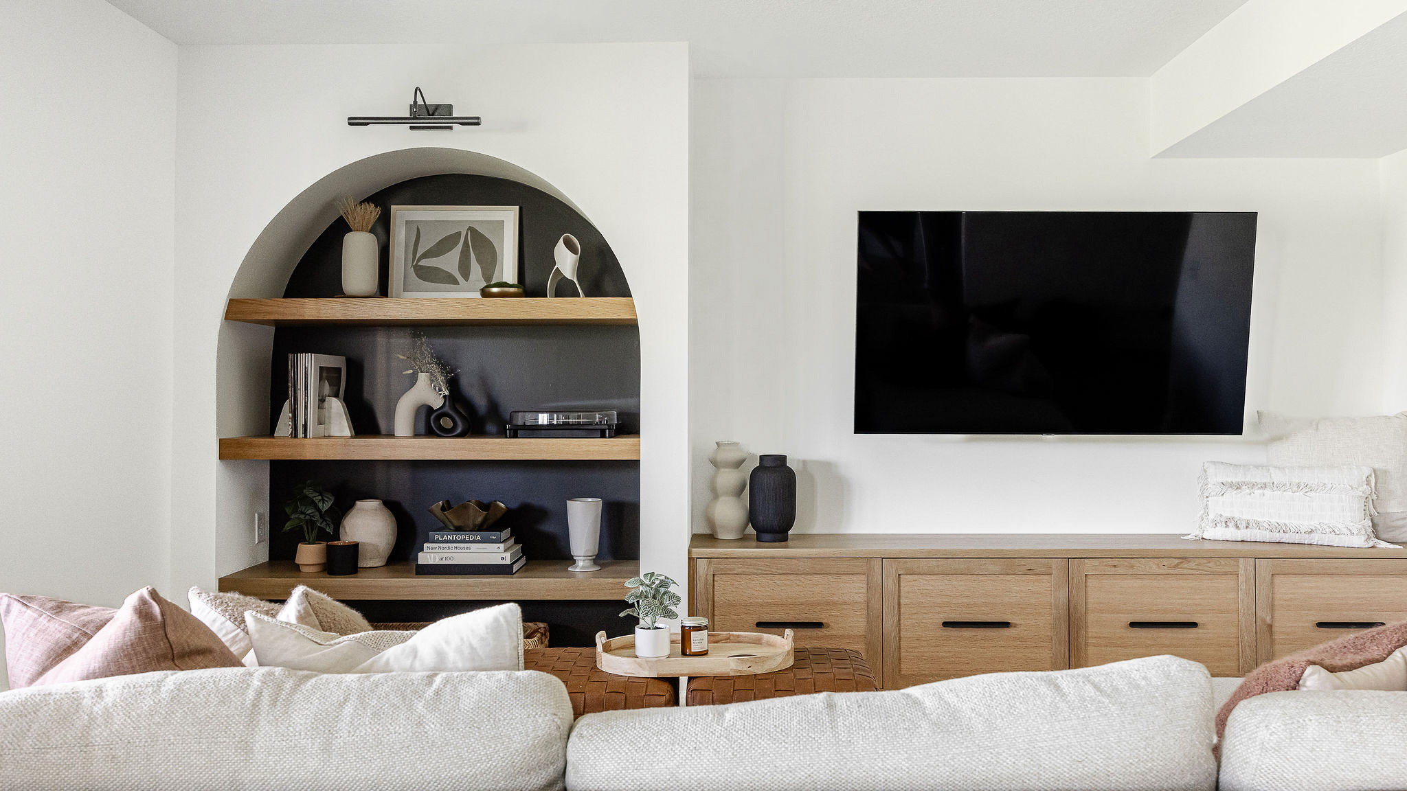
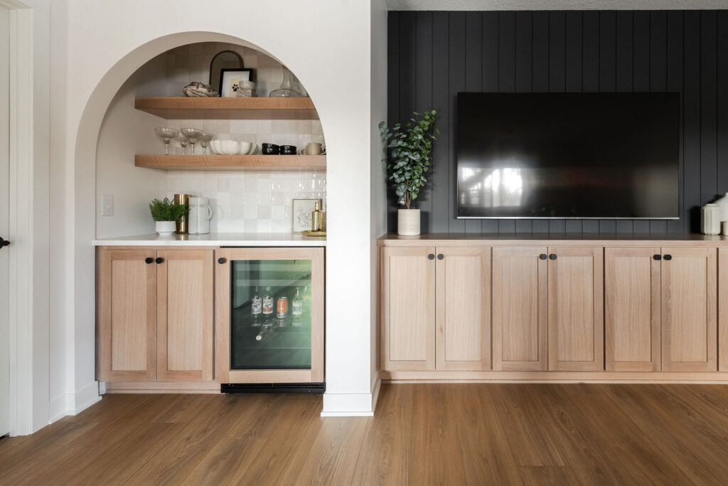
For a cool, mysterious color, look no further than Iron Ore. In the Alvarado Modern Scandi Project, we used this color on the lower level media shiplap and the media cabinets. It is such a great option to pair with white or cream walls and lighter wood tones.
2. Snowbound
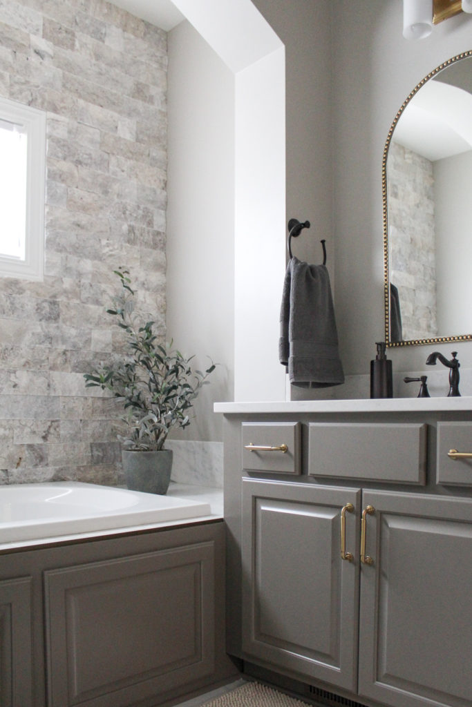
If you’re in need of a go-to light neutral, my top recommendation is Snowbound. I’ve used this color on walls, trim, and cabinets.
It can work with a more rustic style, like on the walls in the Rustic Elegance Bathroom below:
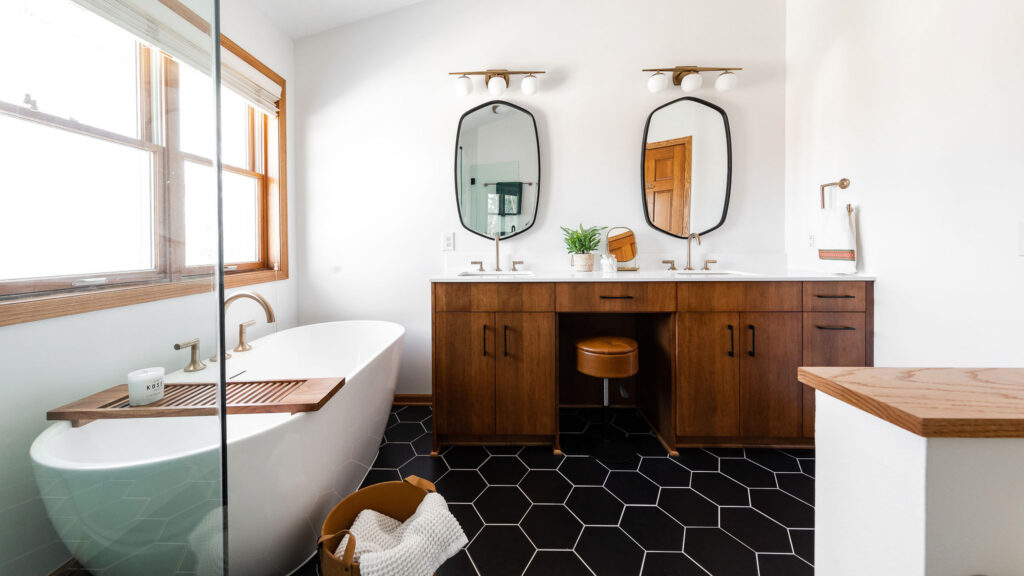
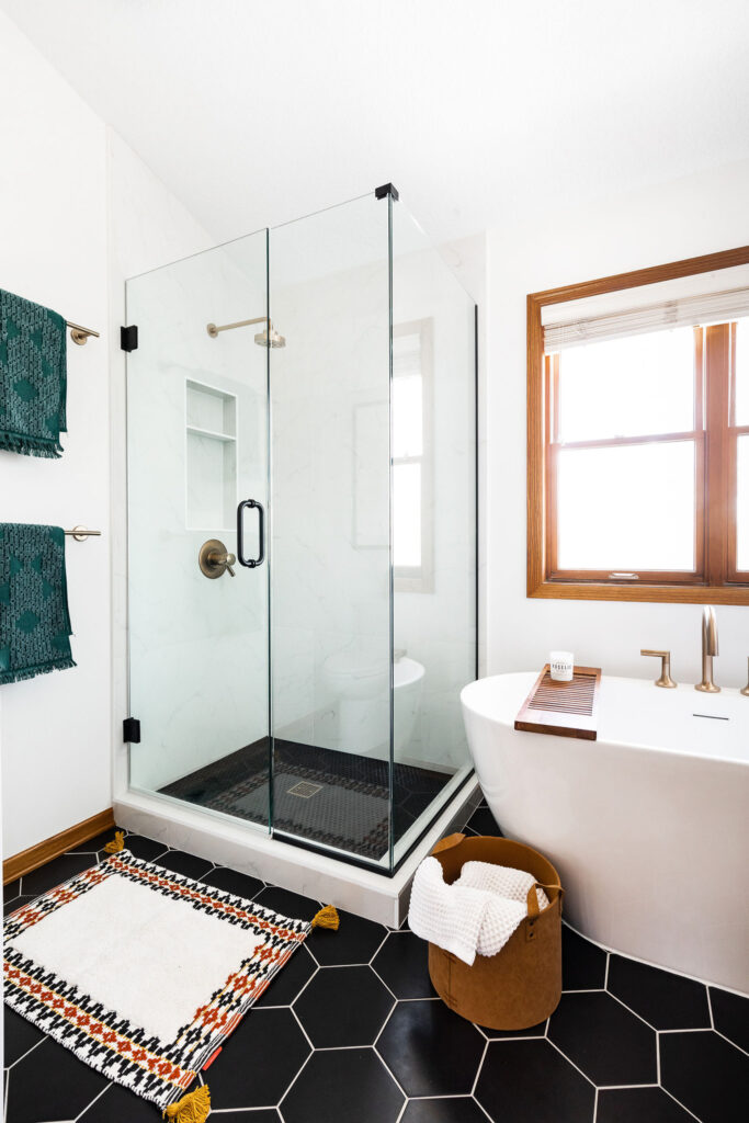
Or it can feel bright and light with a more sleek design like in this mid century modern bathroom:
3. Pewter Green
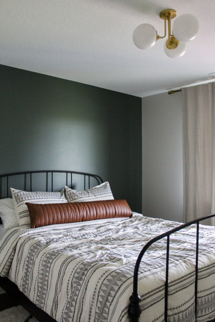
The dark and calming Pewter Green gives off a natural feel and works well as an accent wall or in a bedroom for down-to-earth elegance. We used Retreat as a statement wall in the bedroom of the Classic Modern Basement.
4. Studio Taupe
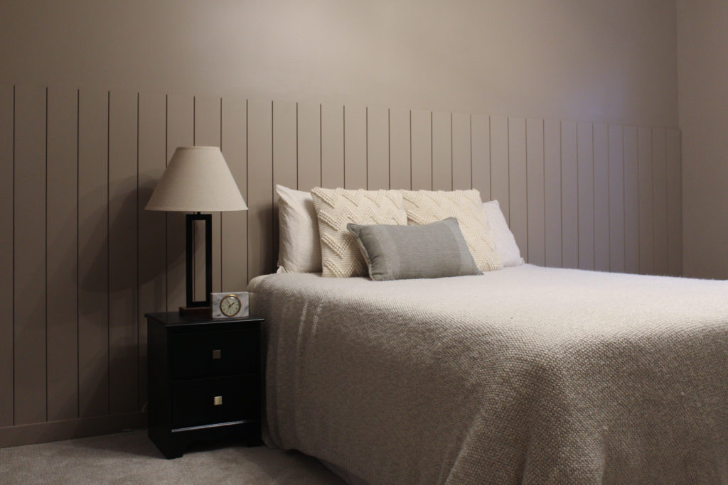
We used Studio Taupe in our guest bedroom and I love how it has a natural feel that brings a cozy vibe to the room. For a monochromatic look, try it on the trim, doors, and baseboards too.
5. Urbane Bronze
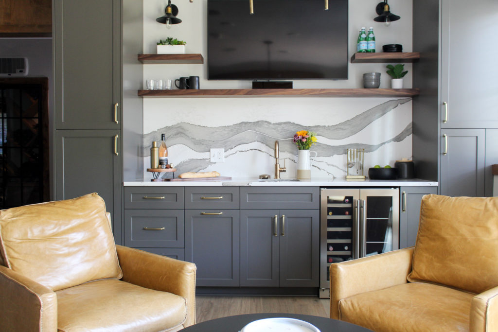
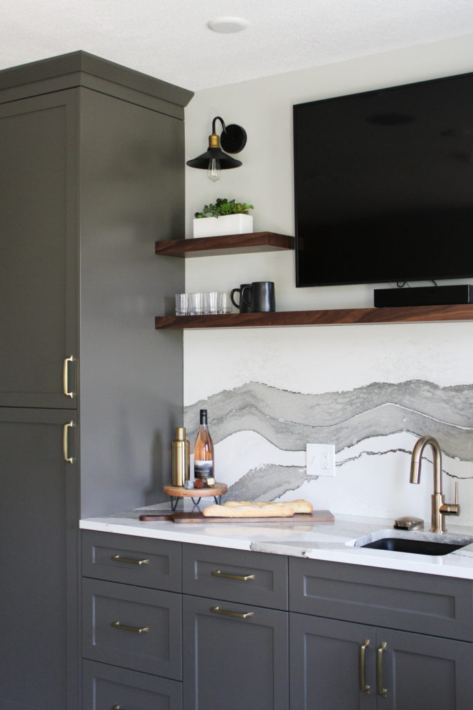
In the Nature Valley Lower Level, we used Urbane Bronze on the cabinets in the bar area, which turned out beautifully! It has an organic feel, while adding a level of sophistication to any space.
6. Grays Harbor
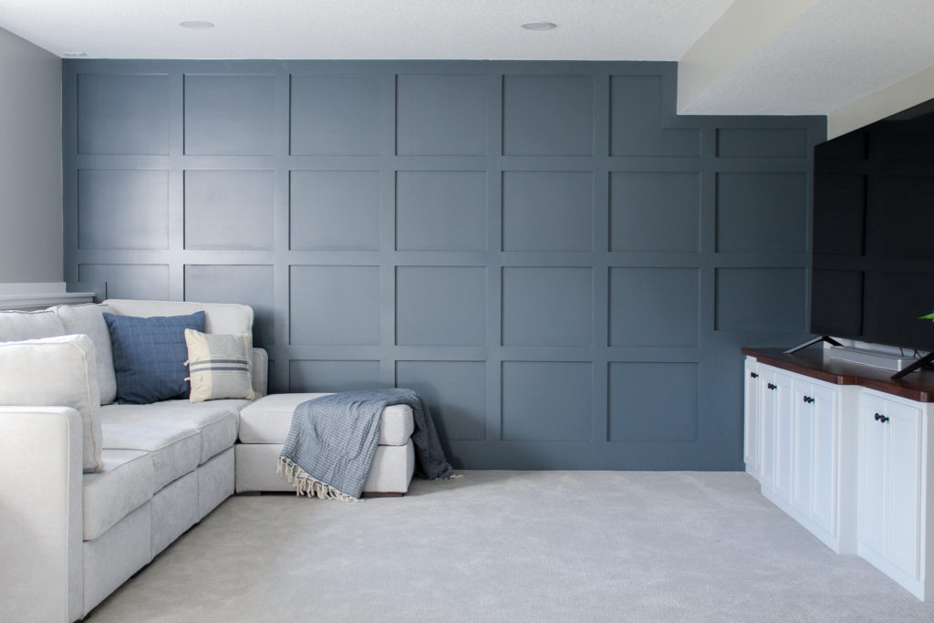
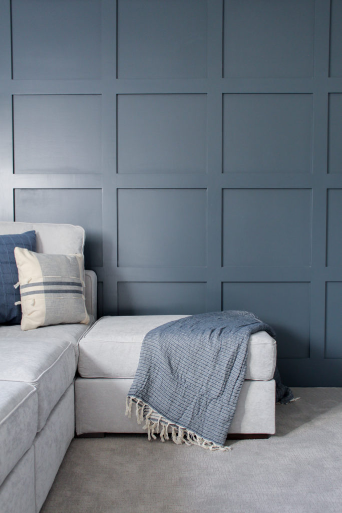
This cool slate blue adds a level of tranquility to a space. In the Paddock Lane basement, this paint color was used as an accent on the board + batten wall in living area. Grays Harbor is such a pretty color and would work well in a bedroom too.
7. Tricorn Black
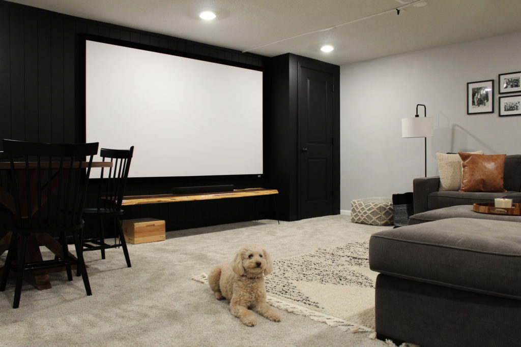
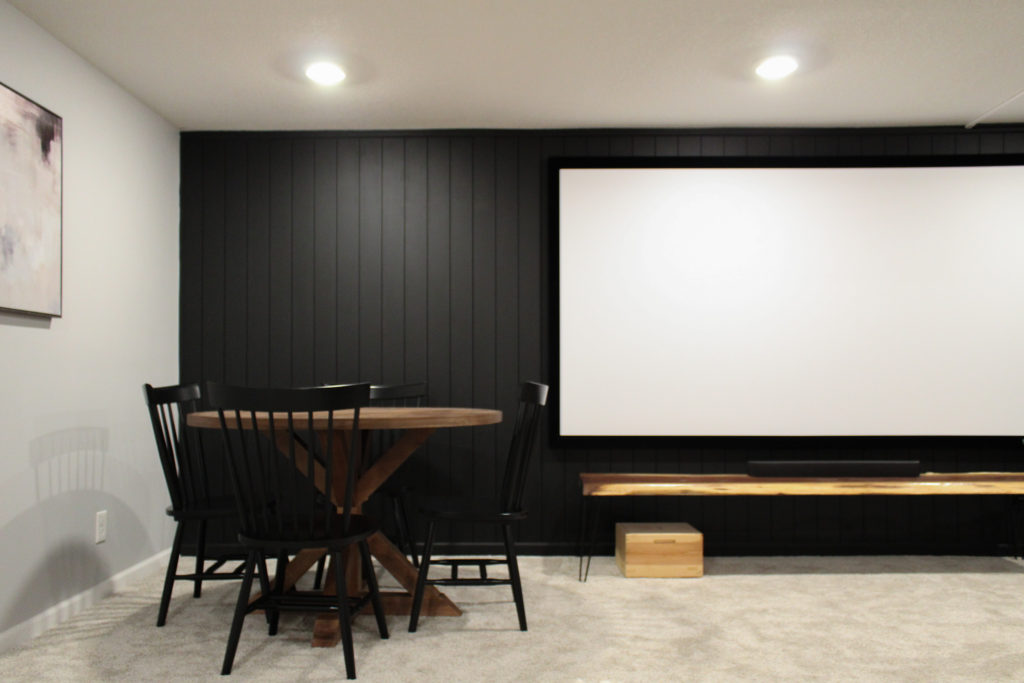
Tricorn Black is a true black and always a go-to of mine! It’s a great option for a statement wall, fireplace, or exterior. In this moody modern movie room, it was applied to the vertical shiplap behind the projector.
8. Drift of Mist
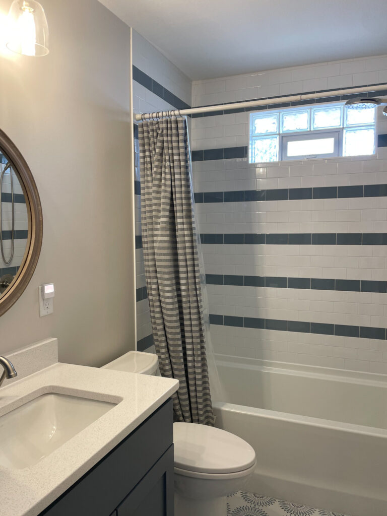
Drift of Mist has been a go-to recommendation for current client projects. It’s an airy gray that feels just right in any space. We used it on all of the walls in this Cape Cod inspired home.
9. Muted Sage
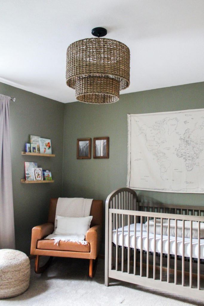
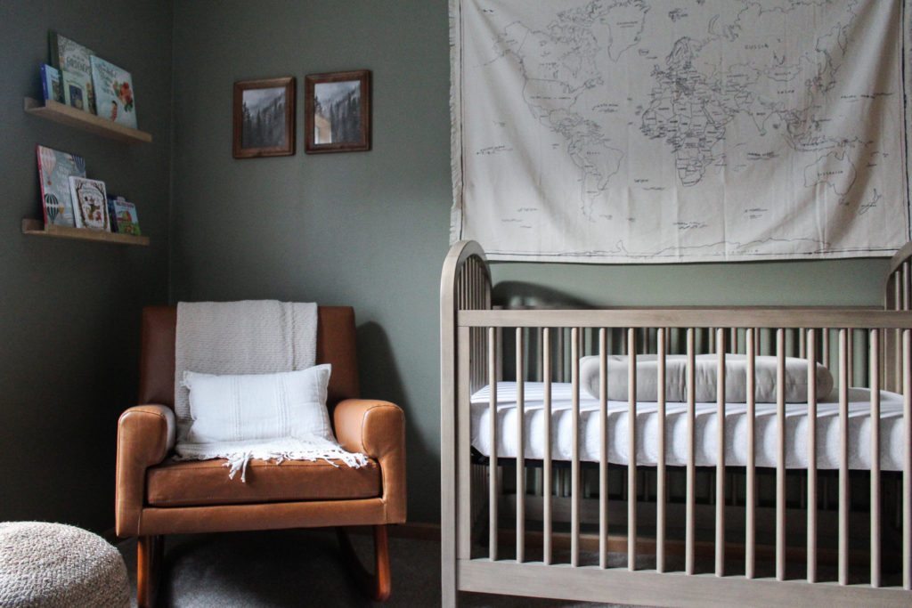
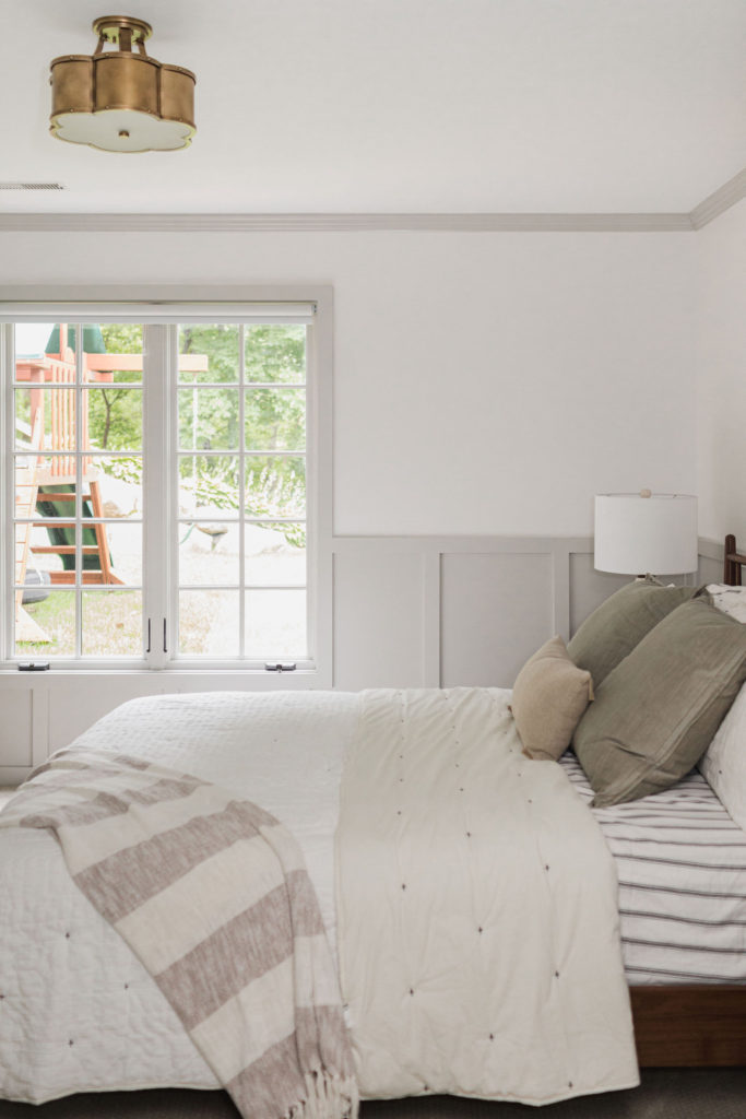
For a soft, earthy green, my favorite is Muted Sage. This was the color of our guest room, which became the nursery. People always ask when they come over what the paint color is and everyone seems to love it!
10. Repose Gray
Repose Gray is the paint color we used throughout the Holdridge Modern Tudor home. It works well with both grays and tans. For the perfect neutral, I’d recommend trying out this color. It’s one that you can use throughout your entire home too!
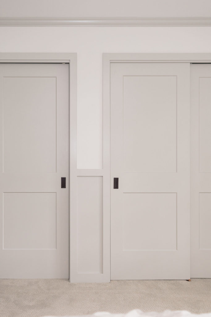
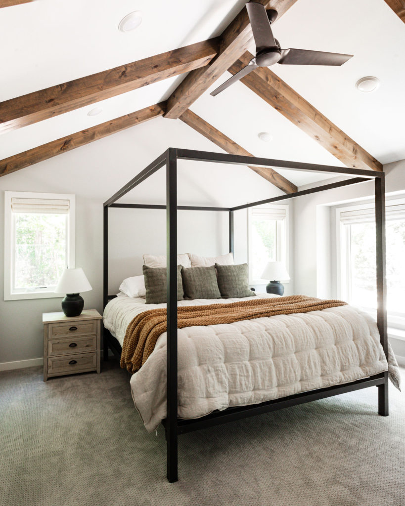
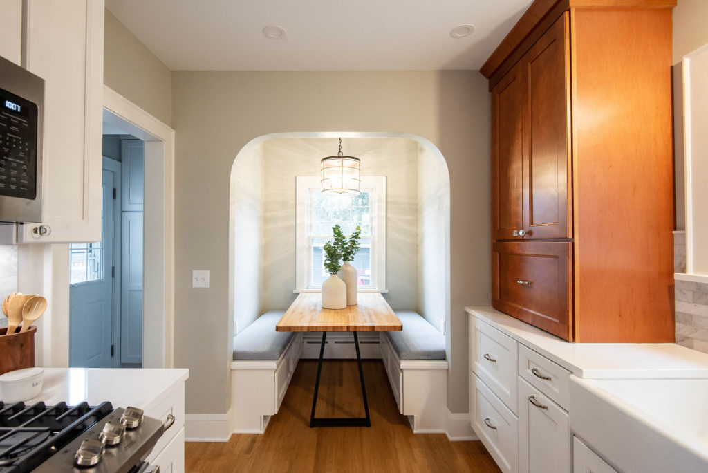
It is also the paint color on the walls of this kitchen:
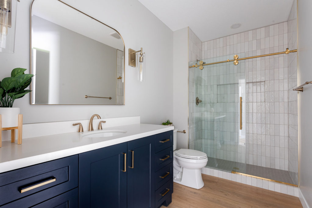
And this bathroom:
11. Homburg Gray
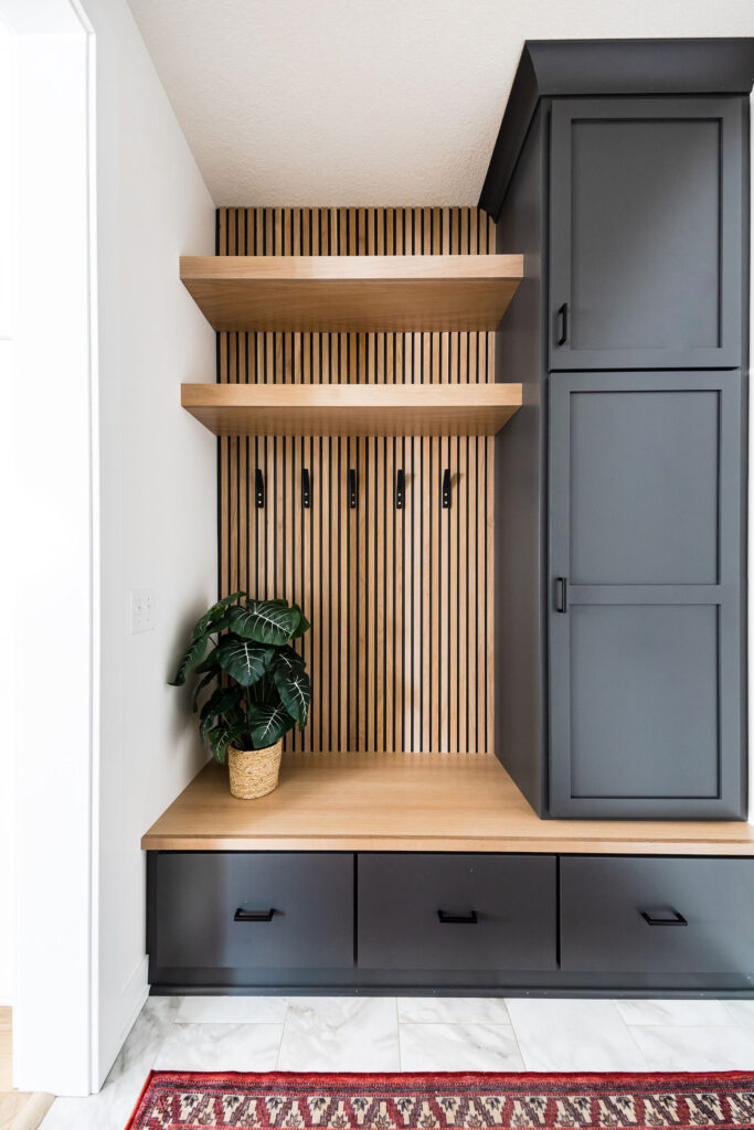
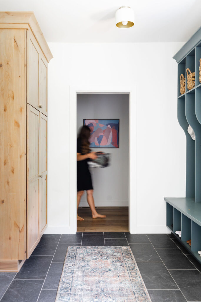
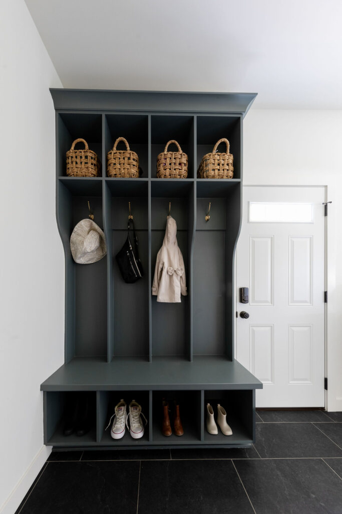
For a teal gray, try Homburg Gray. We used this for the lockers in the Scandinavian Eclectic new build project. I love how it brings a fun accent to the space, without feeling too bold or dark.
12. Alabaster
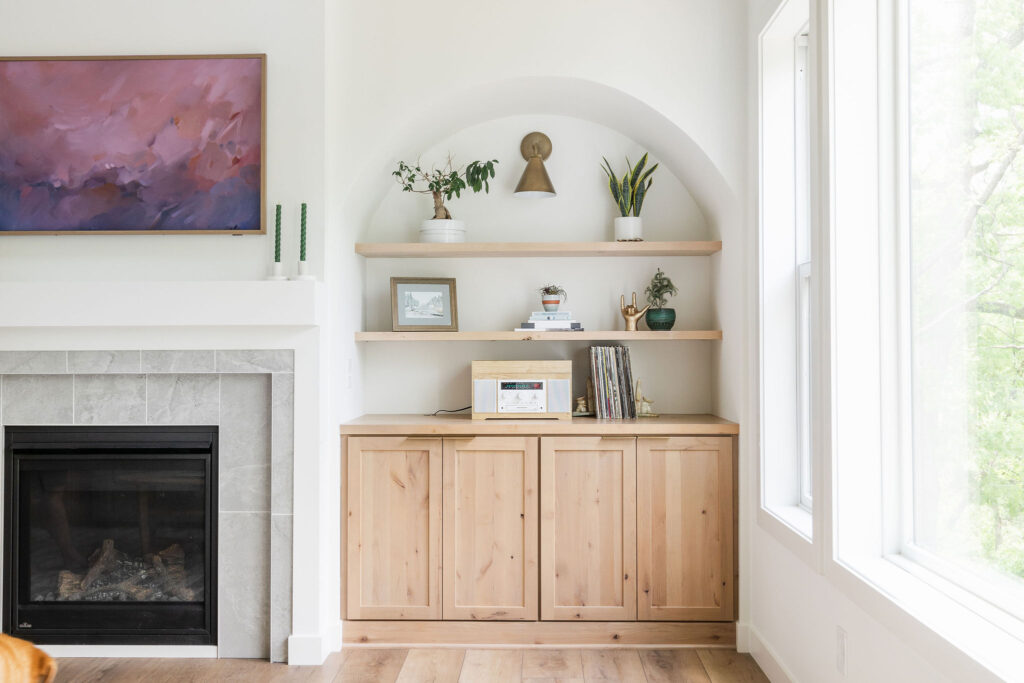
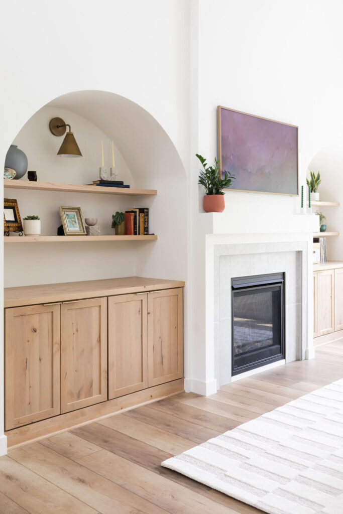
Alabaster brings a bright feel, while still remaining cozy. It’s a soft and warm white that works well for walls, cabinetry, millwork, and doors. It would also be a pretty exterior color if you’re wanting a light and bright look. We used Alabaster on all the walls in the Scandinavian Eclectic home.
Willaby Way Favorite Paint Colors
And there you have it – my favorite paint colors! Save this graphic for when you’re looking for a new color for any room in your home. Do you have a go-to paint color? I’d love to know. Share in the comments below!
