Another branding project in the works! I loved getting to work with Mike of Aurora Tileworks to create a logo concept that would reflect his brand. When I was the designer at construction2style, I got to see the detail and precision that Mike puts into his tile installation business firsthand. He truly cares about the craft and making sure the install is done right. When we talked about what he wanted his brand to encompass, professionalism and a modern feel were top of mind.
Mike loves Minnesota’s North Shore and wanted to reflect that not only with his name – Aurora Tileworks – but in the colors and logo as well. Another aspect that I wanted to incorporate was clean lines to represent tile.
Concept Board
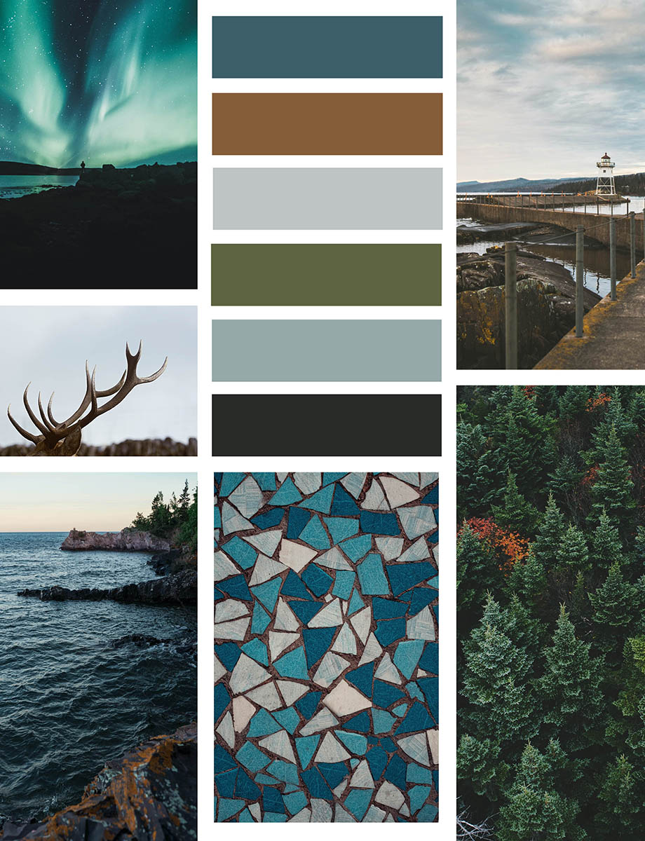
Here are some of the elements that were incorporated into the concept board:
- earthy color scheme of dark teal, rusk, light gray, green, slate
- nod to Lake Superior with nature elements
- clean lines that reflect tile, without being a literal translation
- incorporating inspiration from trees, caribou, and tile
Initial Options
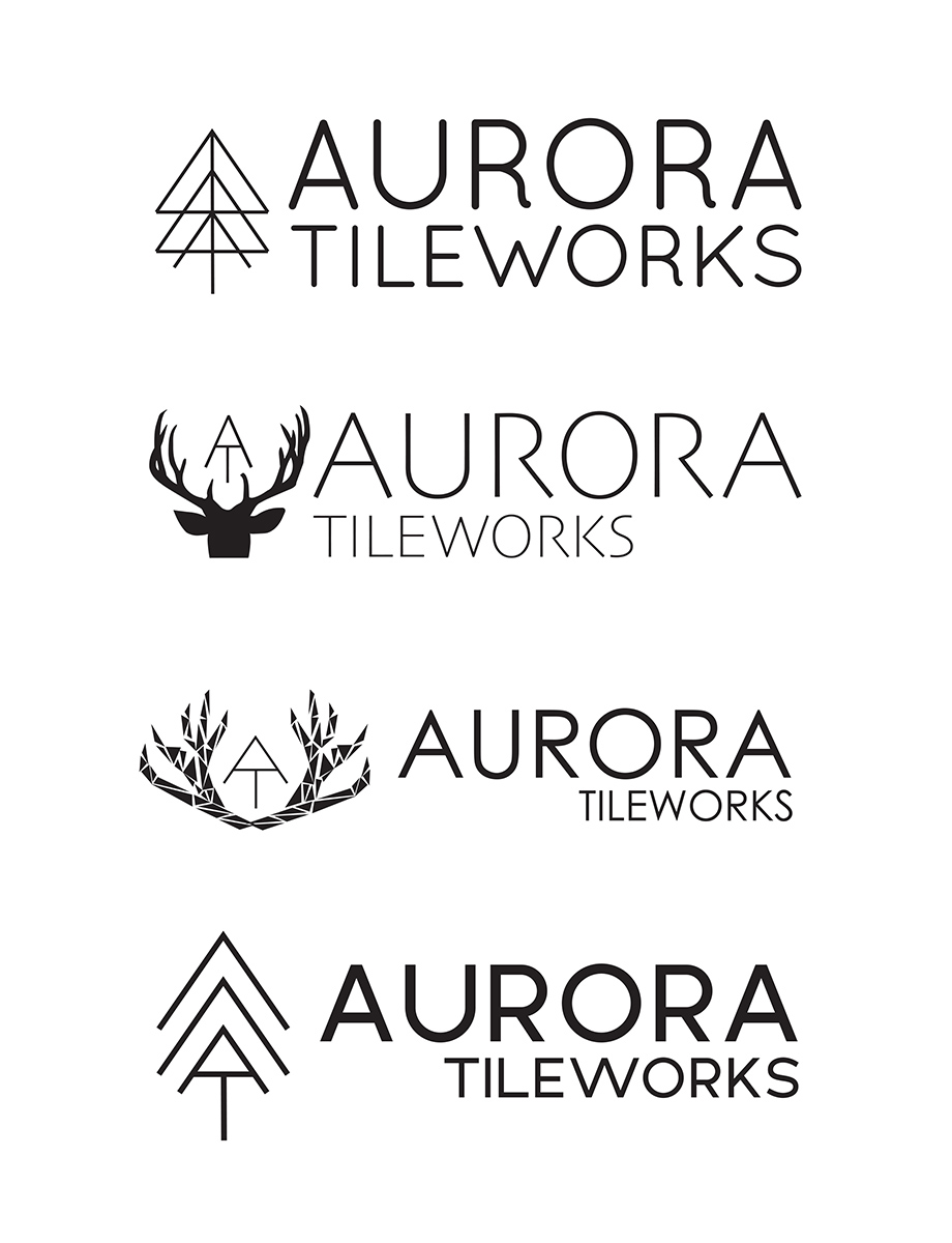
After the concept board, the next step was creating a couple of initial options to get a feel for the direction we wanted to work toward most. Here’s a brief explanation of the options:
Option One
The icon incorporated the A + T in Aurora Tileworks and gives a nod to a chevron tile pattern and a tree. The typography is more curved and organic looking, which reflects the North Shore feel.
Option Two
In the second option, the icon incorporates the A + T with a caribou silhouette. The typography has clean and thin lines, which gives it a more modern flair.
Option Three
The icon shows antlers made out of triangles to bring in a subtle nod to tile with the A + T incorporated. The typography is modern and clean, with the Tileworks shown in a smaller size and located on the left side. This option is more organic and free flowing.
Option Four
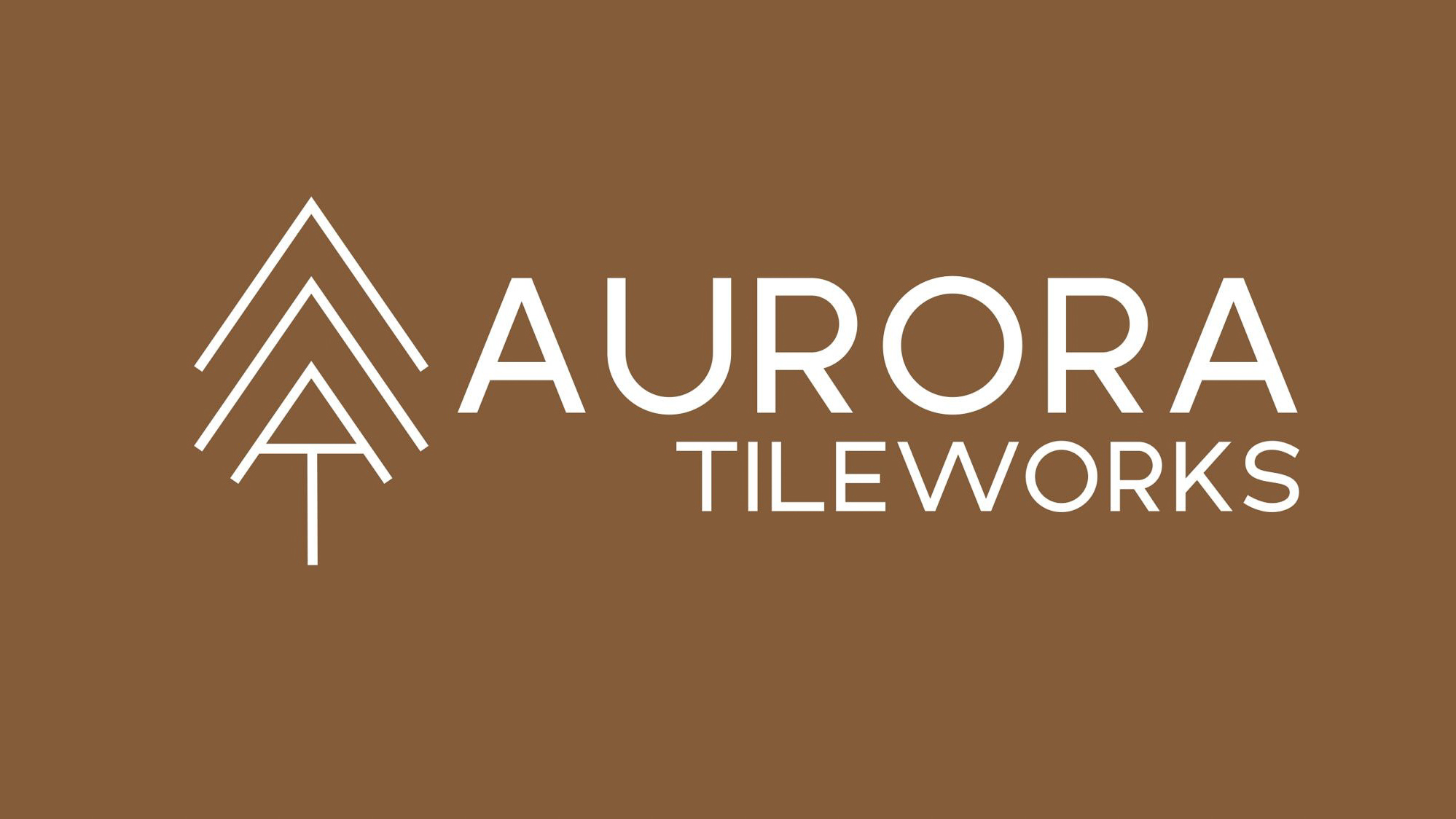
In this final option, the A + T icon has linear lines above it, which reflects a tree and upward motion to signify always moving forward. The typography has simple lines that make an impact, making it more streamlined and timeless.
Final Logo
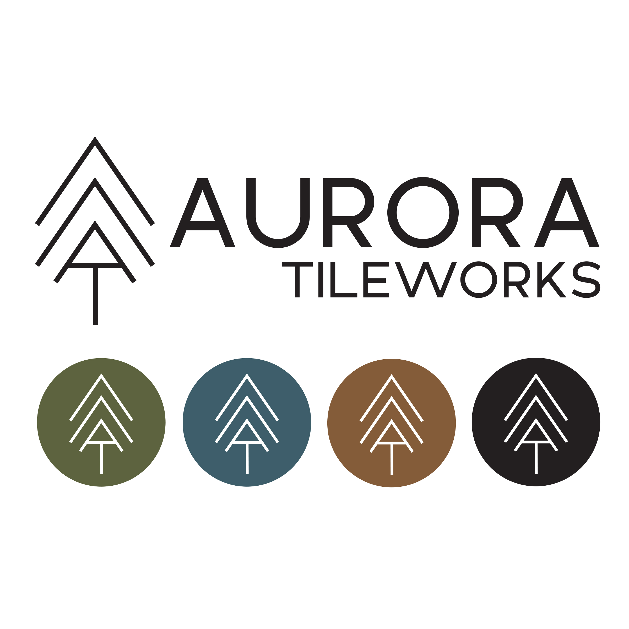
Once we discussed the initial options over the phone, we landed on Option 4 because of how all of the elements that represent Mike and his business were included. From there, I developed the final logo and brand colors, which is shown below. The icons are used for social media purposes and other branding elements.
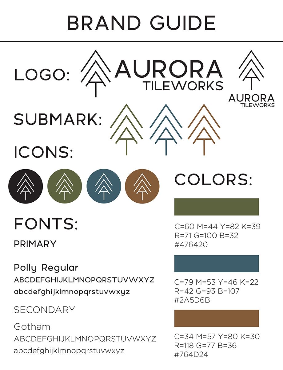
Brand Guide
In this final brand guide, the logo is shown in both vertical and horizontal layouts. Additionally, the submark and icons are shown, along with the brand colors and fonts. This guide ensures that all aspects of the brand will be consistent whether showcased through a website, printed materials, and social media.
Designing for Social Media
The following images are part of the brand packages that was delivered, giving the ability to use the branding on various social media platforms. I absolutely love the colors in this brand guide as they reflect the beauty of Minnesota.
Creating specific images to be used as profile photos, cover photos, and Instagram highlights ensures that the brand will be shown consistently across the board. This also allows the business owner to showcase their new branding, which is always fun to see on social media.
Let’s Connect
A clear brand message is only effective if the logo and branding reflects what you want to be known for. Ensuring that you have a consistent look and feel to your business is so important. It’s a joy to be able to create this for businesses and see how it can positively affect their business. If you’re interested in branding, I’d love to connect with you to chat more!

